Partners with Kakao
Magazine, 180 x 240mm, 2018

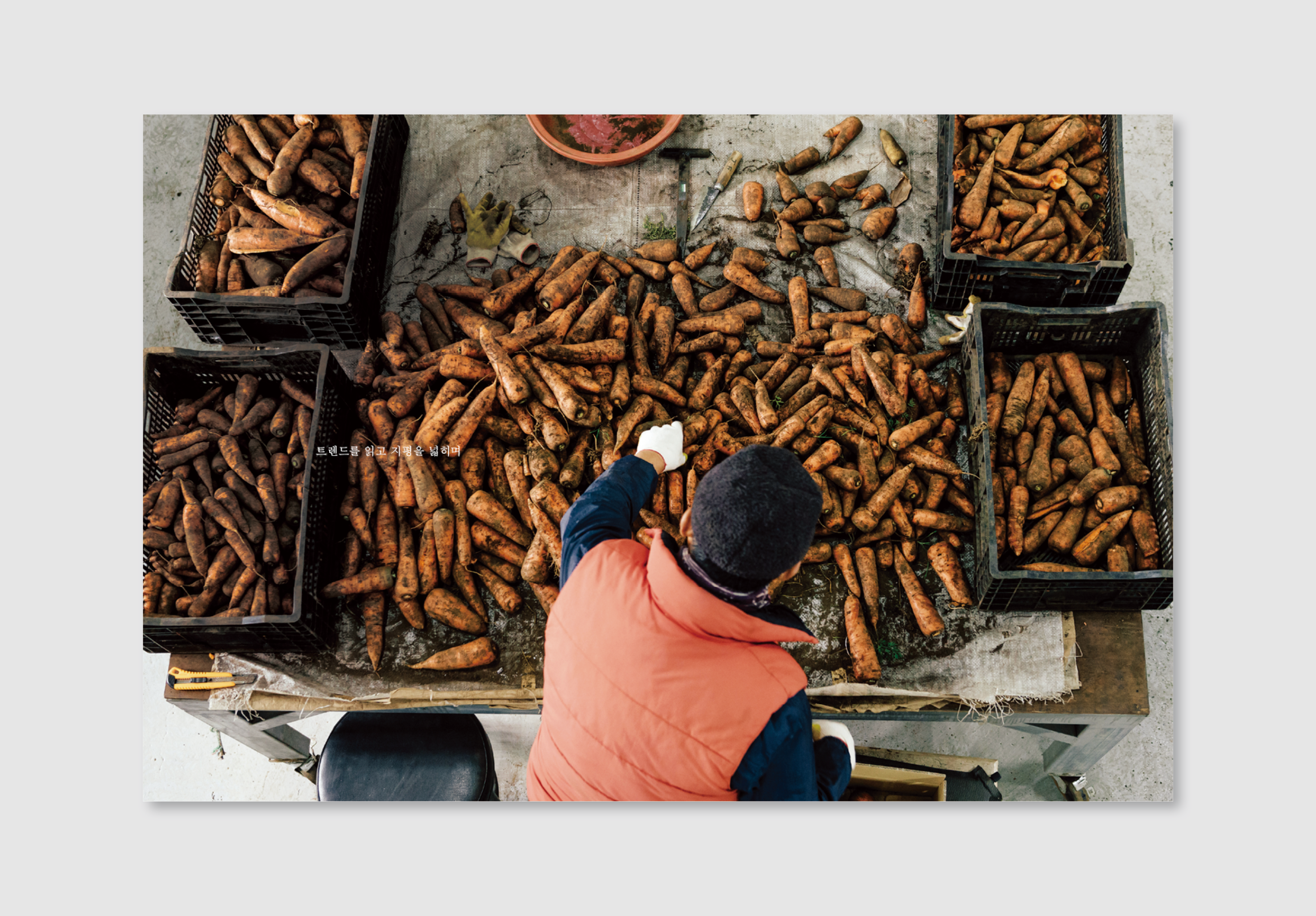

Overview
As a team member of Government Relations & Policy Affairs in Kakao Corp., I designed monthly magazine, “Partners with Kakao” which is about the story of people growing their businesses with services of Kakao Corp. I had participated in the project as a lead graphic designer from the second to the ninth issue except the fourth. As a lead designer, I had focused on the more reader’s side design and also improve the making process for work efficiency.
Link ︎ Partners with Kakao
Link ︎ Partners with Kakao
Team
Kakao Brand Lab
Sumin Jeon
Yeonju Kim
Jaekook Han
Jaehyun Kim
Hyeseung Lee
Jinsol Kim
Jihong Min
Kakao Brand Lab
Sumin Jeon
Yeonju Kim
Jaekook Han
Jaehyun Kim
Hyeseung Lee
Jinsol Kim
Jihong Min
Role
Lead graphic designer
Art Direction
Master page layout
Information architecture
Lead graphic designer
Art Direction
Master page layout
Information architecture
Tool
Indesign
Illustrator
Photoshop
InCopy
Indesign
Illustrator
Photoshop
InCopy


Role
I join the team and the project from the second issue. The magazine already has a basic concept of design and my role was to use my former experience to improve the magazine’s design and the making system with the team. Also, I art directed photography and illustration.


Process
First, I had analyzed the task based on the first issue, and the making process through the meeting with the team. Because I wanted to know precisely that what I can contribute to the readers and the team.
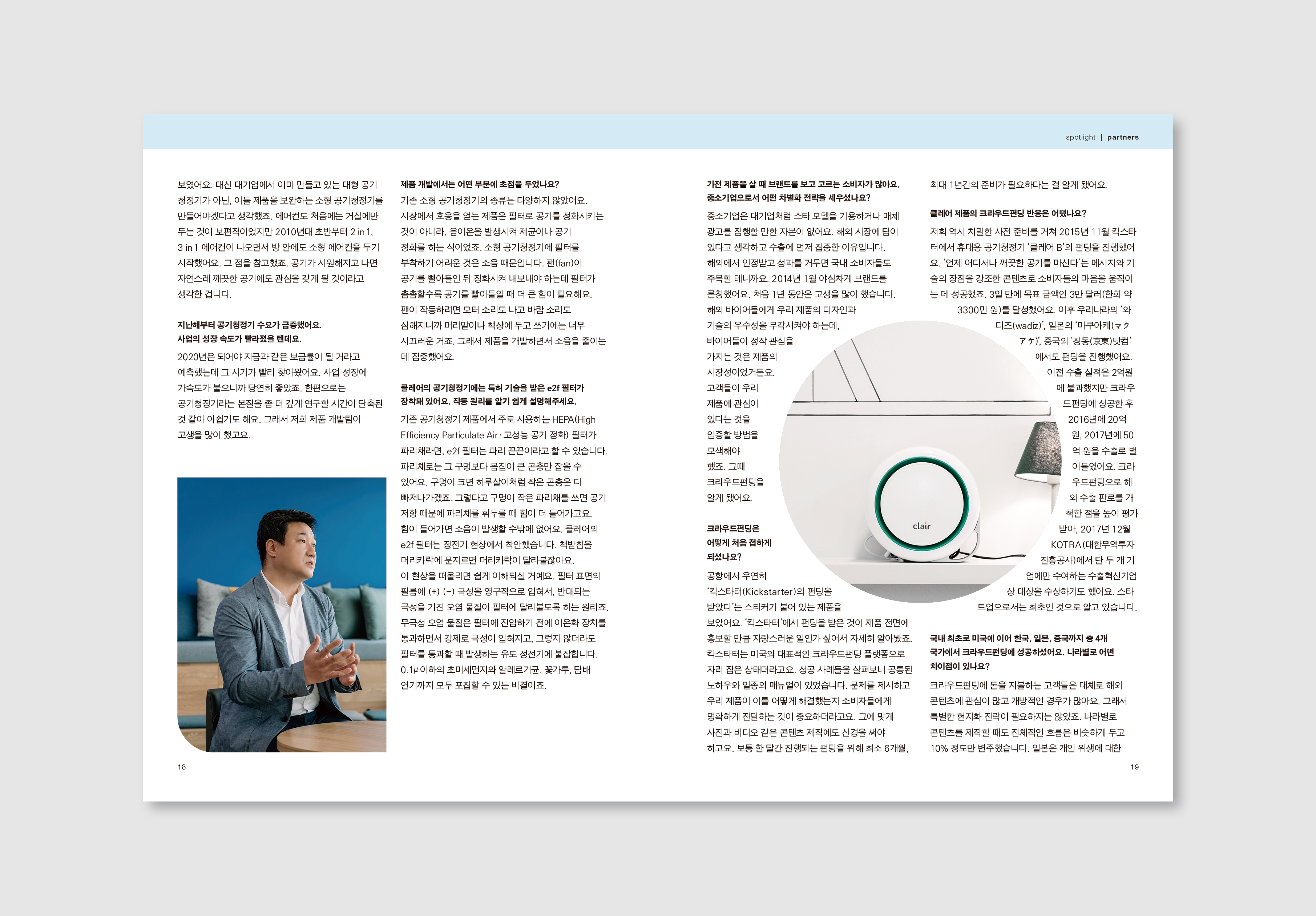
The first look of the magazine looks sweet but a little bit flat because it has various stories, but each page looks similar. An individual story needs more personality to contrast to help readers understand easily where they are and what they read. But not too much to ruin the visual coherence.
Also, I wanted to make this magazine as a platform for stories. It needs a master grid design for that, and I believe it could improve efficiency of project management. Because monthly magazine has an intense schedule, so if the magazine has a master grid design, it gives visual consistency to the magazine and also helps manage it. So, I had designed master grid based on the first issue. Because it's not a renewal, but improve it. After this thought, I had personal goals that are
1. Context based design for readers
2. Solid Information Structure
3. Visual consistency
4. Improve work efficiency
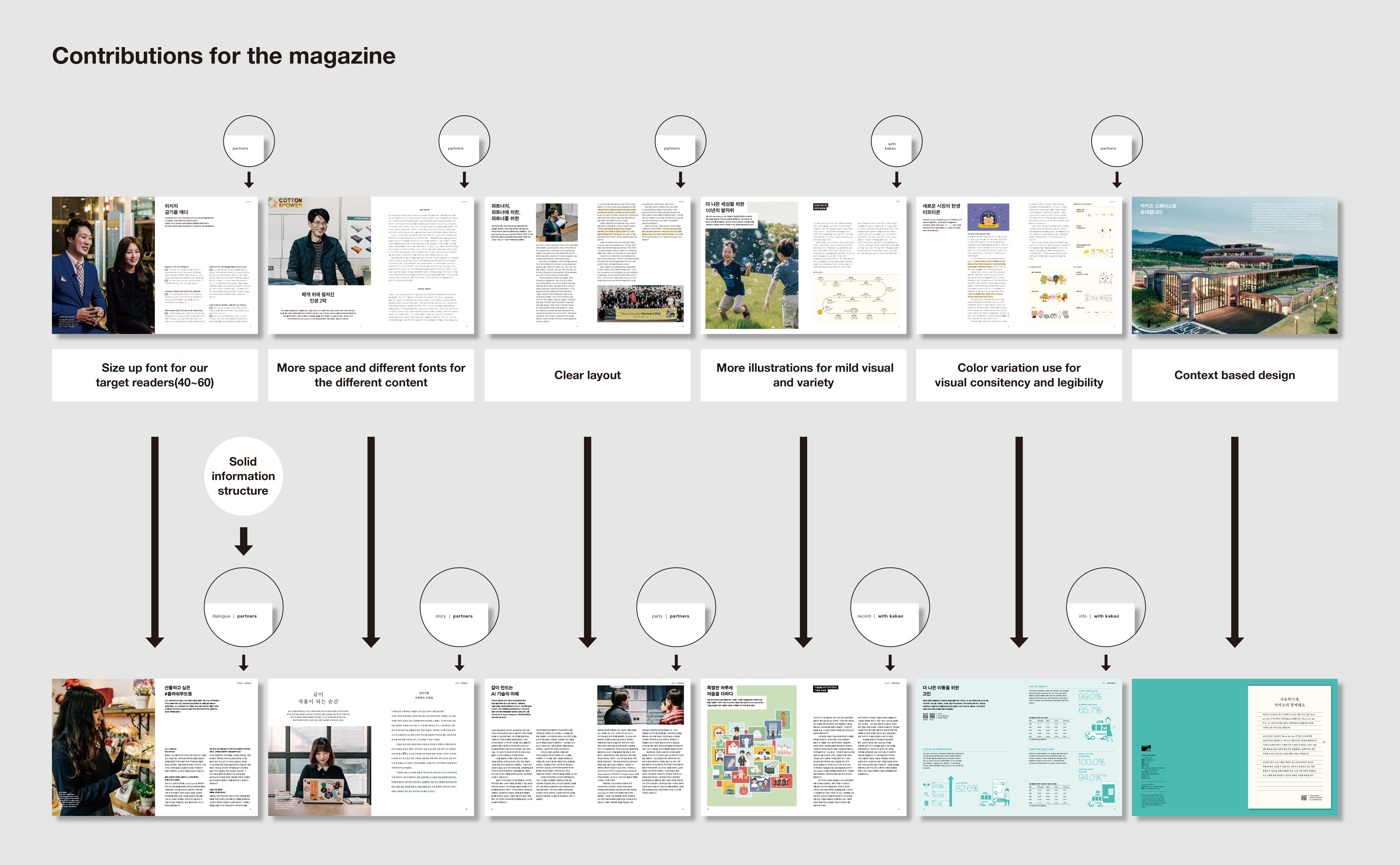
Readers can distinguish the contents when they are reading, but I wanted to make it also visually. If the story and design bond firmly, it makes more solid result and give readers clear information hierarchy. So, I concentrated on the context based design that each chapter, each contents can have their own fit.
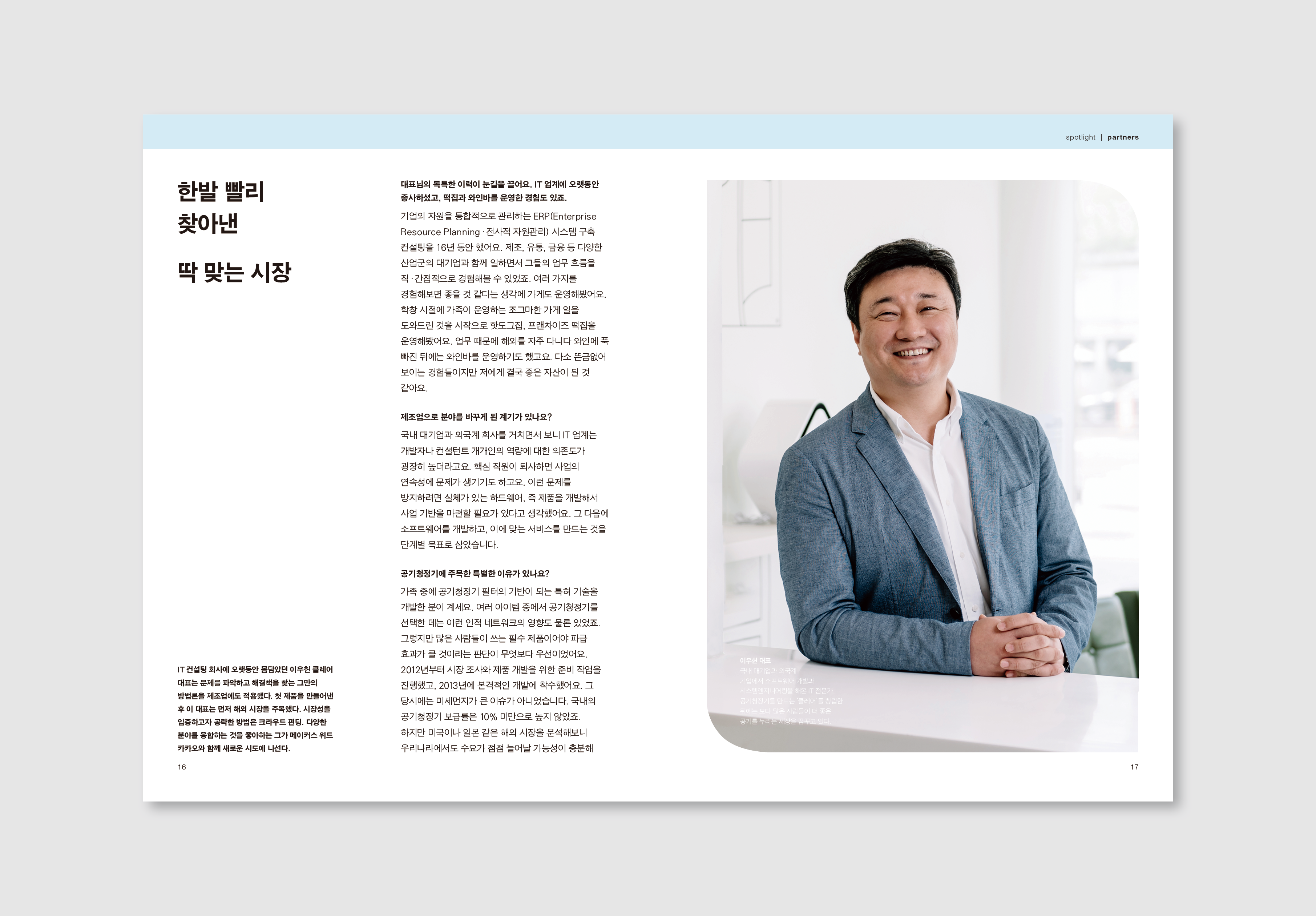
There was a running head but it covers a too broad range, it confuses where I read now. So I clarify each chapter's running head and connected to table of contents to make solid information structure.
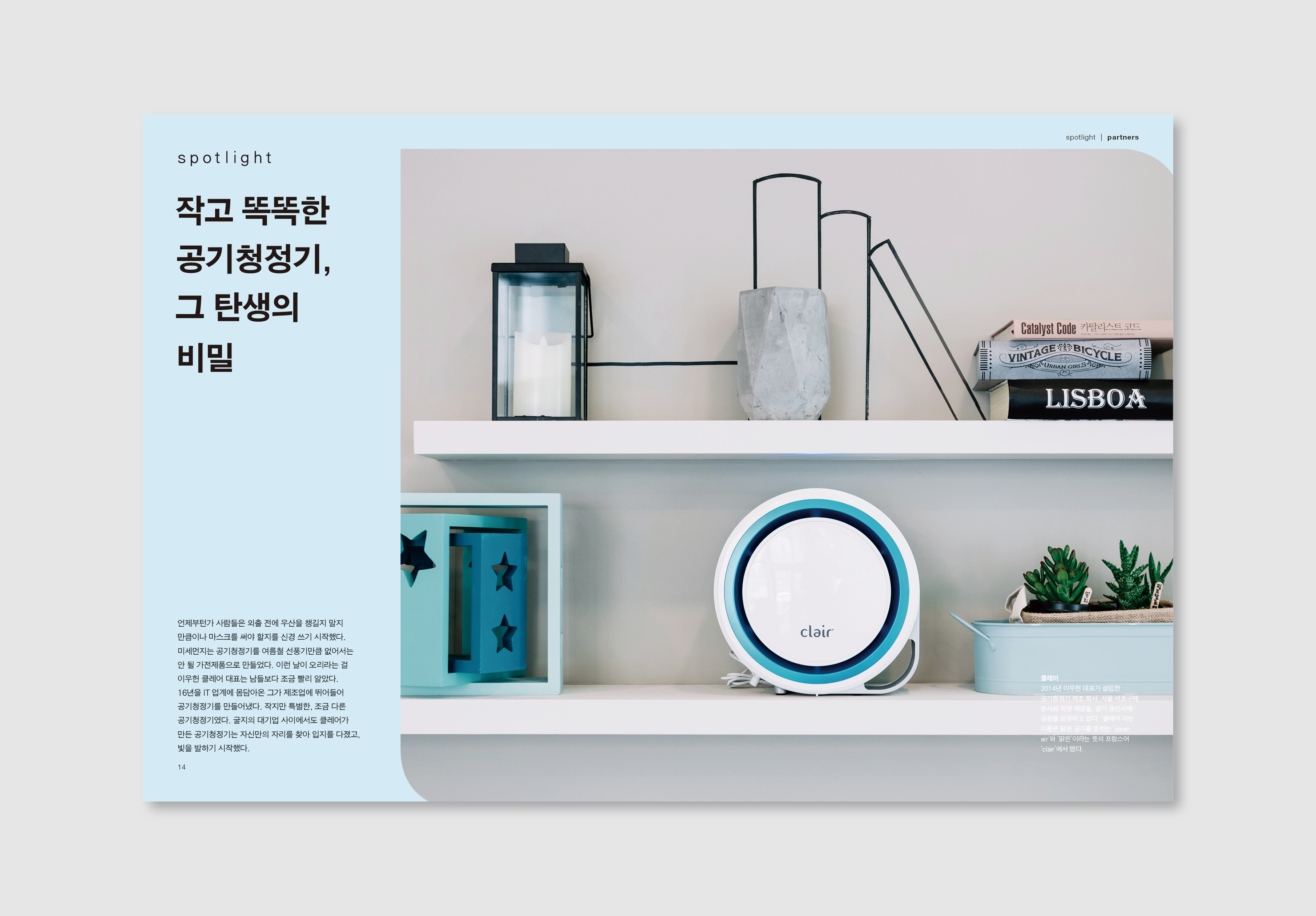
Every chapter has different story, and it needs its design. It's not only about layout but also font. So I suggest serif font on the story chapter to give a soft and delicate feeling for the readers. Because it's about their story, not information. I wanted to make it relax. Also, invitation chapter, I got an idea from the word “invitation,” I designed with letter form to give a gentle and respectful feeling to the readers.
Every chapter has different story, and it needs its design. It's not only about layout but also font. So I suggest serif font on the story chapter to give a soft and delicate feeling for the readers. Because it's about their story, not information. I wanted to make it relax. Also, invitation chapter, I got an idea from the word “invitation,” I designed with letter form to give a gentle and respectful feeling to the readers.
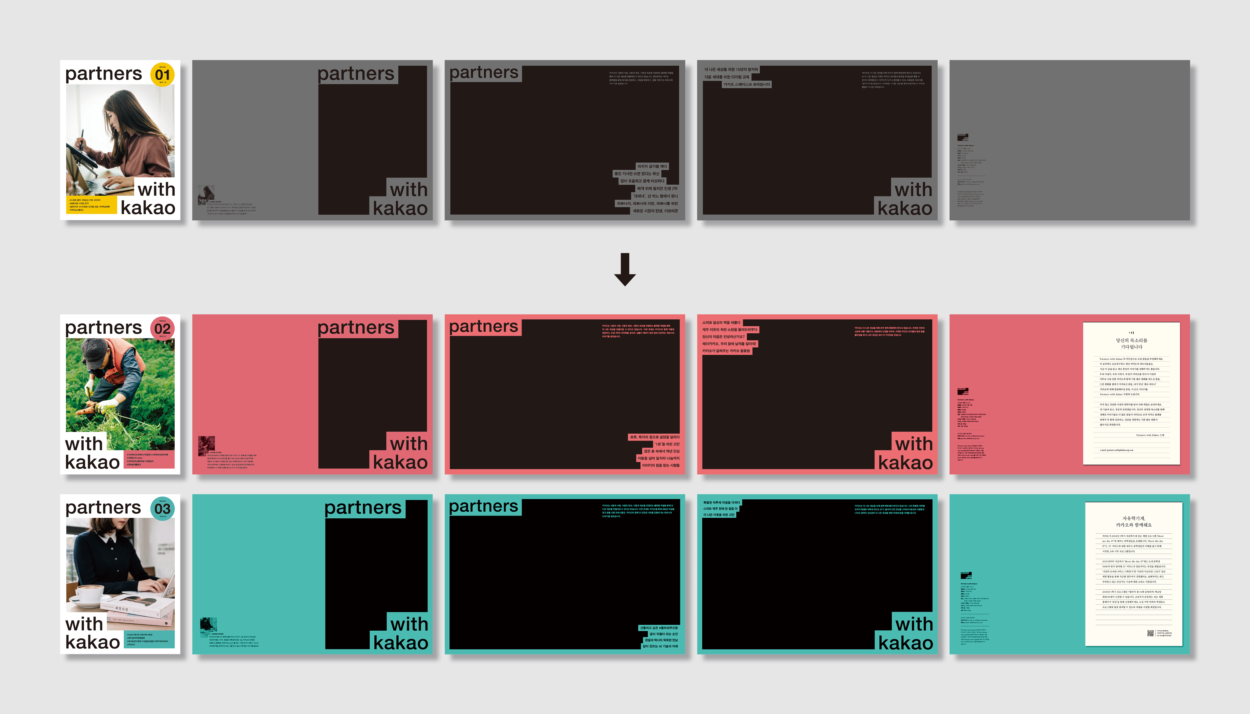
Every issue has signature colors on the cover. I put these colors to the chapter title page for the visual consistency, and it makes the magazine have a solid design. Also, I use a variation of each months color on Information chapter. I expand background color to the whole page and every part except the main title and body text. A black colored title is one of the rules of entire magazine design for consistency, and black colored body text makes a contrast with a background color, it makes readers easy to read.
“How improved work efficiency affects the project management.”
The master gird reduces the time to design, but I wanted to improve the whole making process, not only the design part. After full contents were coming from the writers, editors proofreading the text again and again and again. We, designers keep working on the layout during that moment, but usually, we had to wait for the reviewed version, because it could be affected to the design. I wanted to reduce this gap. So I’m looking for the way to solve this, I found the application Adobe InCopy. It lively connected to InDesign text boxes, so editors and designers working the same page simultaneously. Moreover, this gave us more time to polish the magazine.
These things needed effort and not comfortable in the tight schedule, but worth it. And it means not only by me but every team member also listen carefully, and we discussed all of the things together and tried hard to improve it. It took time more than a month. We evaluate it step by step. Therefore every month, we can feel we are getting better.
These things needed effort and not comfortable in the tight schedule, but worth it. And it means not only by me but every team member also listen carefully, and we discussed all of the things together and tried hard to improve it. It took time more than a month. We evaluate it step by step. Therefore every month, we can feel we are getting better.

Compared work time between the first month and the last month, it reduced 90% of overworking time during the six months. It gave designers enough time to focus on details like art direction to photos and illustrations. They were outsourcing, we have a guide, but it’s not enough. When the work efficiency was improved, so we have time, I had participated to shot for direction, and it gave us a more suitable image for our contents. And for editors, they could spend more time on the writings and editing. It was a beautiful experience. Every team member listens carefully to each other's idea and all we had shared what our goal it is and put out effort in it. Therefore it turns out a remarkable result.
Link ︎ Partners with Kakao
Link ︎ Partners with Kakao
Copyright 2025, Jaekook Han