Partners with Kakao
Magazine, 180 x 240mm, 2018


Overview
As a team member of Government Relations & Policy Affairs in Kakao Corp., I designed monthly magazine, “Partners with Kakao” which is about the story of people growing their businesses with services of Kakao Corp. I had participated in the project as a lead graphic designer from the second to the ninth issue except the fourth. As a lead designer, I had focused on the more reader’s side design and also improve the making process for work efficiency.
Link ︎ Partners with Kakao
Link ︎ Partners with Kakao
Team
Kakao Brand Lab
Sumin Jeon
Yeonju Kim
Jaekook Han
Jaehyun Kim
Hyeseung Lee
Jinsol Kim
Jihong Min
Kakao Brand Lab
Sumin Jeon
Yeonju Kim
Jaekook Han
Jaehyun Kim
Hyeseung Lee
Jinsol Kim
Jihong Min
Role
Lead graphic designer
Art Direction
Master page layout
Information architecture
Lead graphic designer
Art Direction
Master page layout
Information architecture
Tool
Indesign
Illustrator
Photoshop
InCopy
Indesign
Illustrator
Photoshop
InCopy


Role
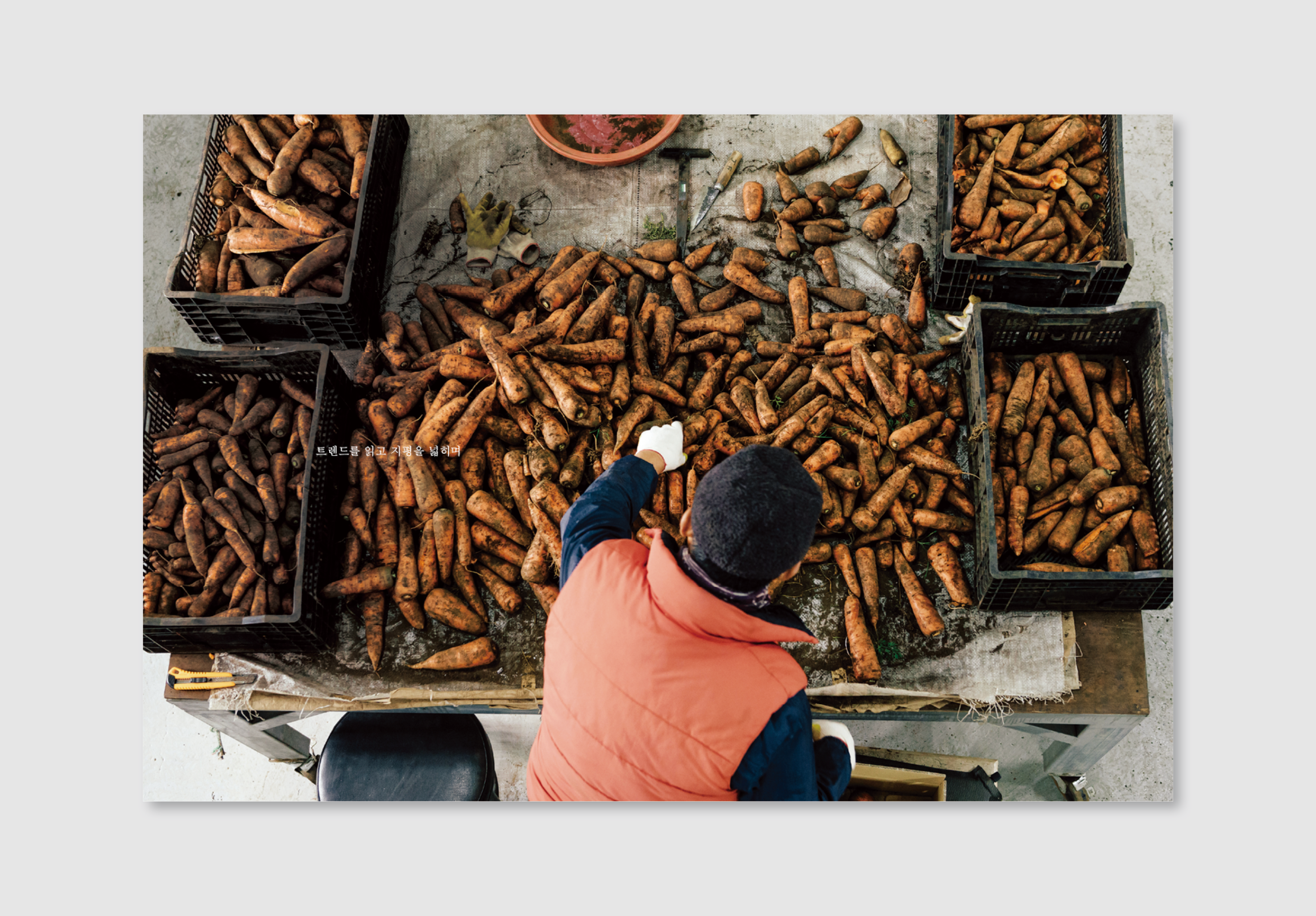
I join the team and the project from the second issue. The magazine already has a basic concept of design and my role was to use my former experience to improve the magazine’s design and the making system with the team. Also, I art directed photography and illustration.


Process
First, I had analyzed the task based on the first issue, and the making process through the meeting with the team. Because I wanted to know precisely that what I can contribute to the readers and the team.
The first look of the magazine looks sweet but a little bit flat because it has various stories, but each page looks similar. An individual story needs more personality to contrast to help readers understand easily where they are and what they read. But not too much to ruin the visual coherence.
Also, I wanted to make this magazine as a platform for stories. It needs a master grid design for that, and I believe it could improve efficiency of project management. Because monthly magazine has an intense schedule, so if the magazine has a master grid design, it gives visual consistency to the magazine and also helps manage it. So, I had designed master grid based on the first issue. Because it's not a renewal, but improve it. After this thought, I had personal goals that are
1. Context based design for readers
2. Solid Information Structure
3. Visual consistency
4. Improve work efficiency
Readers can distinguish the contents when they are reading, but I wanted to make it also visually. If the story and design bond firmly, it makes more solid result and give readers clear information hierarchy. So, I concentrated on the context based design that each chapter, each contents can have their own fit.
There was a running head but it covers a too broad range, it confuses where I read now. So I clarify each chapter's running head and connected to table of contents to make solid information structure.
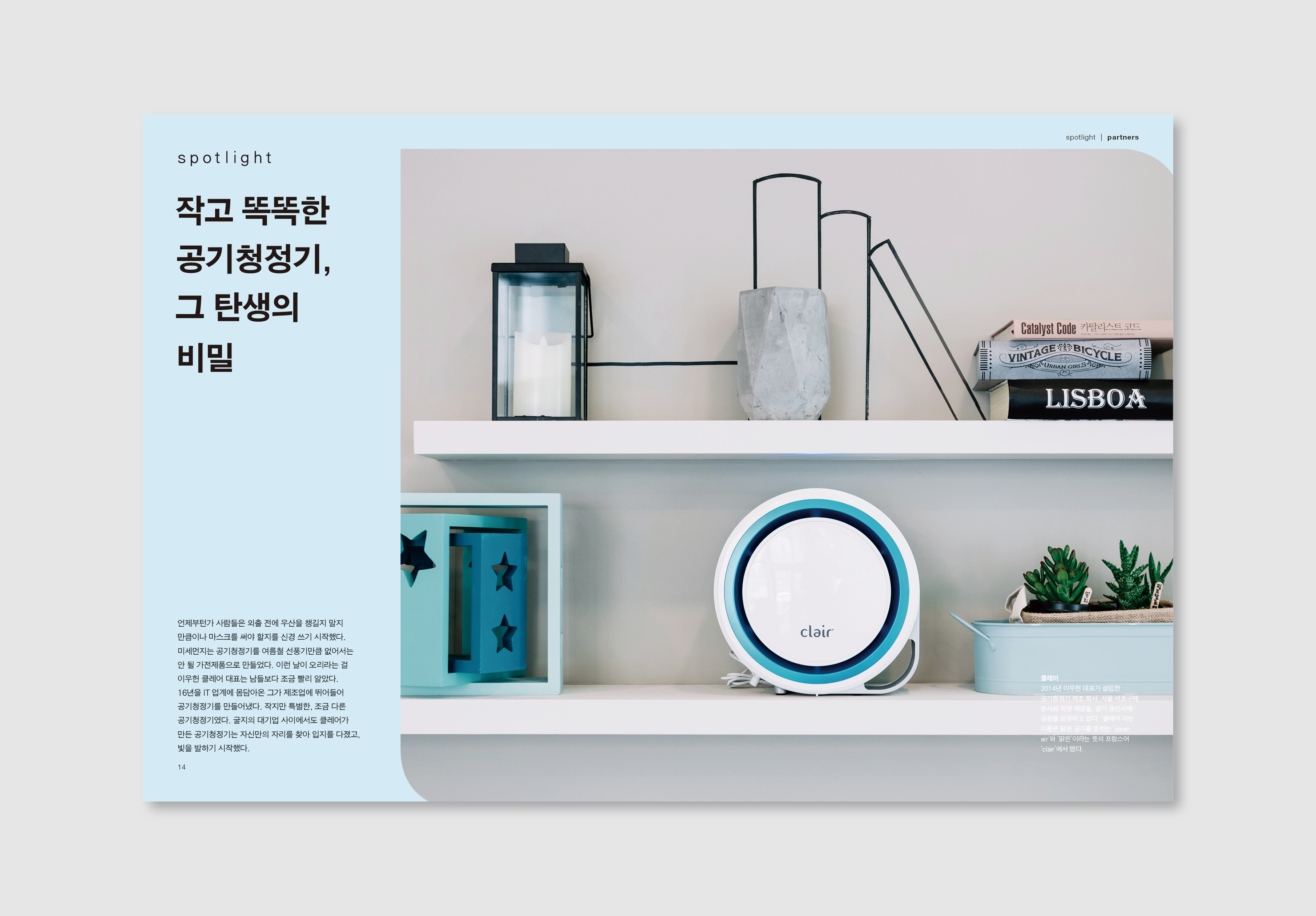
Every chapter has different story, and it needs its design. It's not only about layout but also font. So I suggest serif font on the story chapter to give a soft and delicate feeling for the readers. Because it's about their story, not information. I wanted to make it relax. Also, invitation chapter, I got an idea from the word “invitation,” I designed with letter form to give a gentle and respectful feeling to the readers.
Every chapter has different story, and it needs its design. It's not only about layout but also font. So I suggest serif font on the story chapter to give a soft and delicate feeling for the readers. Because it's about their story, not information. I wanted to make it relax. Also, invitation chapter, I got an idea from the word “invitation,” I designed with letter form to give a gentle and respectful feeling to the readers.
Every issue has signature colors on the cover. I put these colors to the chapter title page for the visual consistency, and it makes the magazine have a solid design. Also, I use a variation of each months color on Information chapter. I expand background color to the whole page and every part except the main title and body text. A black colored title is one of the rules of entire magazine design for consistency, and black colored body text makes a contrast with a background color, it makes readers easy to read.
“How improved work efficiency affects the project management.”
The master gird reduces the time to design, but I wanted to improve the whole making process, not only the design part. After full contents were coming from the writers, editors proofreading the text again and again and again. We, designers keep working on the layout during that moment, but usually, we had to wait for the reviewed version, because it could be affected to the design. I wanted to reduce this gap. So I’m looking for the way to solve this, I found the application Adobe InCopy. It lively connected to InDesign text boxes, so editors and designers working the same page simultaneously. Moreover, this gave us more time to polish the magazine.
These things needed effort and not comfortable in the tight schedule, but worth it. And it means not only by me but every team member also listen carefully, and we discussed all of the things together and tried hard to improve it. It took time more than a month. We evaluate it step by step. Therefore every month, we can feel we are getting better.
These things needed effort and not comfortable in the tight schedule, but worth it. And it means not only by me but every team member also listen carefully, and we discussed all of the things together and tried hard to improve it. It took time more than a month. We evaluate it step by step. Therefore every month, we can feel we are getting better.

Compared work time between the first month and the last month, it reduced 90% of overworking time during the six months. It gave designers enough time to focus on details like art direction to photos and illustrations. They were outsourcing, we have a guide, but it’s not enough. When the work efficiency was improved, so we have time, I had participated to shot for direction, and it gave us a more suitable image for our contents. And for editors, they could spend more time on the writings and editing. It was a beautiful experience. Every team member listens carefully to each other's idea and all we had shared what our goal it is and put out effort in it. Therefore it turns out a remarkable result.
Link ︎ Partners with Kakao
Link ︎ Partners with Kakao
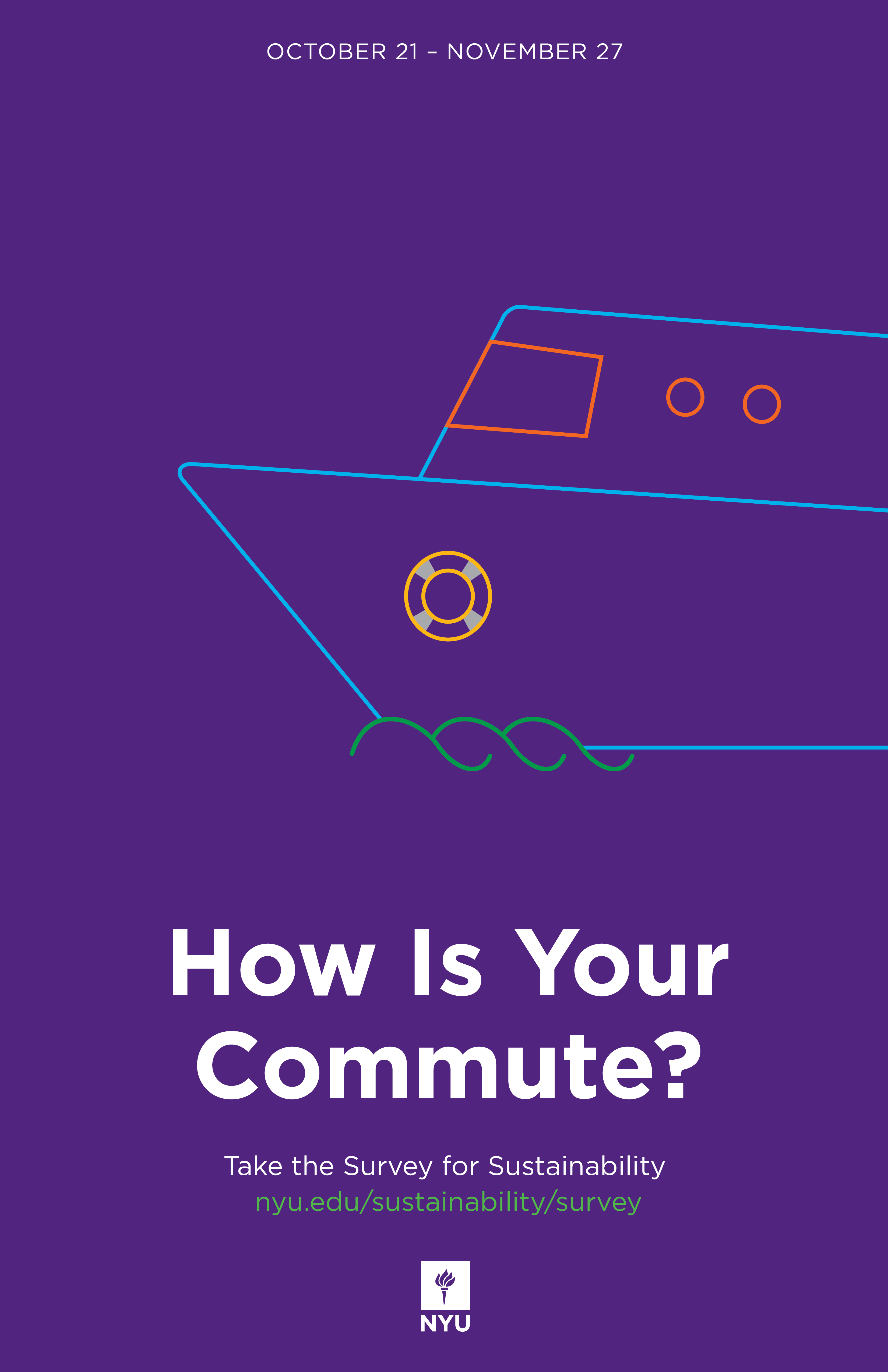
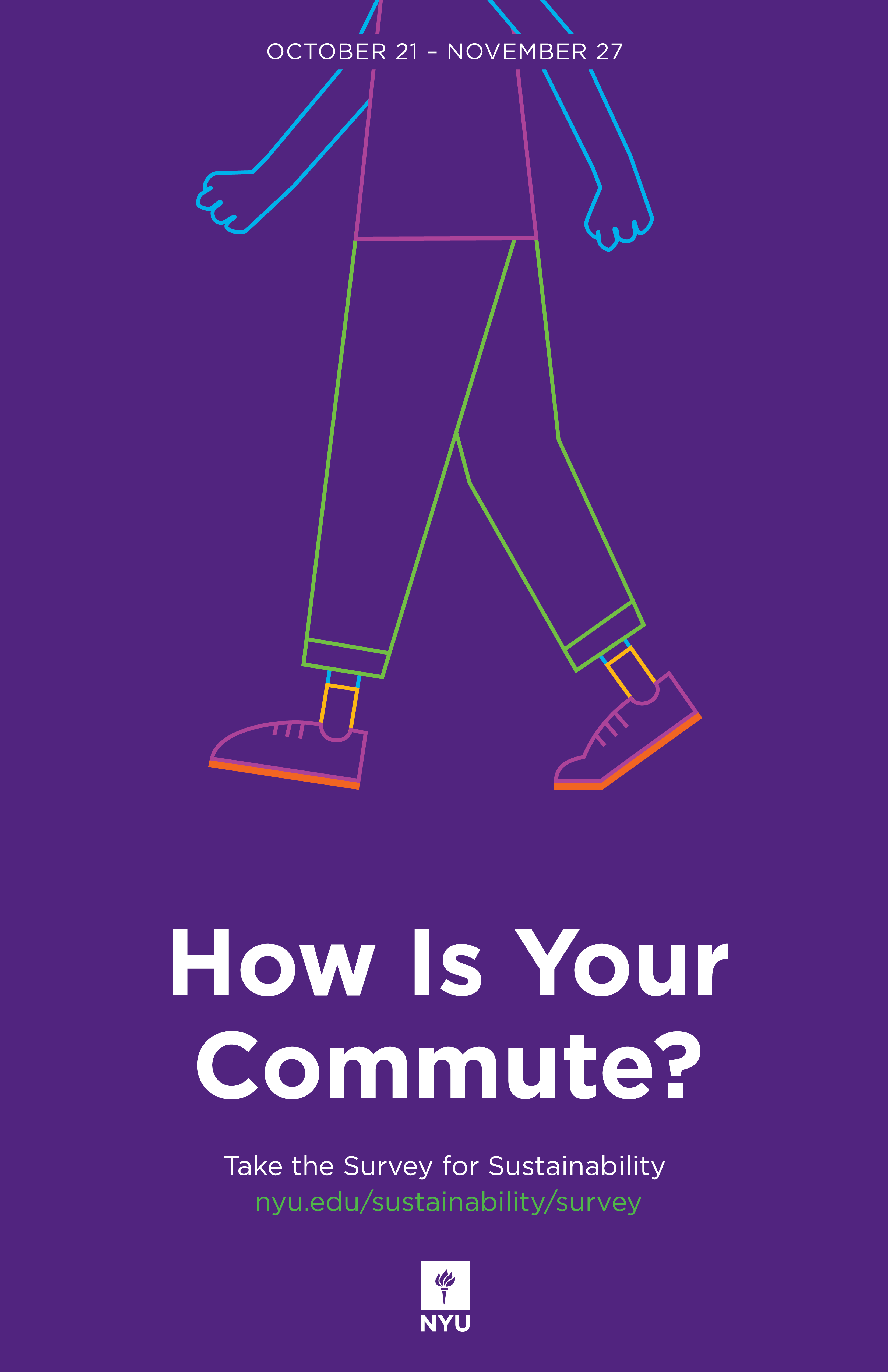
How Is Your Commute?
Poster + Illustration, 2019

About
I designed the print and digital version of the poster for a "Transportation survey for sustainability" campaign at New York University with illustrations of transportation that use in New York City. And the campaign was very successful that almost doubled the number of people participated rather than expectation.
Client
NYU Office of Sustainability
NYU Office of Sustainability
Team
Suzanne Doig
Logan Johnson
Jaekook Han
Suzanne Doig
Logan Johnson
Jaekook Han
Role
Graphic Design
Illustration
Graphic Design
Illustration
Tool
Indesign
Illustrator
Indesign
Illustrator


Ways of Seeing Now
Poster, 2019
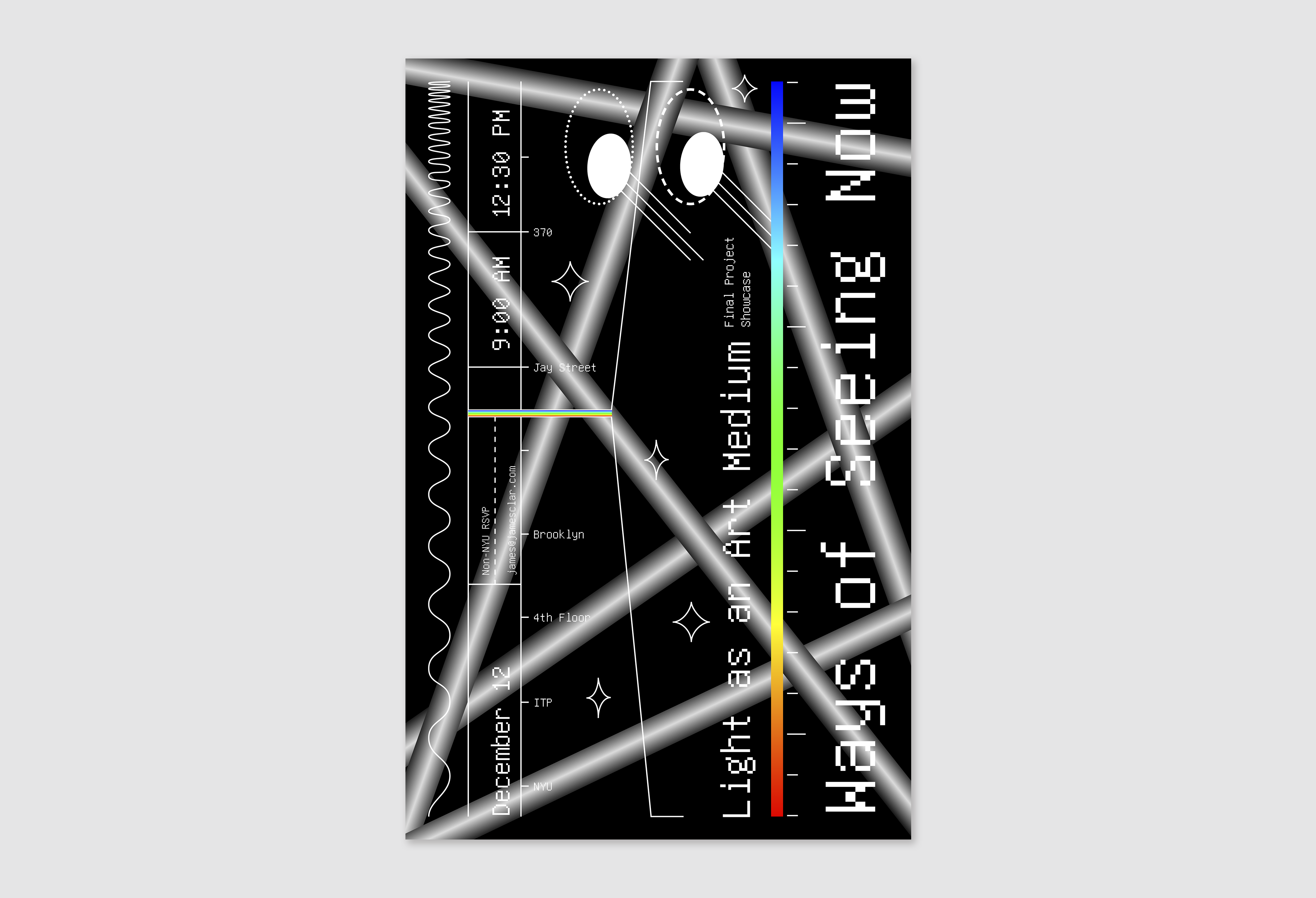
Client: Class of Light as an Art Medium, ITP, NYU
Tool: Adobe Illustrator, Indesign
About
A poster for the final project showcase of Light as an Art Medium class in ITP, New York University.
Tool: Adobe Illustrator, Indesign
About
A poster for the final project showcase of Light as an Art Medium class in ITP, New York University.
FFRD EP: What You Need
Album, 2020
Client: 45 Records
Client: 45 Records

About
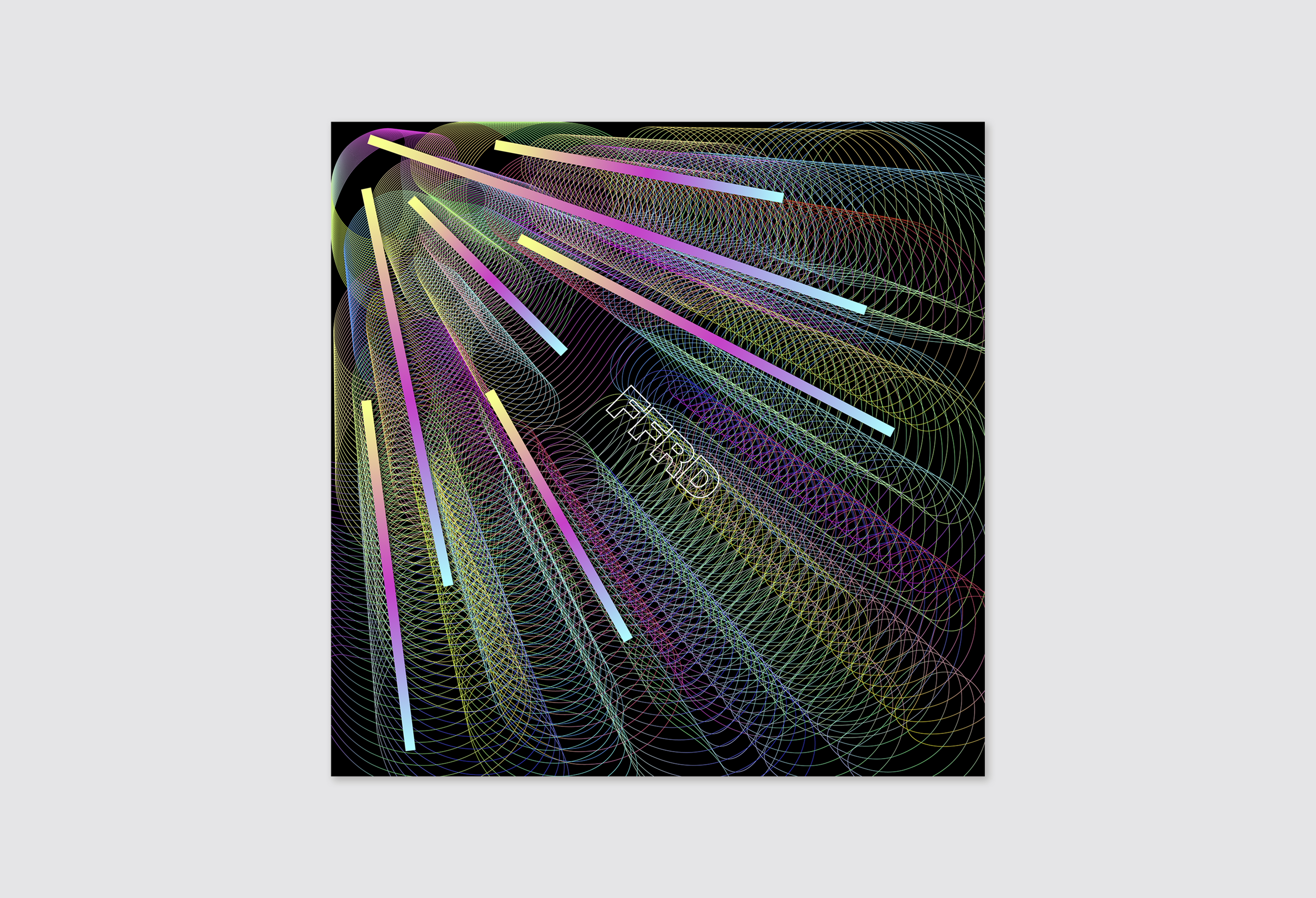
Cover design for South Korean electronic duo FFRD EP, “What You Need.”
FFRD: A History of Violence
Album, 2022
Client: 45 Records
Client: 45 Records
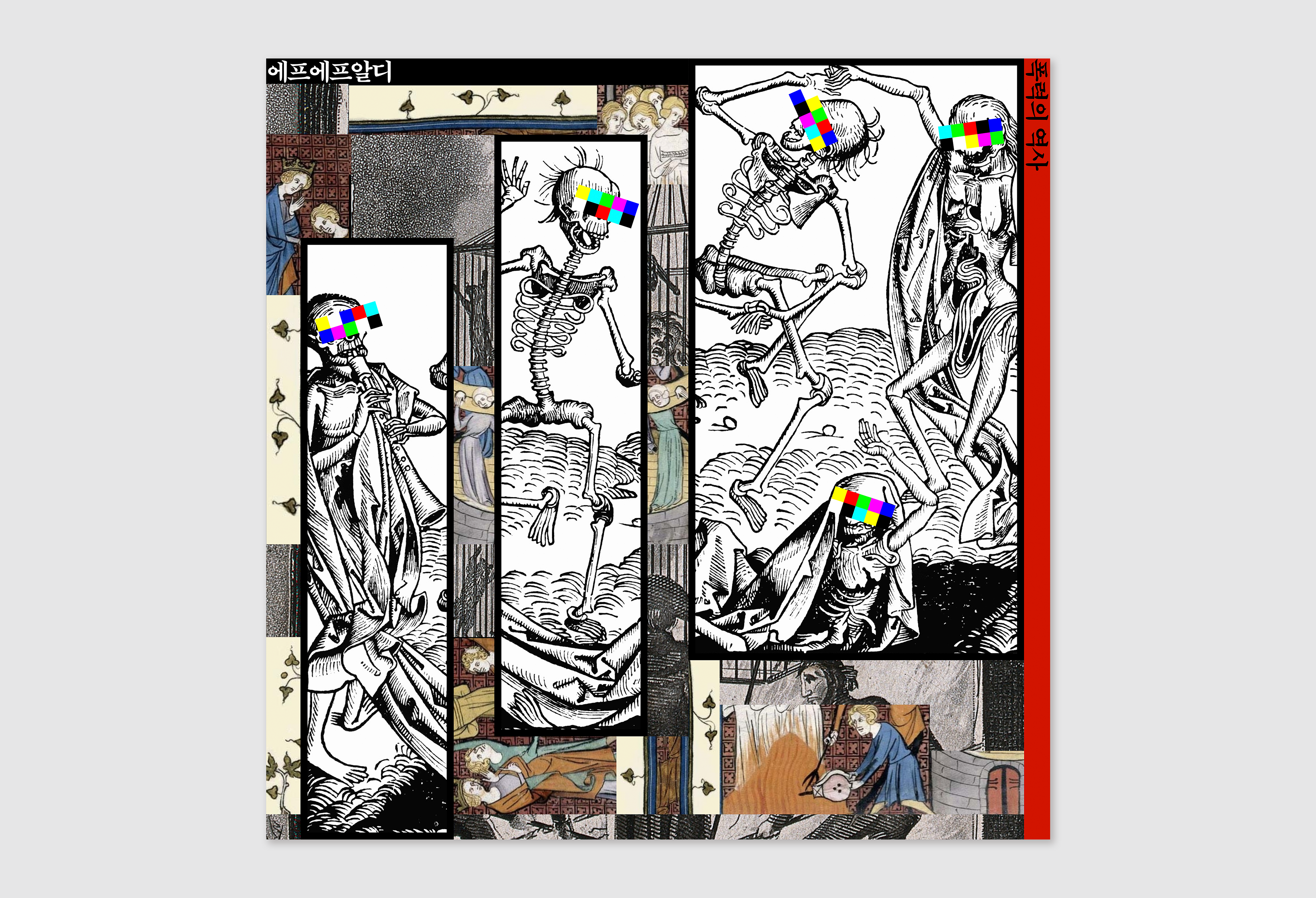
About
Cover design for South Korean electronic duo, “폭력의 역사(A History of Violence).”
Dongchan: Moon Like the Sun
Album, 2021
Client: Dongchan
Client: Dongchan

About
Cover design for South Korean artist Dongchan, “Moon Like the Sun.”
Link ︎ Dongchan, “Moon Like the Sun”
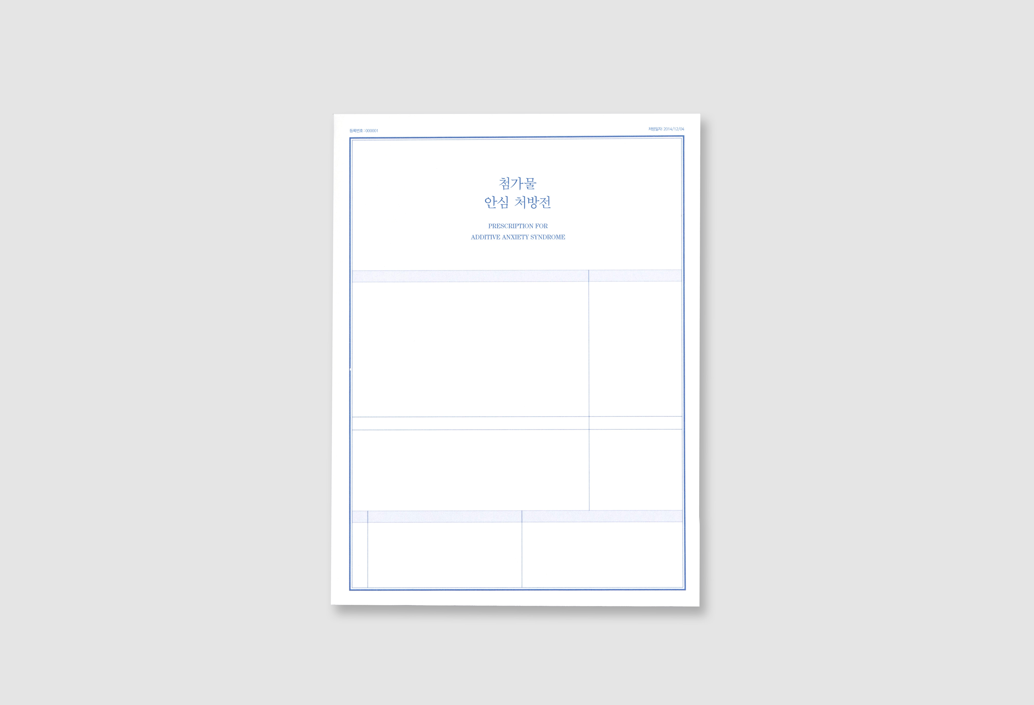
Prescription for Additive Anxiety Syndrome
Book, 165 x 220mm, 108p, 2014
Solo Project
Solo Project

Team
Solo project
Solo project
Tool
Indesign
Illustrator
Photoshop
Indesign
Illustrator
Photoshop
Overview
Graduation project from personal experience. This book gives information about food additive to solve people’s anxiety about it.
Design process
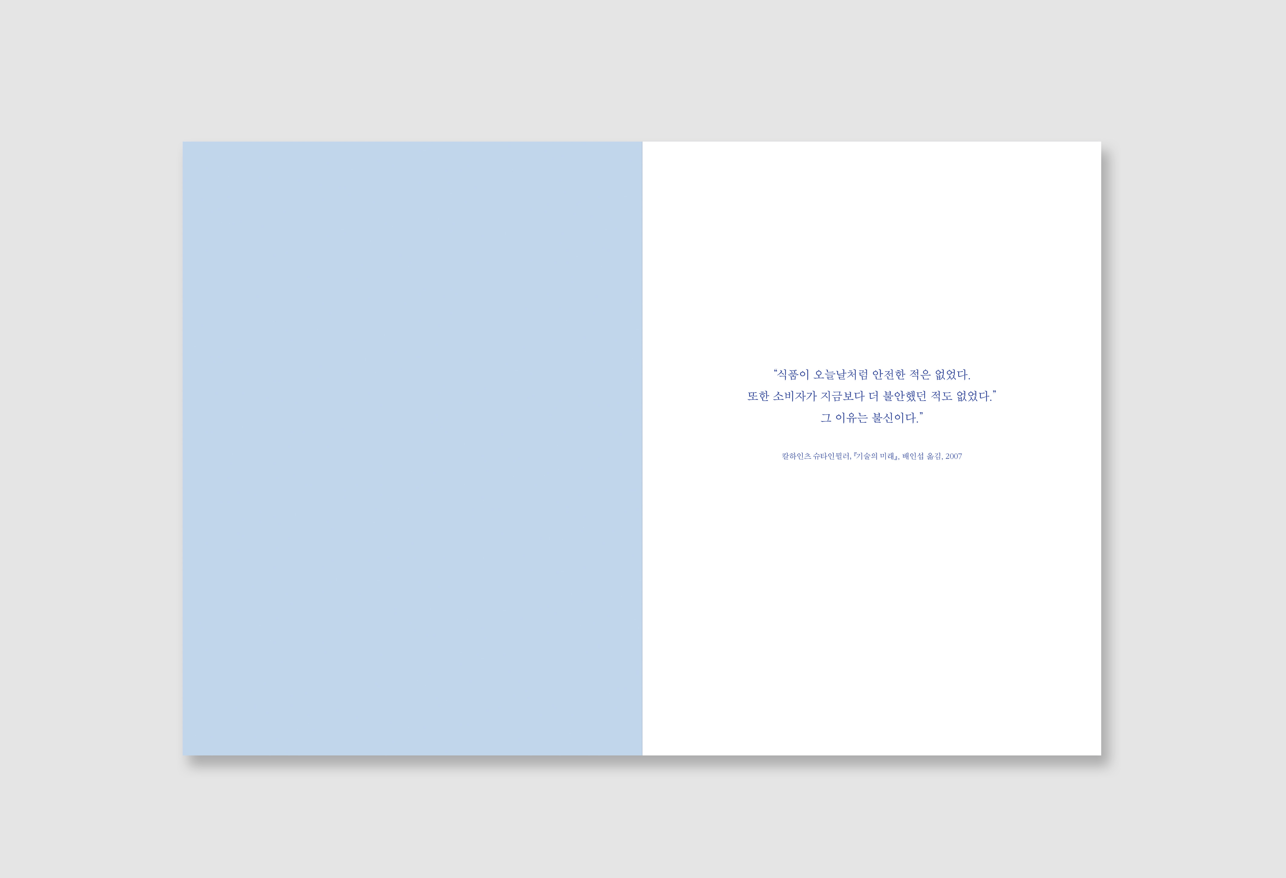
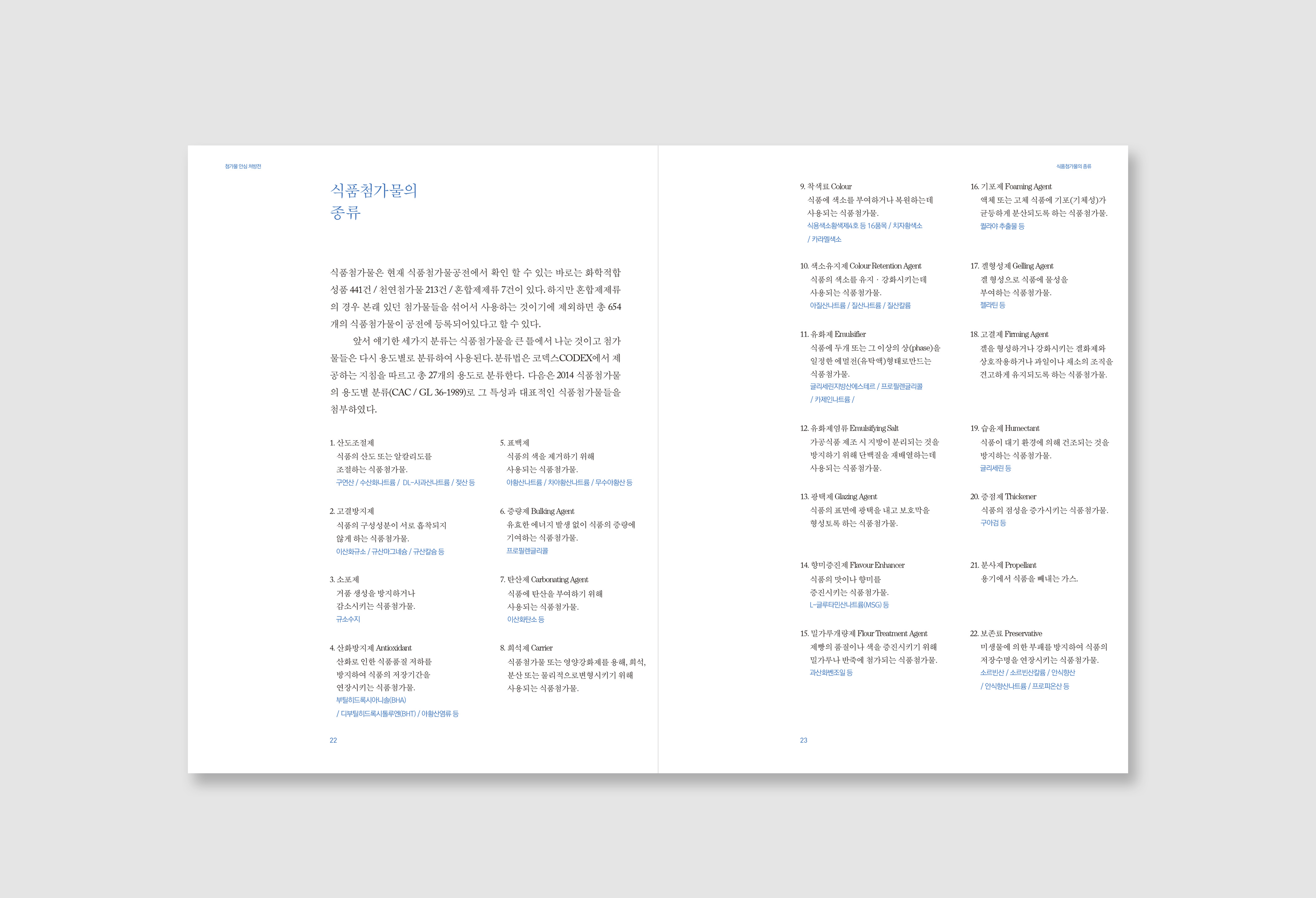
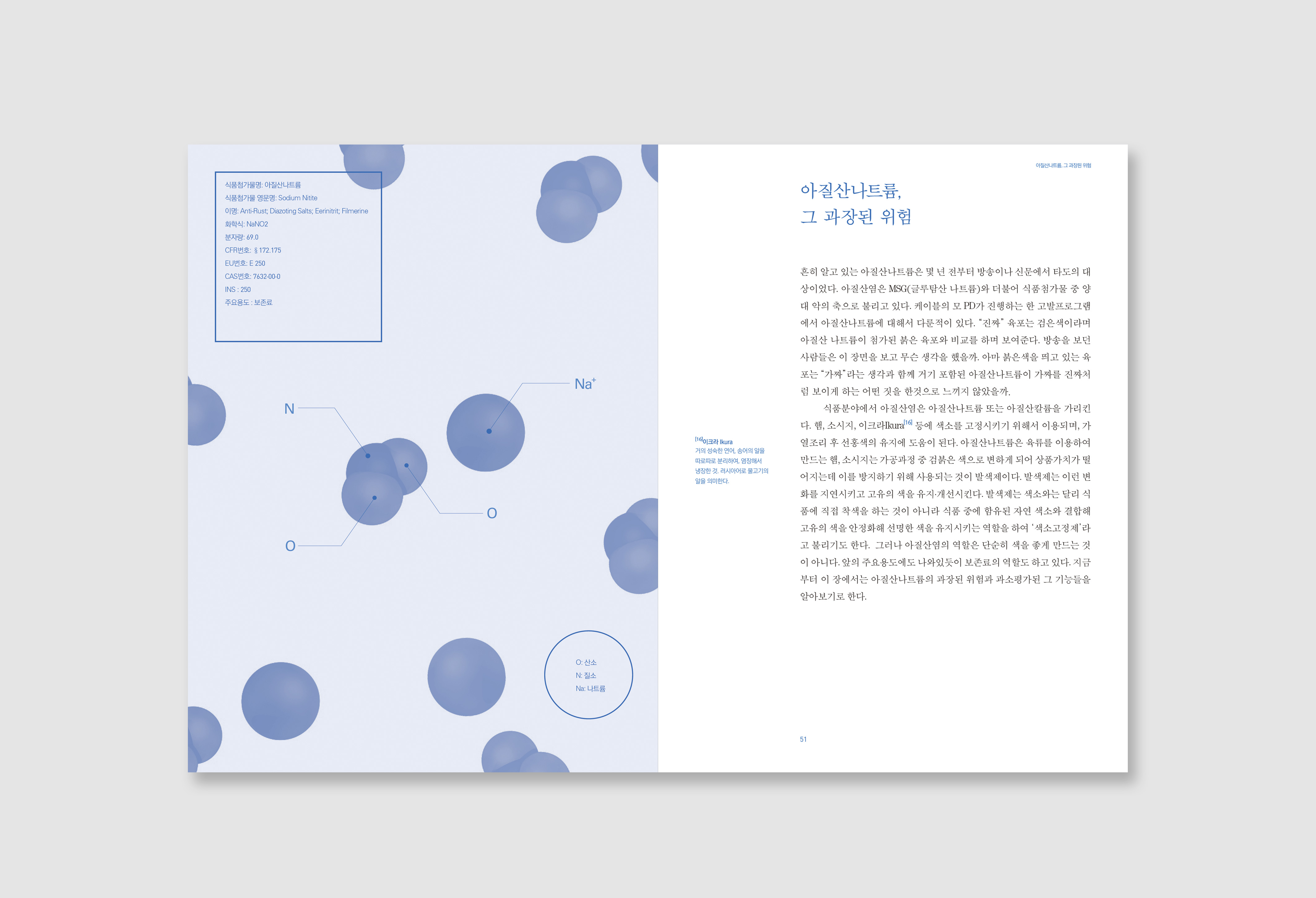
In 2013, I was really sick. After that I had had to be concerned about what I eat for health naturally, and this gave me a habit that when before I bought groceries I always check ingredient labeling. There were the words that something I do not know, called food additive. I wanted to know what exactly they are, so I searched for it on the web. And then I found the fears and distrust about additive from many people. I wonder what the food additives are genuinely hazardous? And if there are so harmful to us, why they distributed openly?. So I searched in-depth about that and found there was so many incendiary information from the news, and commercials that used anxiety of consumers, furthermore these sources were thoughtlessly shared on the Internet. Consequentially, these misinformation makes people distrust the food additive. I wanted to remove their anxiety.
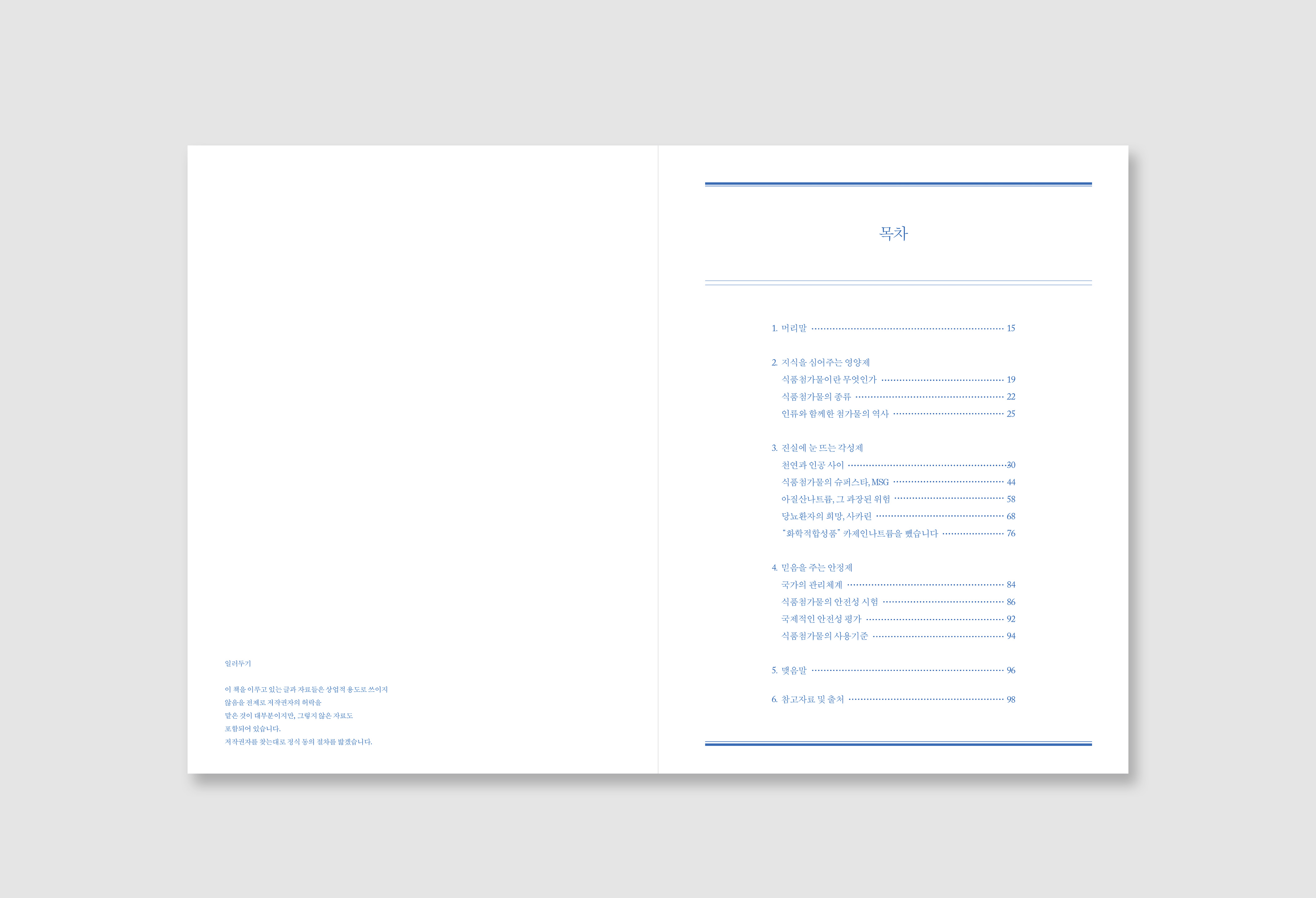
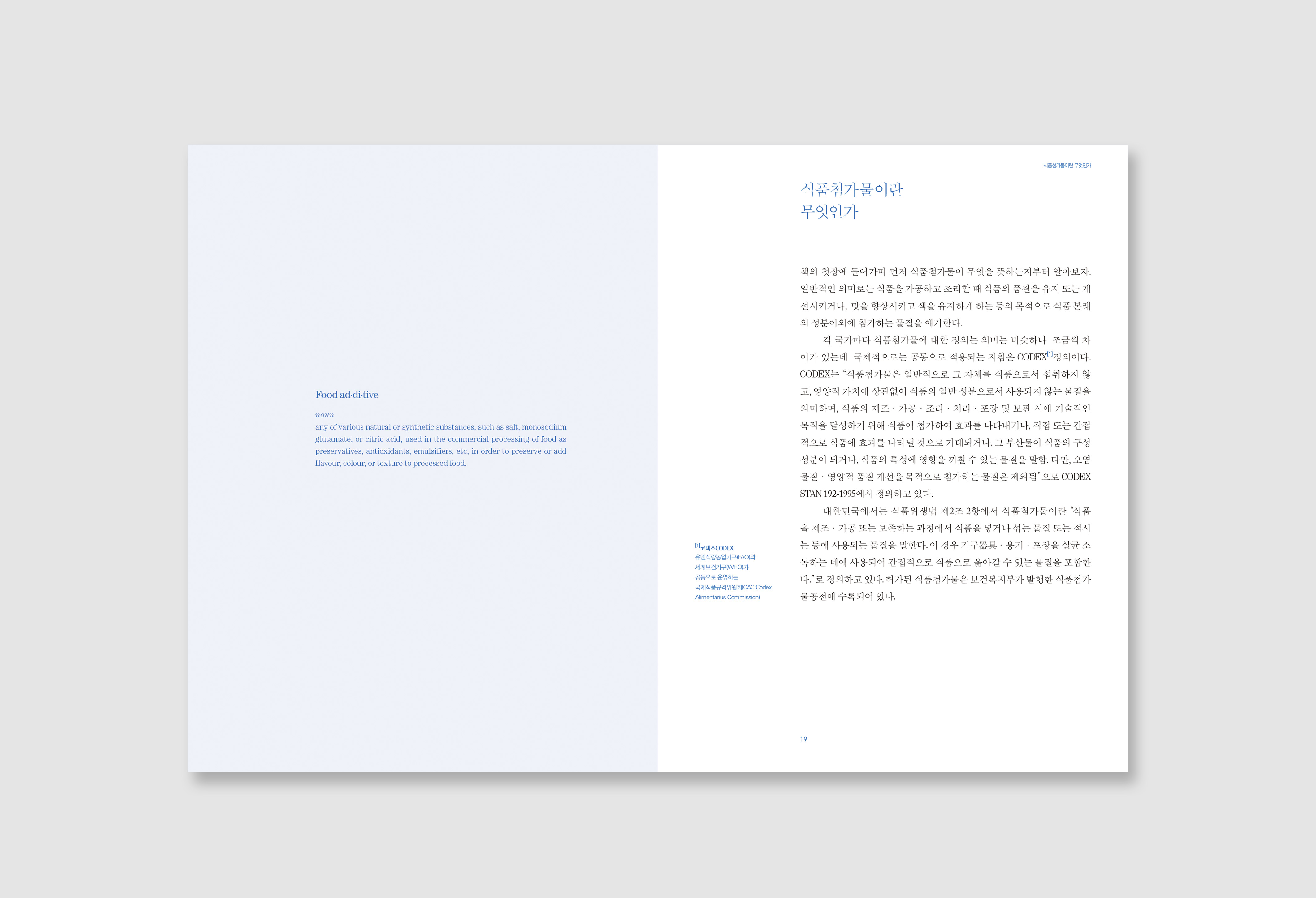
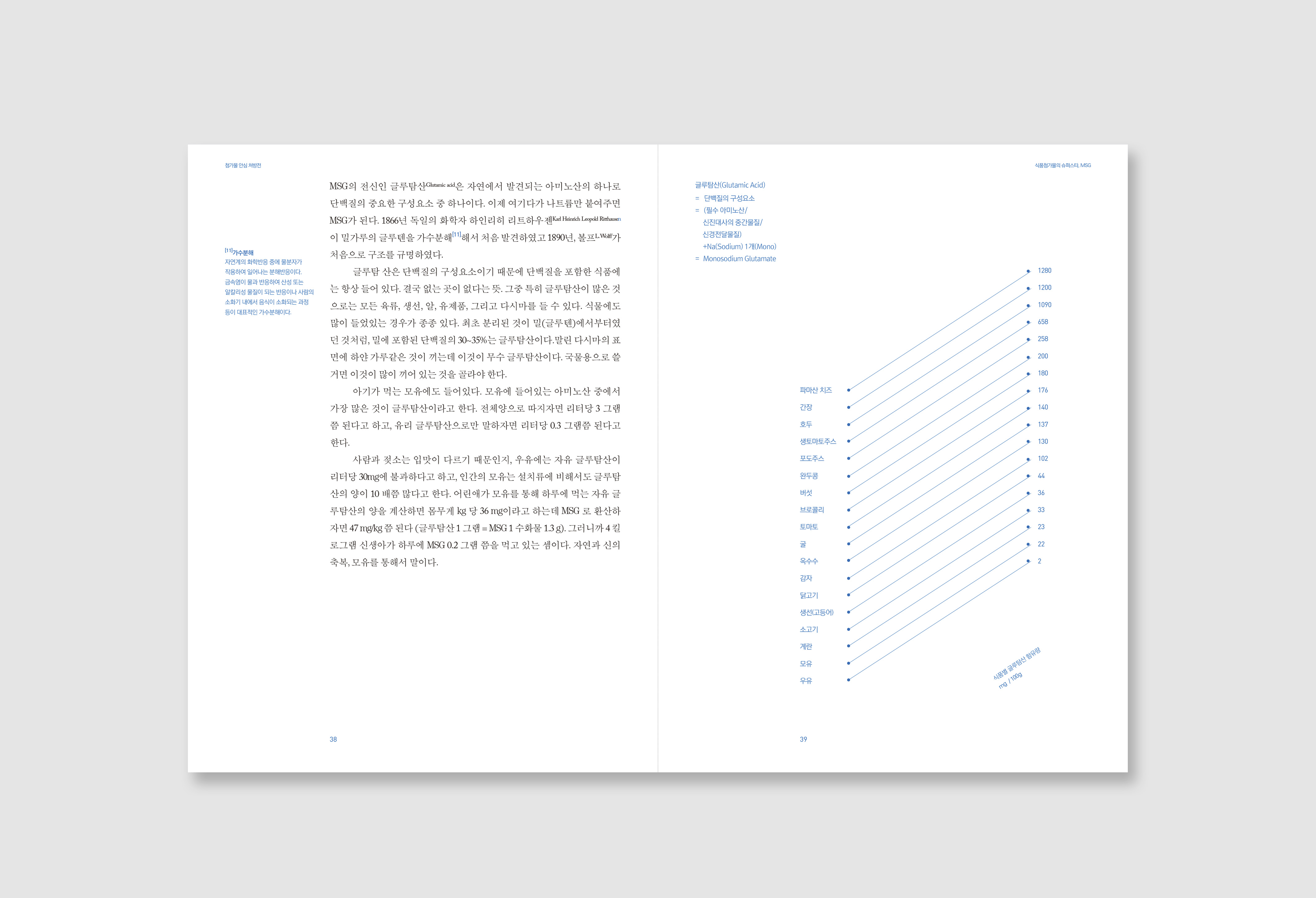
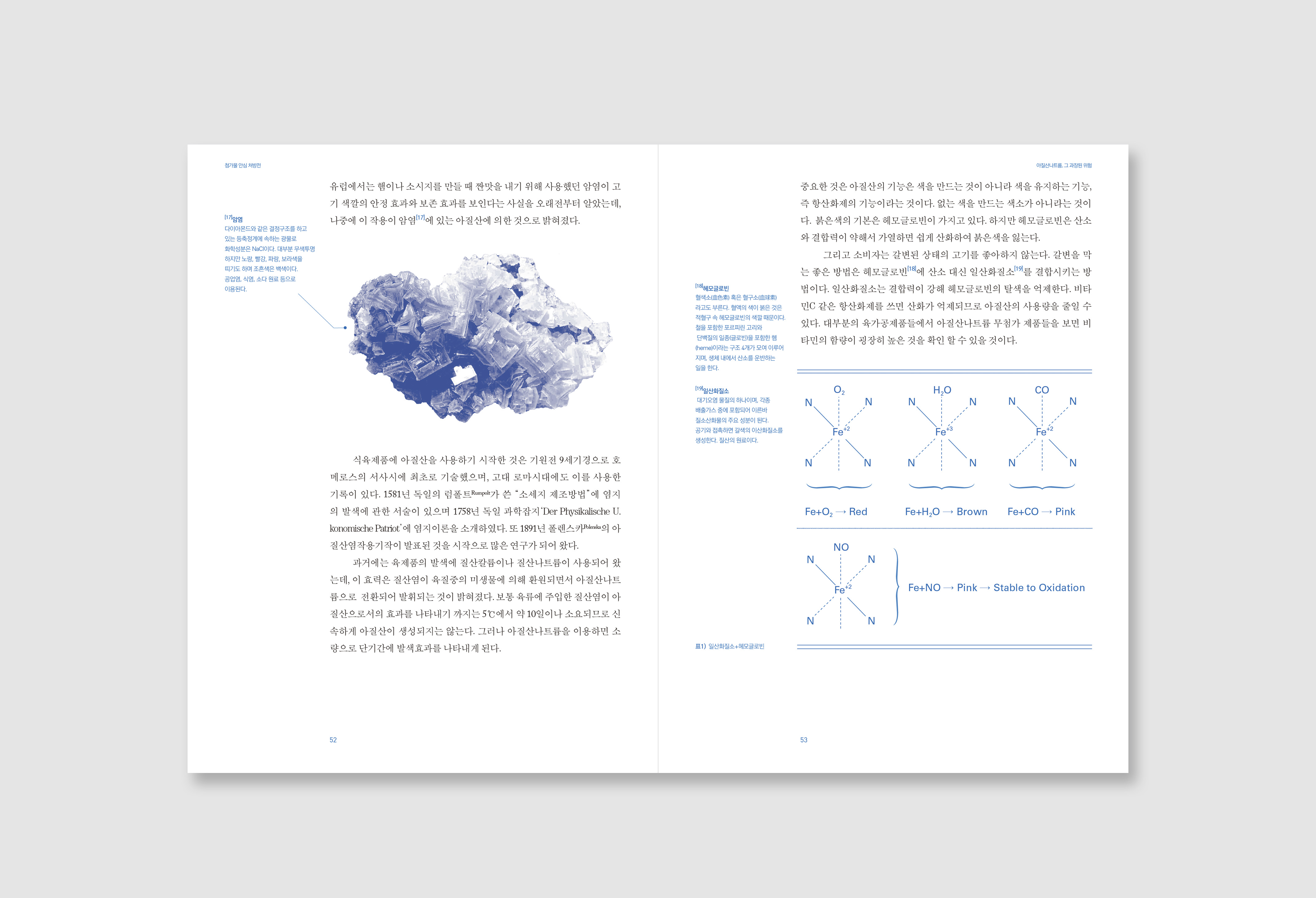
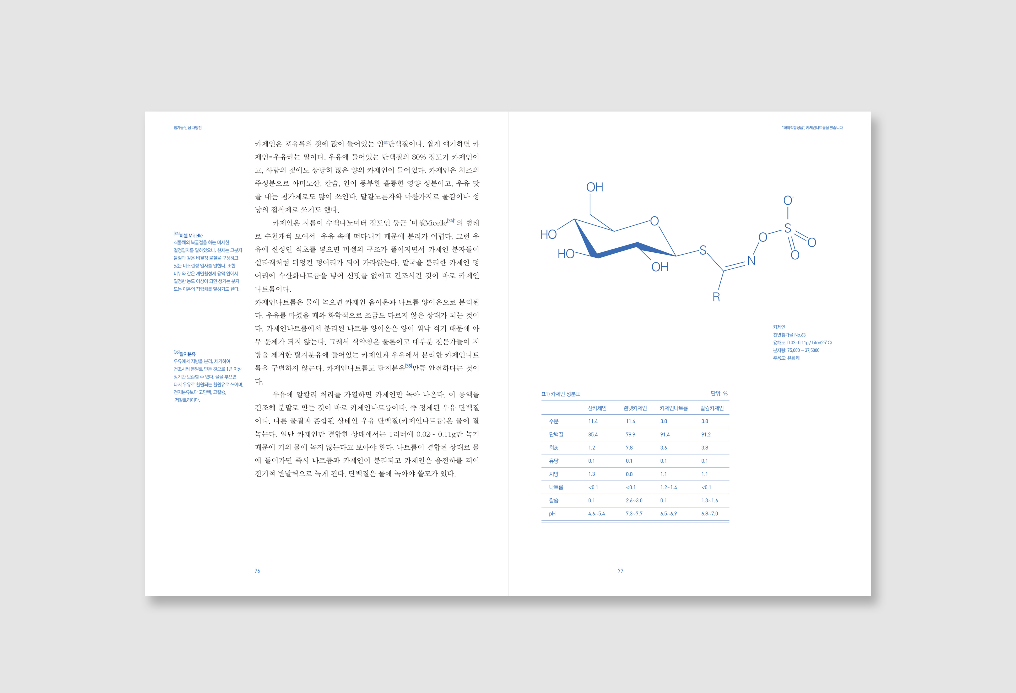
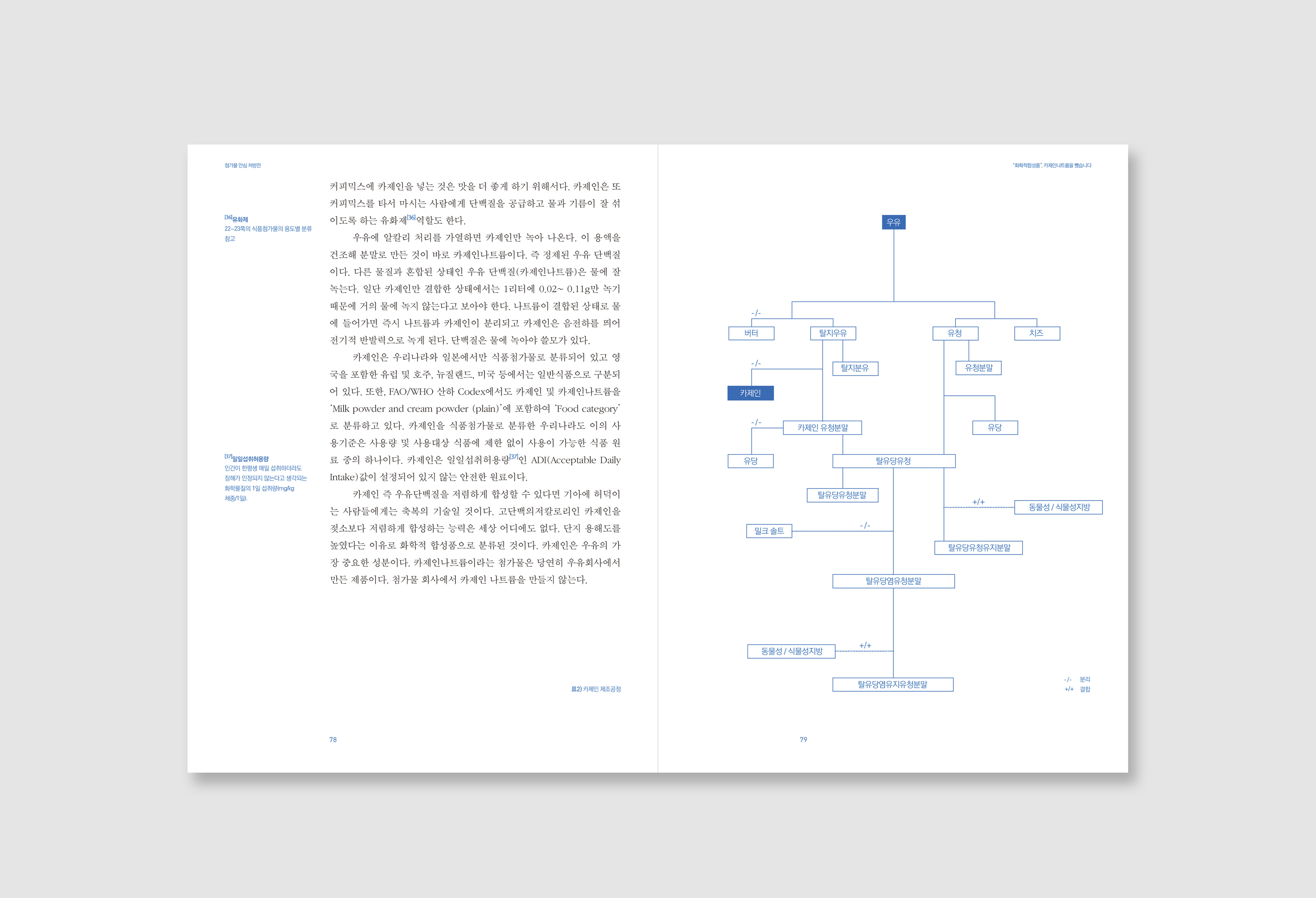
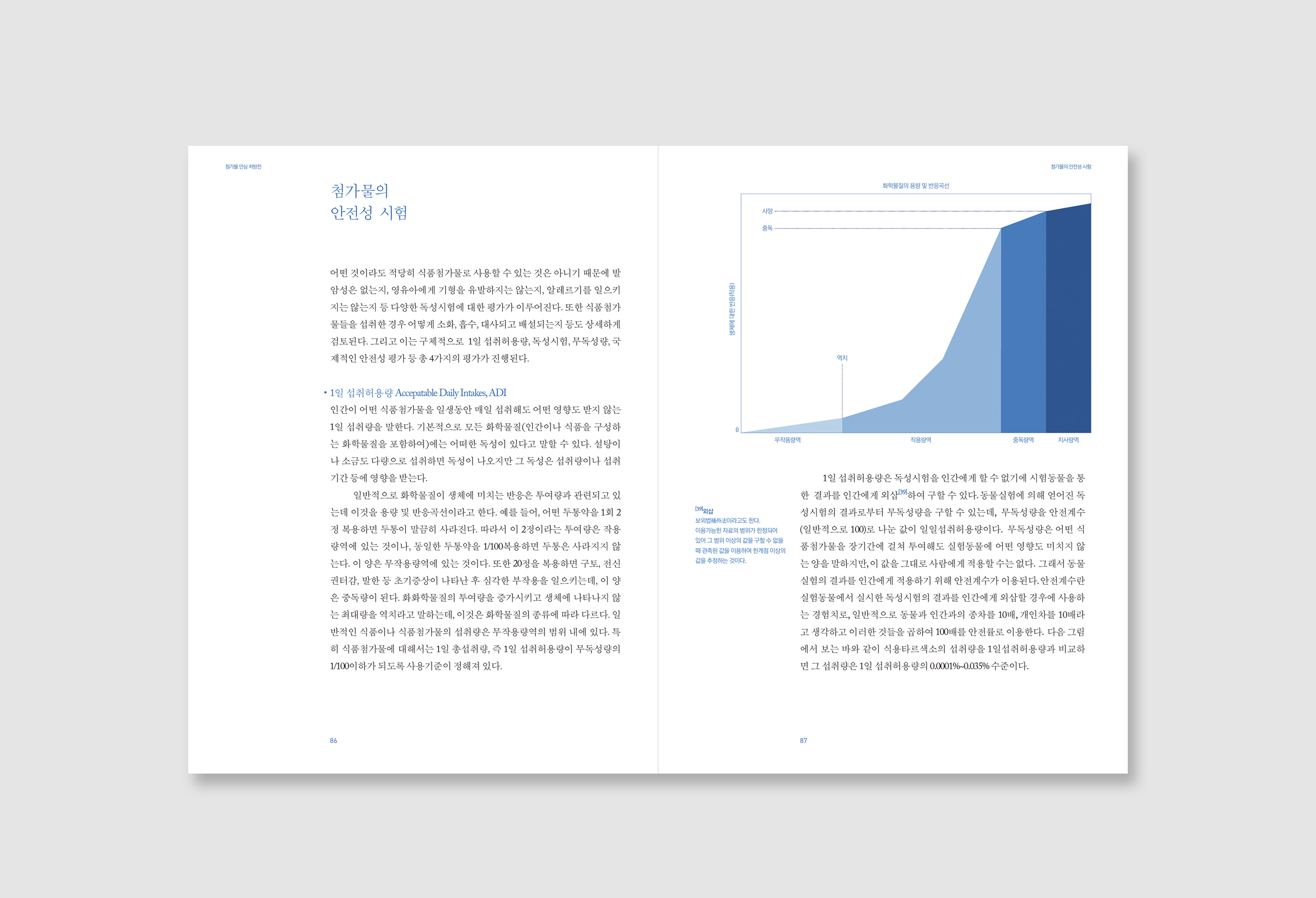
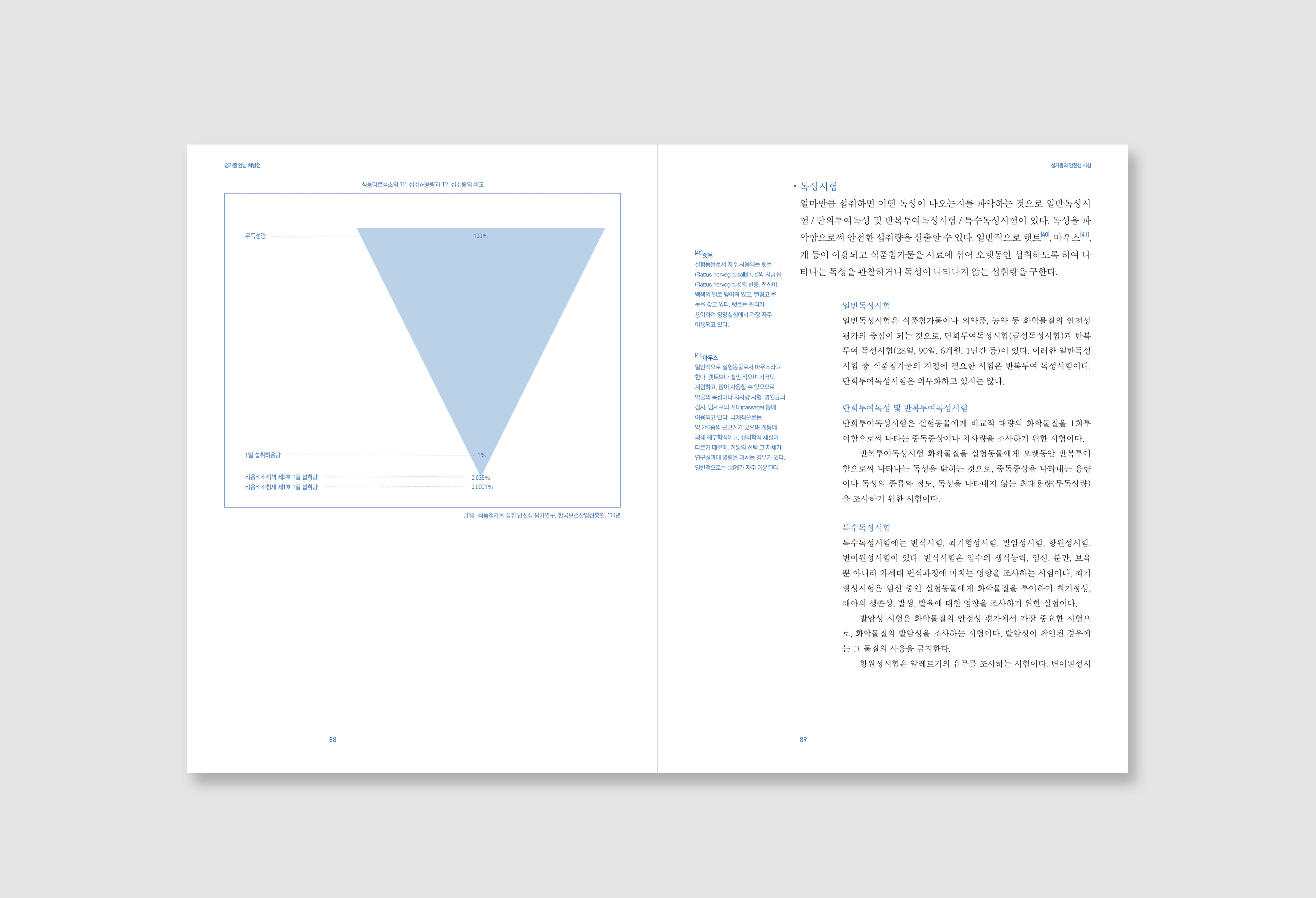
So, I regulate this anxiety about food additive is a sort of syndrome, and to cure this, give people to the right information about additive through the book of prescription. The prescription composed of three medications(chapters). First one is the tonic of knowledge, this medication defines, classify food additive and informs history about it. Second is the stimulant of truth; it shows the inside facts of classic controversies such as MSG, sodium nitrate and how the company using the anxiety of consumers through hiding the truth behind the commercials. The last one is the tranquilizer of belief; it informs how the safety of food additive managed by governments and internationally.

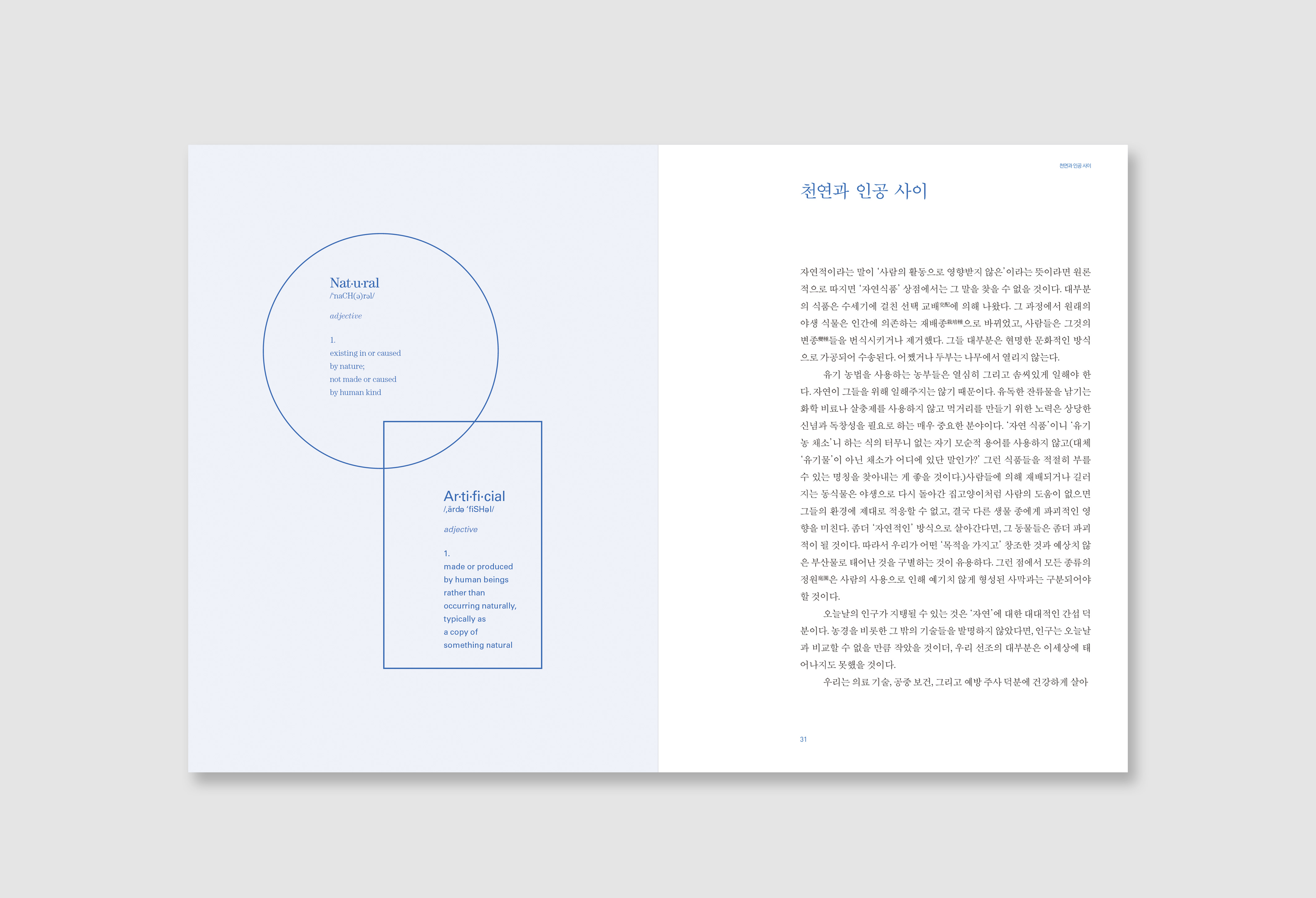
I used the blue for the primary color because the concept of the book is a prescription, it gives calm and rational feeling to readers. Also, the cover design motivated by South Korea’s prescription form. The contents of the book have some technical terms, so I designed internal pages concentrate on easy to read rather than experimental artwork.
Through the project, I rethought the importance of delivery right information and designer’s role in it while making the book.
Through the project, I rethought the importance of delivery right information and designer’s role in it while making the book.
Self Portrait
Print, 2014

FFRD EP: Contemporary
Album, 2019
Client
45 Records
45 Records
Role
Graphic designer
Graphic designer
Tool
Adobe Indesign
Illustrator
Adobe Indesign
Illustrator
About
Cover design for South Korean electronic duo FFRD’s first EP, “Contemporary.”
Link ︎ FFRD, “Contemporary”
Link ︎ FFRD, “Contemporary”
Dubinvain EP: Iron Gate
Album, 2019
Client
45 Records
45 Records
Role
Graphic designer
Graphic designer
Tool
Adobe Indesign
Illustrator
Adobe Indesign
Illustrator
About
Cover design for the first EP of Dubinvain who is the electronic musician based in South Korea.
Link ︎ Duninvain, “Iron Gate”
AMOREPACIFIC:
Dream of Asian Beauty
Dream of Asian Beauty
Book, 165 x 220mm, 2016
Client: AMOREPACIFIC
Client: AMOREPACIFIC


Overview
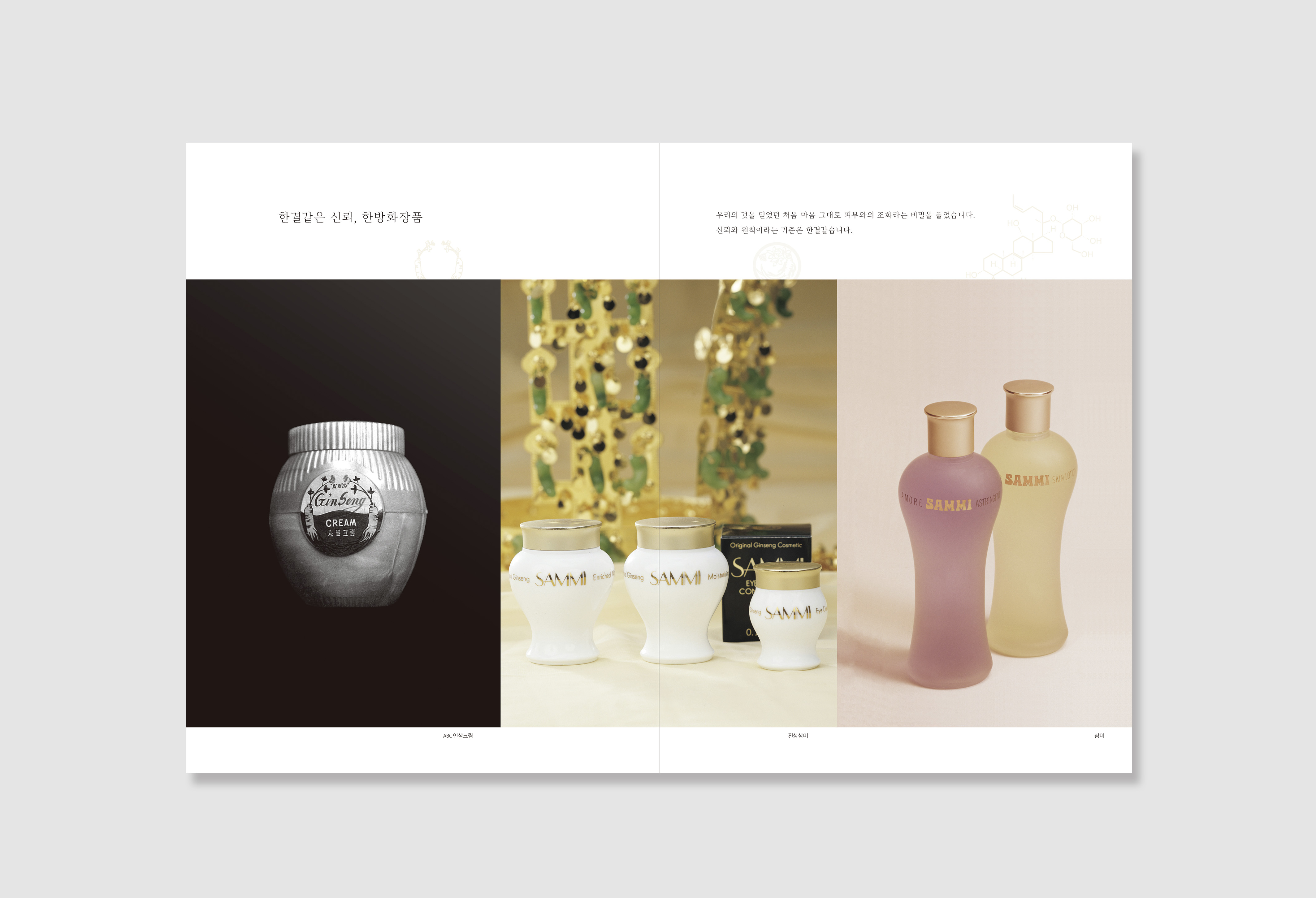
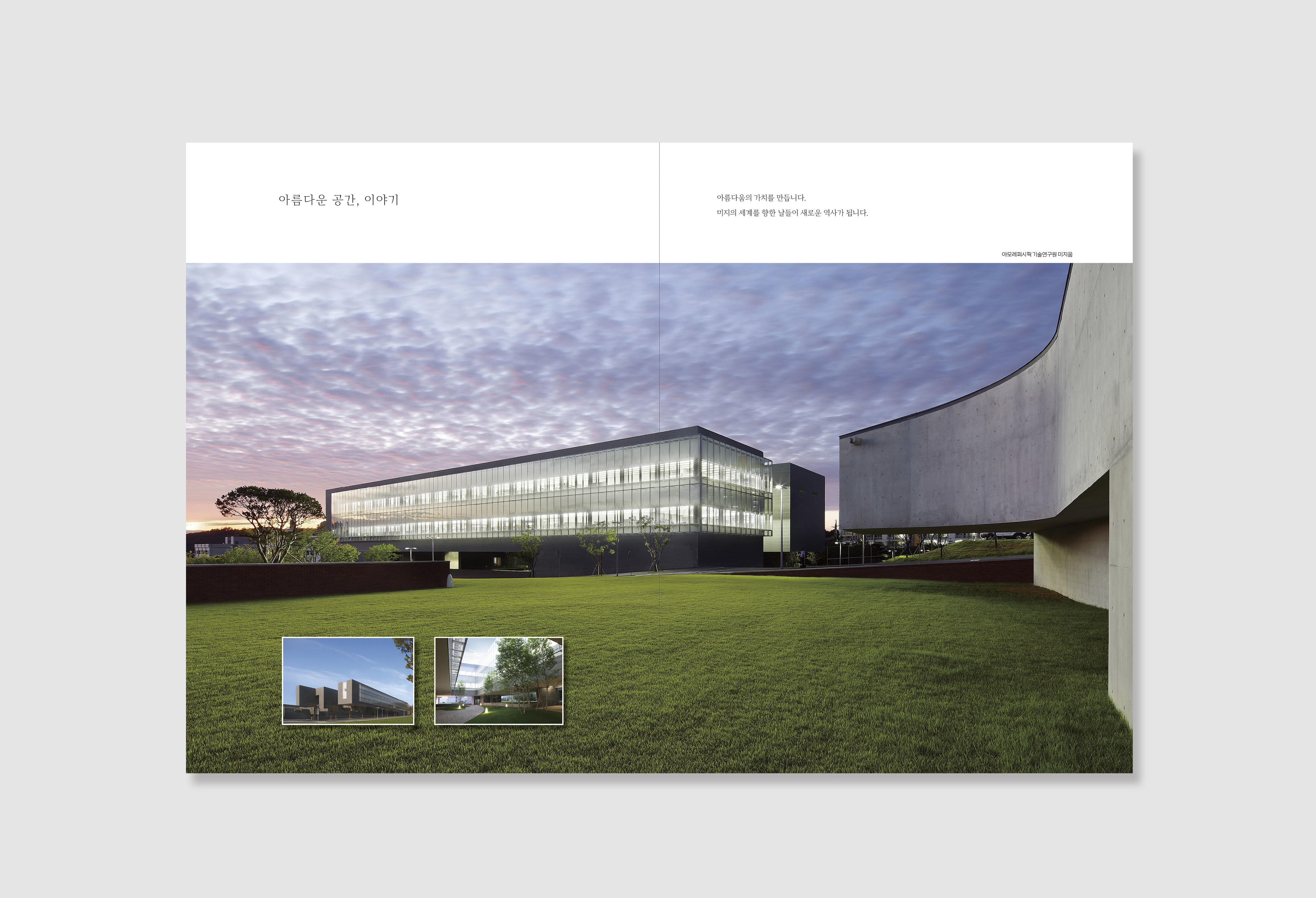
The book “AMOREPACIFIC: Dream of Asian Beauty” is seventy years of the history book of AMOREPACIFIC which is the biggest cosmetic company in South Korea. The project goal is making storybook rather than the general chronological sourcebook, so the readers that all the members of the staff in the company can be interested in their history.
Design process
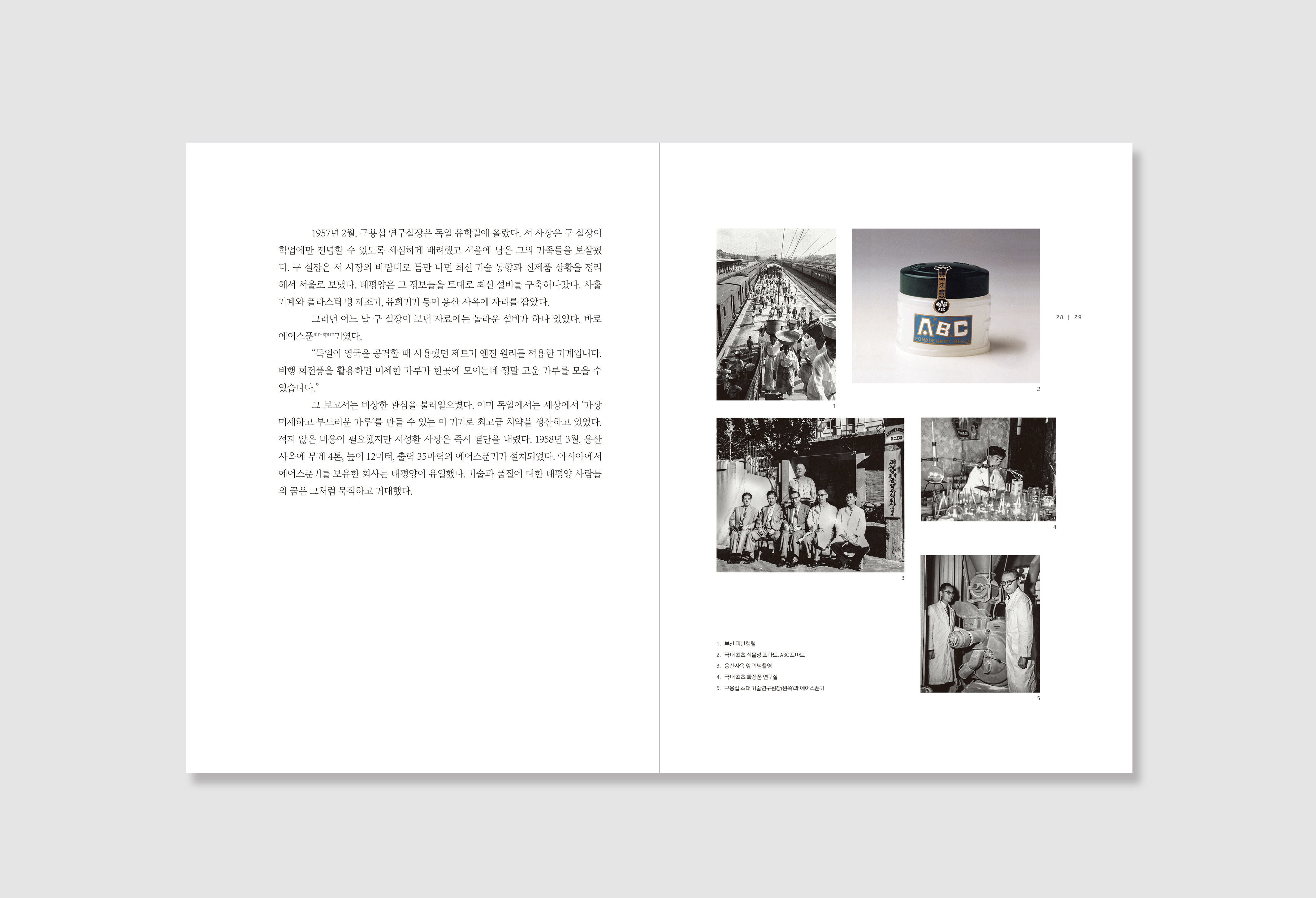
The project had taken almost three years including bidding process, and I joined the team as a designer in the final year that took whole part of visualization. After two years of research was done by writer and editors.
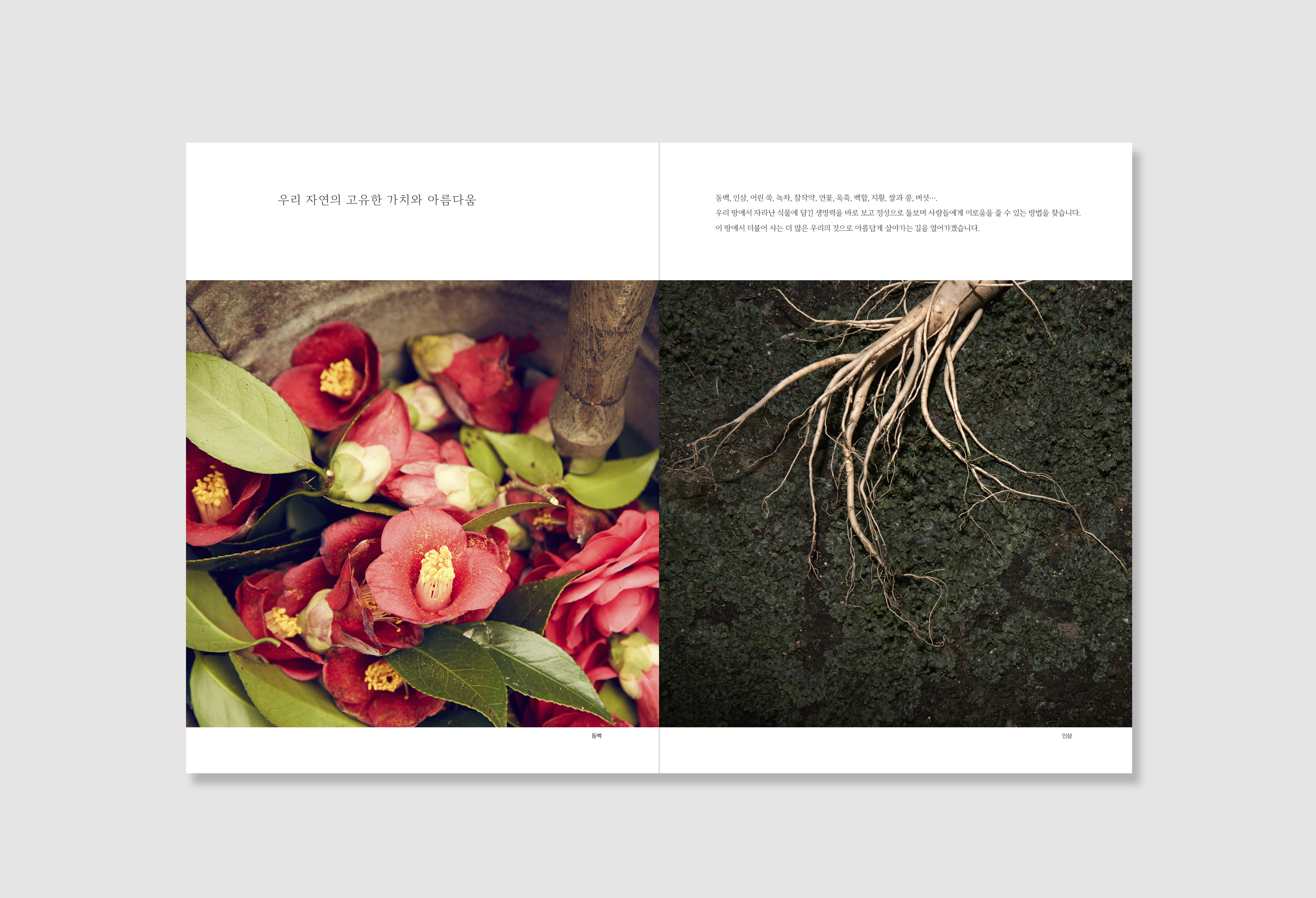
The central concept of “AMOREPACIFIC: Dream of Asian Beauty" was white porcelain, because the book should fill with the contents of seventy years of the episode, and softly embrace all of them. Therefore I focused on calm and simple design. I designed master page at first to give coherence. The book has twenty-eight episodes and each episode composed of story and photos. I created them separately because I wanted to make readers concentrate on the story, then they see the images related to the story. And I laid the pictures out from the top left side in chronological order.
In this project, I focused on not only design but also communication more than any other projects. Because It was the long-term and large-scale project, and I was the only designer took the complete visualization of the book. So I concentrate every people on this project share same goal and idea of the design concept of the book. It was not easy but worth to do it and gave me the meaningful experience.
Creative Director: Younghoon Park
Project Manager: Jiyoung Lee
Editor: Jiyoung Lee, Donyoung Lim
Designer: Jaekook Han
Writer: Unjoo Choi
Photographer: Wookin Park, Intak Kim
Illustrator: Jihong Min
Assistant: Gaeun Jang, Yeonjung Ko, Dahye Jung, Siyeon Ha
The project had taken almost three years including bidding process, and I joined the team as a designer in the final year that took whole part of visualization. After two years of research was done by writer and editors.
The central concept of “AMOREPACIFIC: Dream of Asian Beauty" was white porcelain, because the book should fill with the contents of seventy years of the episode, and softly embrace all of them. Therefore I focused on calm and simple design. I designed master page at first to give coherence. The book has twenty-eight episodes and each episode composed of story and photos. I created them separately because I wanted to make readers concentrate on the story, then they see the images related to the story. And I laid the pictures out from the top left side in chronological order.
In this project, I focused on not only design but also communication more than any other projects. Because It was the long-term and large-scale project, and I was the only designer took the complete visualization of the book. So I concentrate every people on this project share same goal and idea of the design concept of the book. It was not easy but worth to do it and gave me the meaningful experience.
Creative Director: Younghoon Park
Project Manager: Jiyoung Lee
Editor: Jiyoung Lee, Donyoung Lim
Designer: Jaekook Han
Writer: Unjoo Choi
Photographer: Wookin Park, Intak Kim
Illustrator: Jihong Min
Assistant: Gaeun Jang, Yeonjung Ko, Dahye Jung, Siyeon Ha
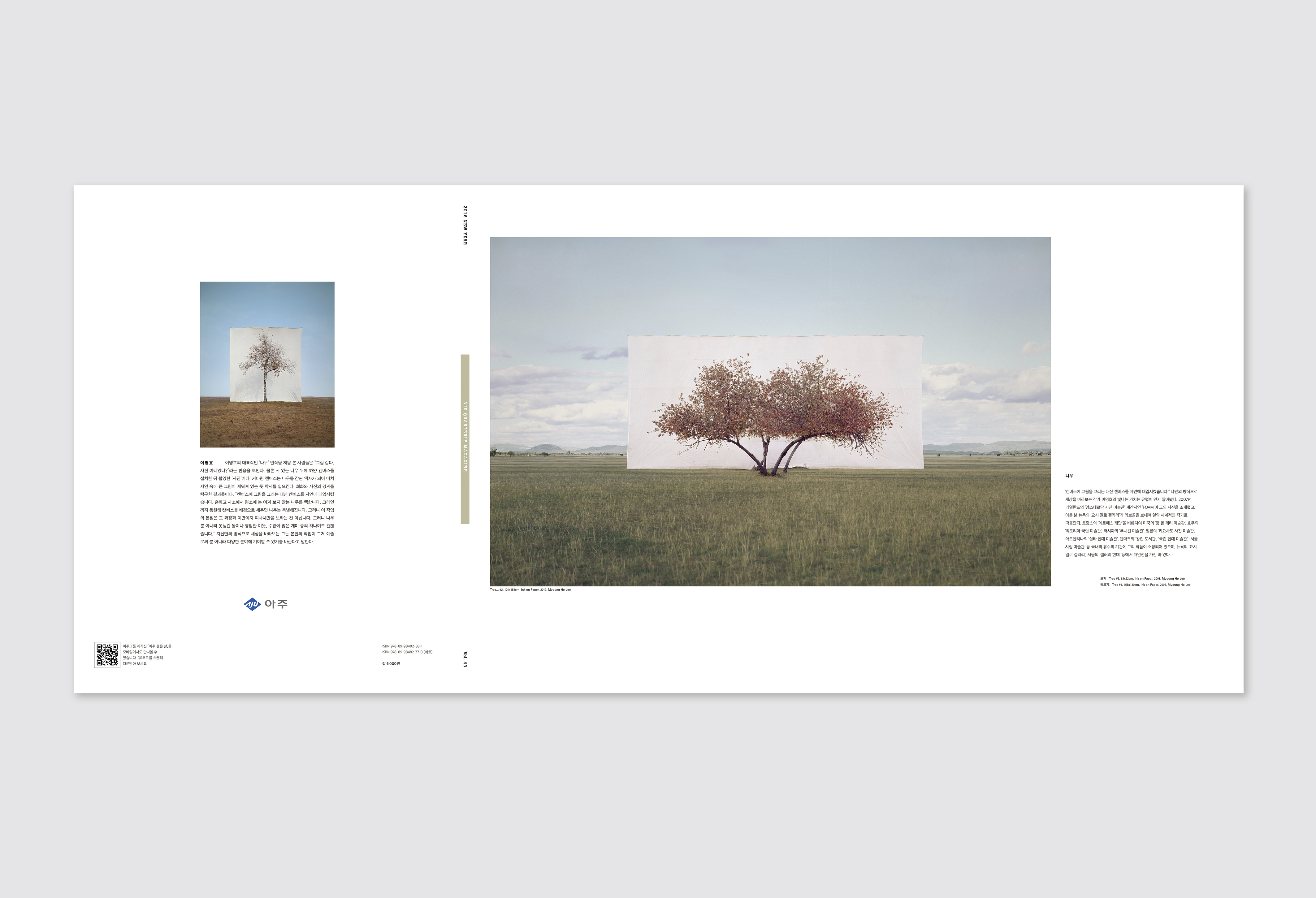
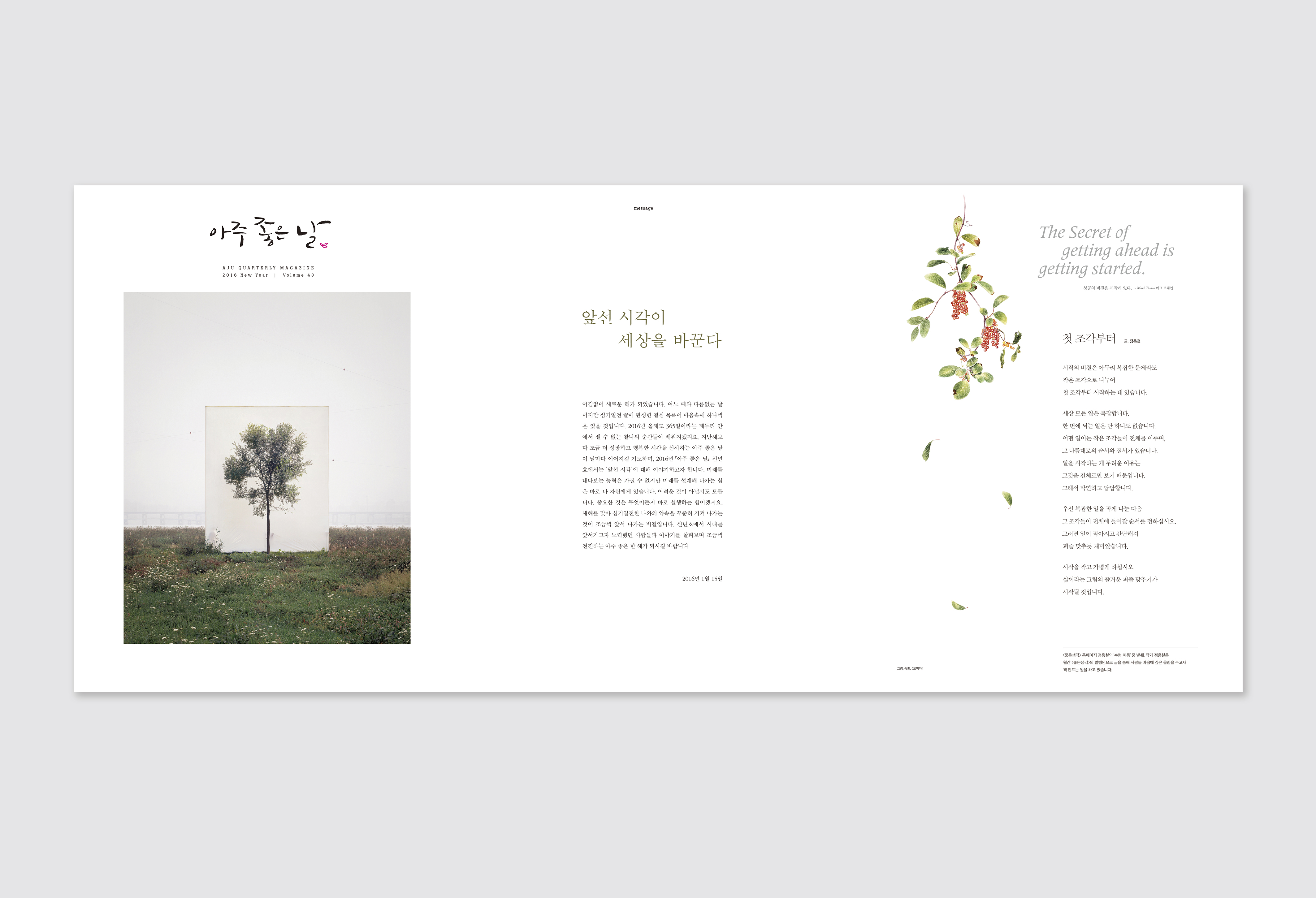
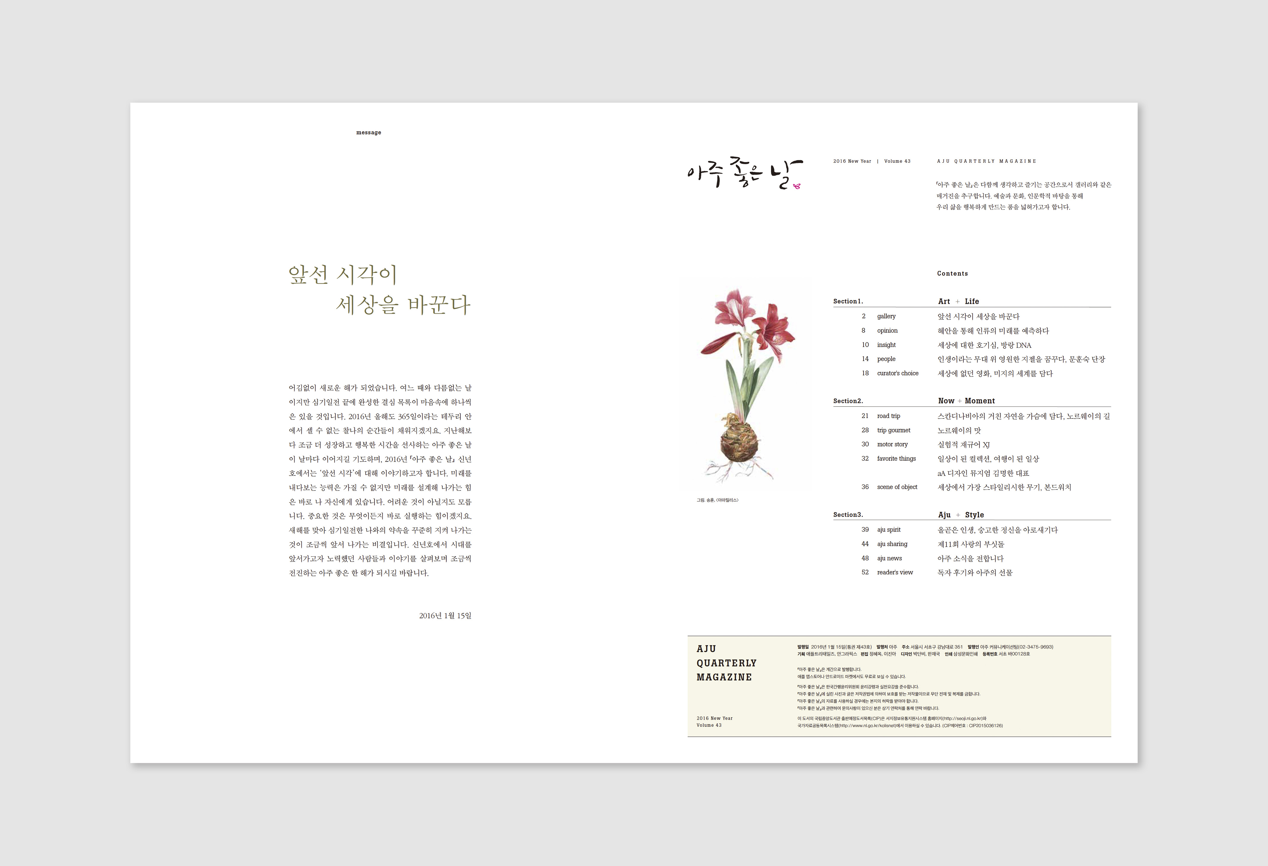
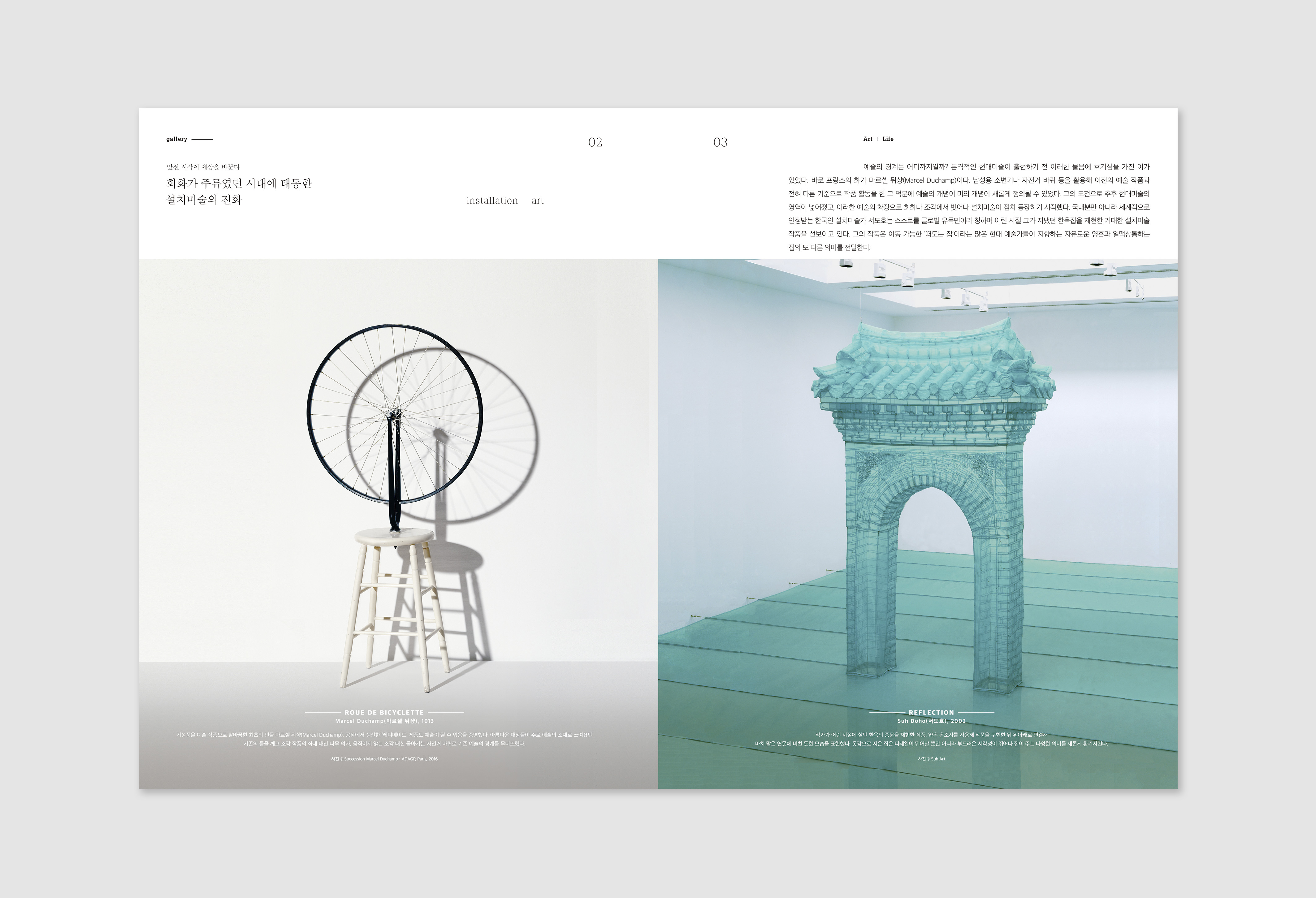
Great Day AJu
Magazine, 225 x 295mm, 2015
Client: Aju Group
Client: Aju Group
Overview
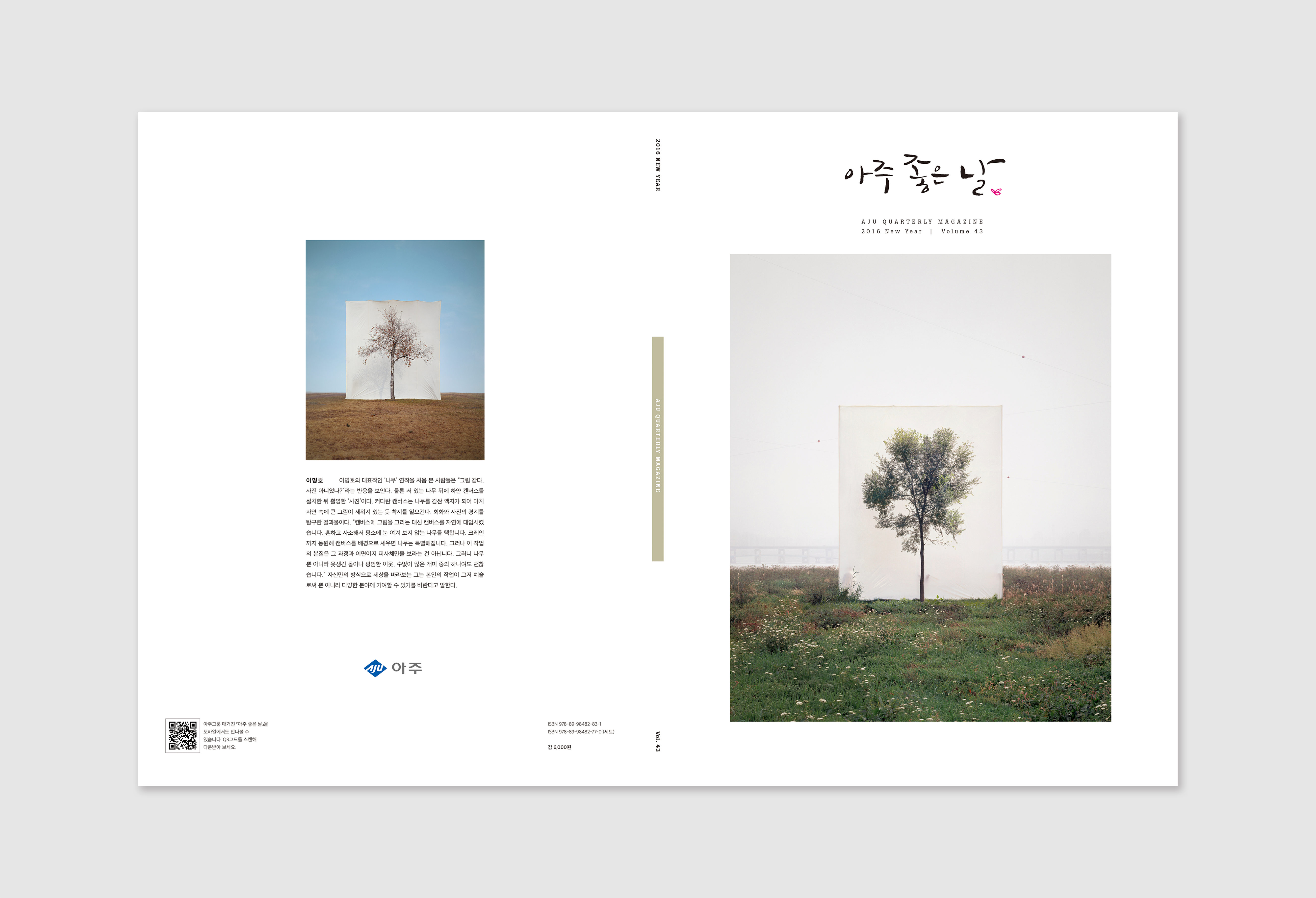
Greate Day Aju is a quaterly art+culture company magazine of Aju Group in South Korea.
Team
Creative Director: Younghoon Park
Project Manager: Hyeok Jeong
Editor: Hyeok Jeong, Jinah Lee
Designer: Jaekook Han, Danbi Park
Illustrator: Jihong Min
Creative Director: Younghoon Park
Project Manager: Hyeok Jeong
Editor: Hyeok Jeong, Jinah Lee
Designer: Jaekook Han, Danbi Park
Illustrator: Jihong Min
Role
Cover design Art+Life Chapter design
Cover design Art+Life Chapter design
Design Process
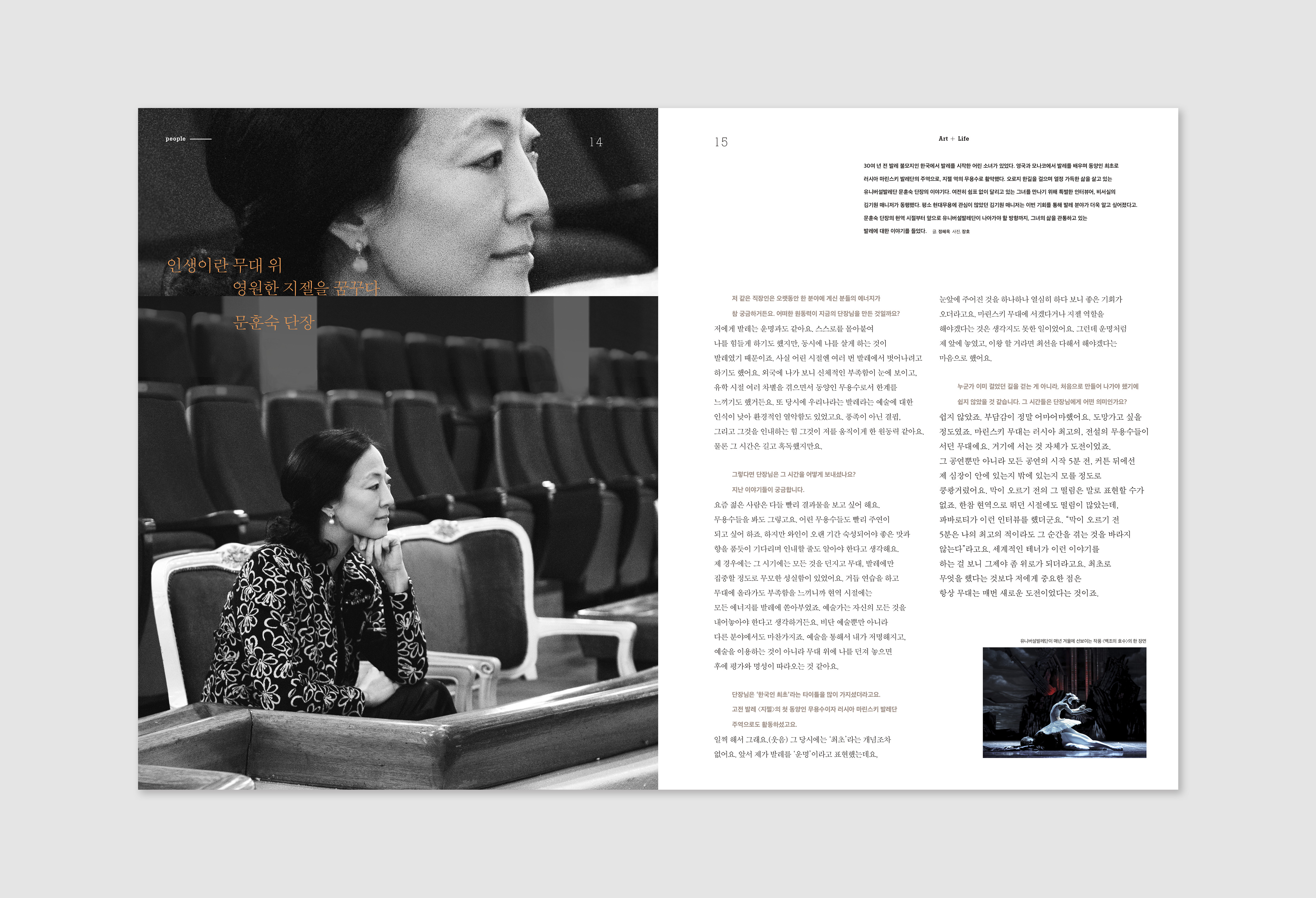
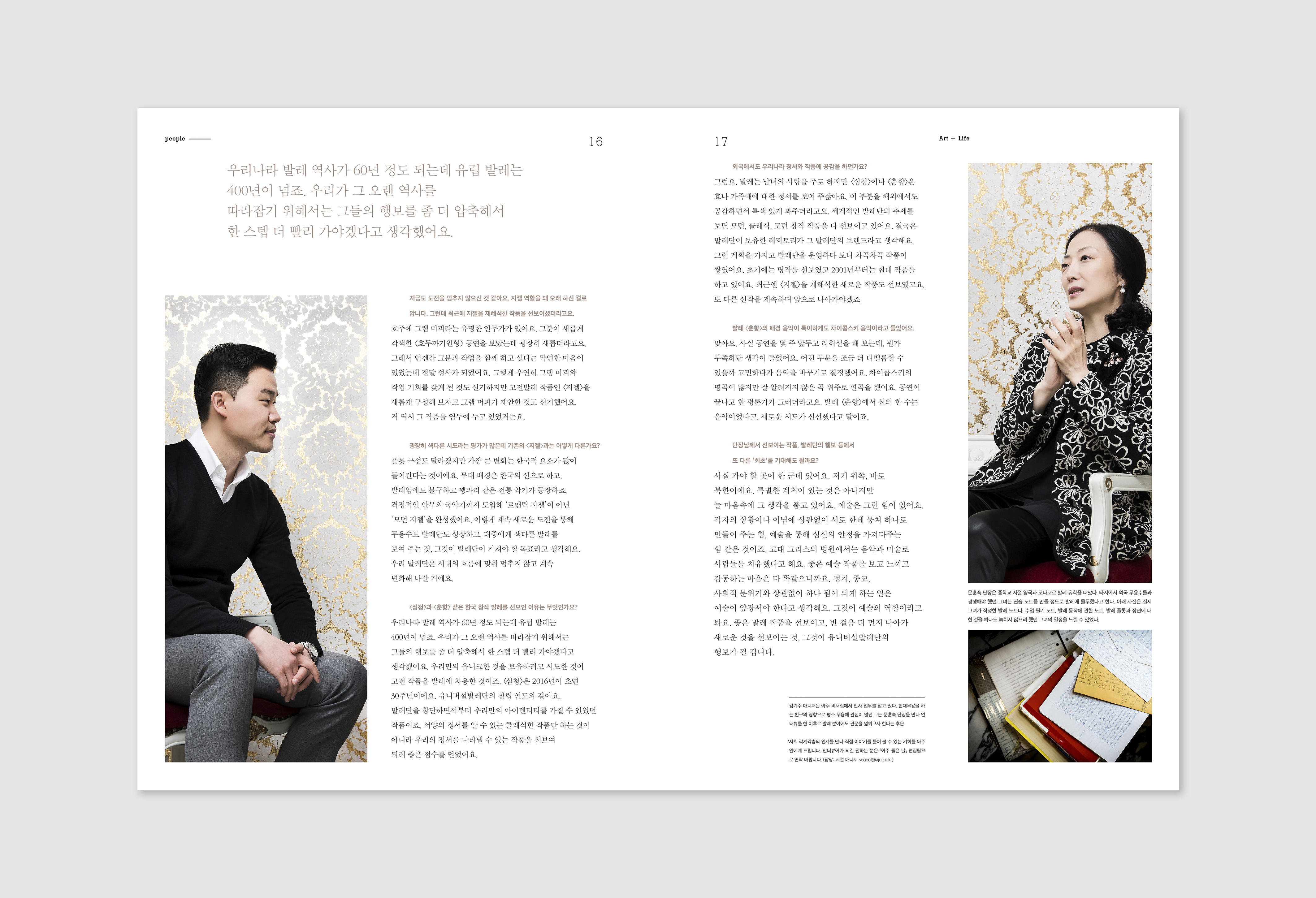
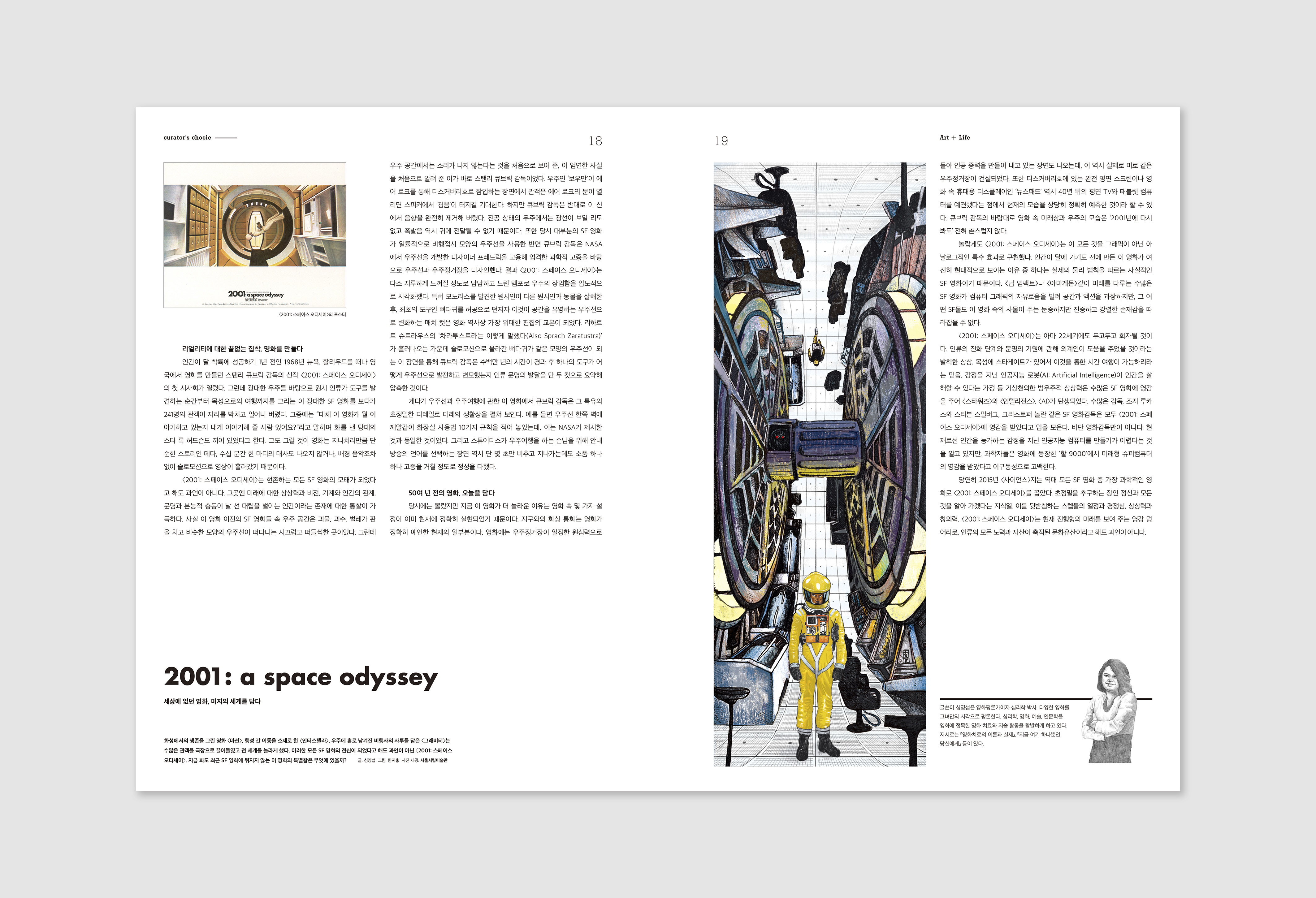
Greate Day Aju is composed by three chapters and I designed the cover and the first chapter “Art+Life.” The design concept is the magazine as a gallery. So I designed folded cover that could use as a gallery space. Each issue has different artist’s works for the cover.
And I use white space as a frame to emphasize the artwork image. In the body, I had focused on the visual consistency and enough size of images that fit to our concept of the gallery.
And I use white space as a frame to emphasize the artwork image. In the body, I had focused on the visual consistency and enough size of images that fit to our concept of the gallery.

2016 Pierre Fabre Dermo-Cosmétique
Calendar, 178 x 243mm, 2015
Client: Pierre Fabre Dermo-Cosmétique Korea
Client: Pierre Fabre Dermo-Cosmétique Korea


Overview
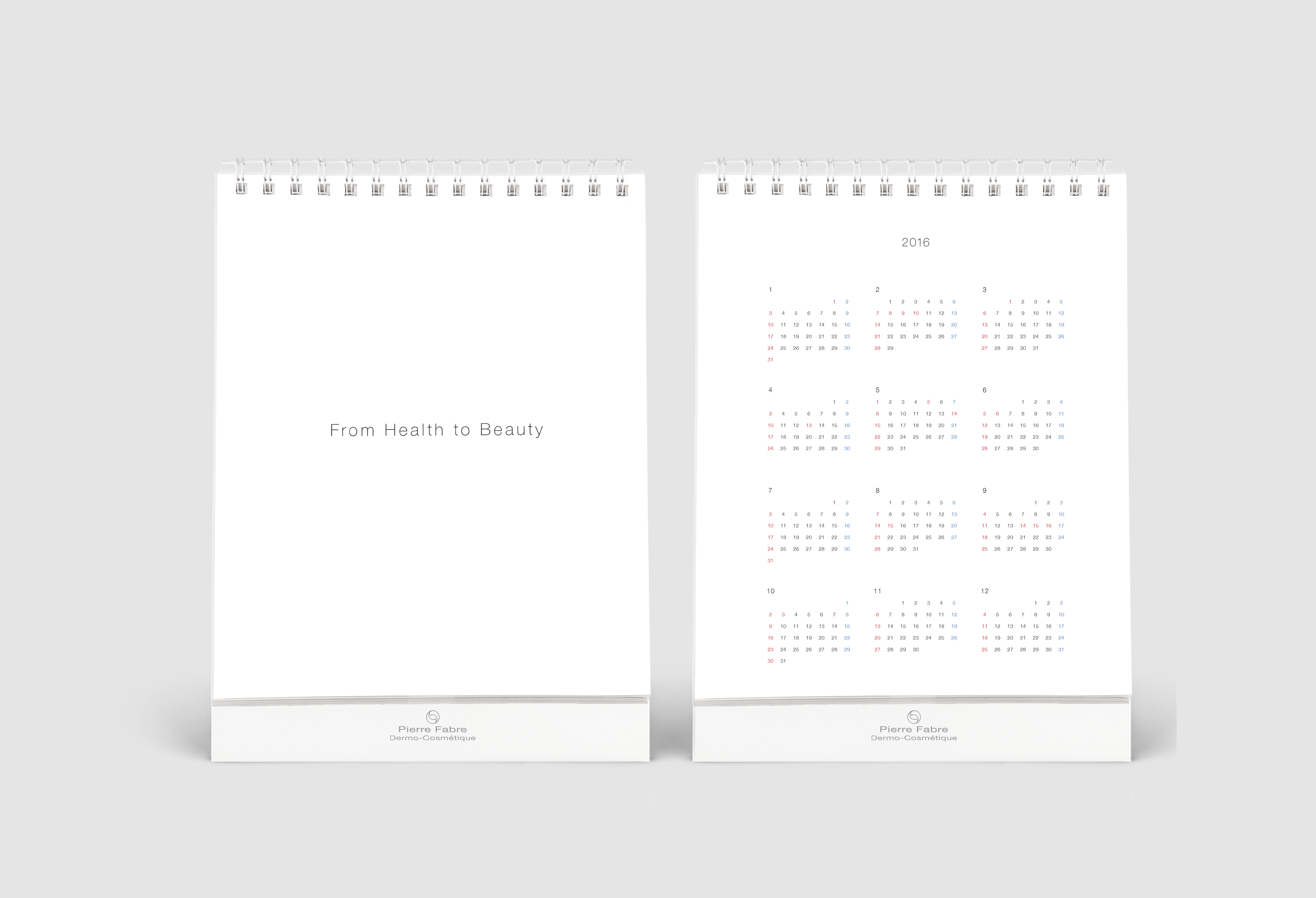
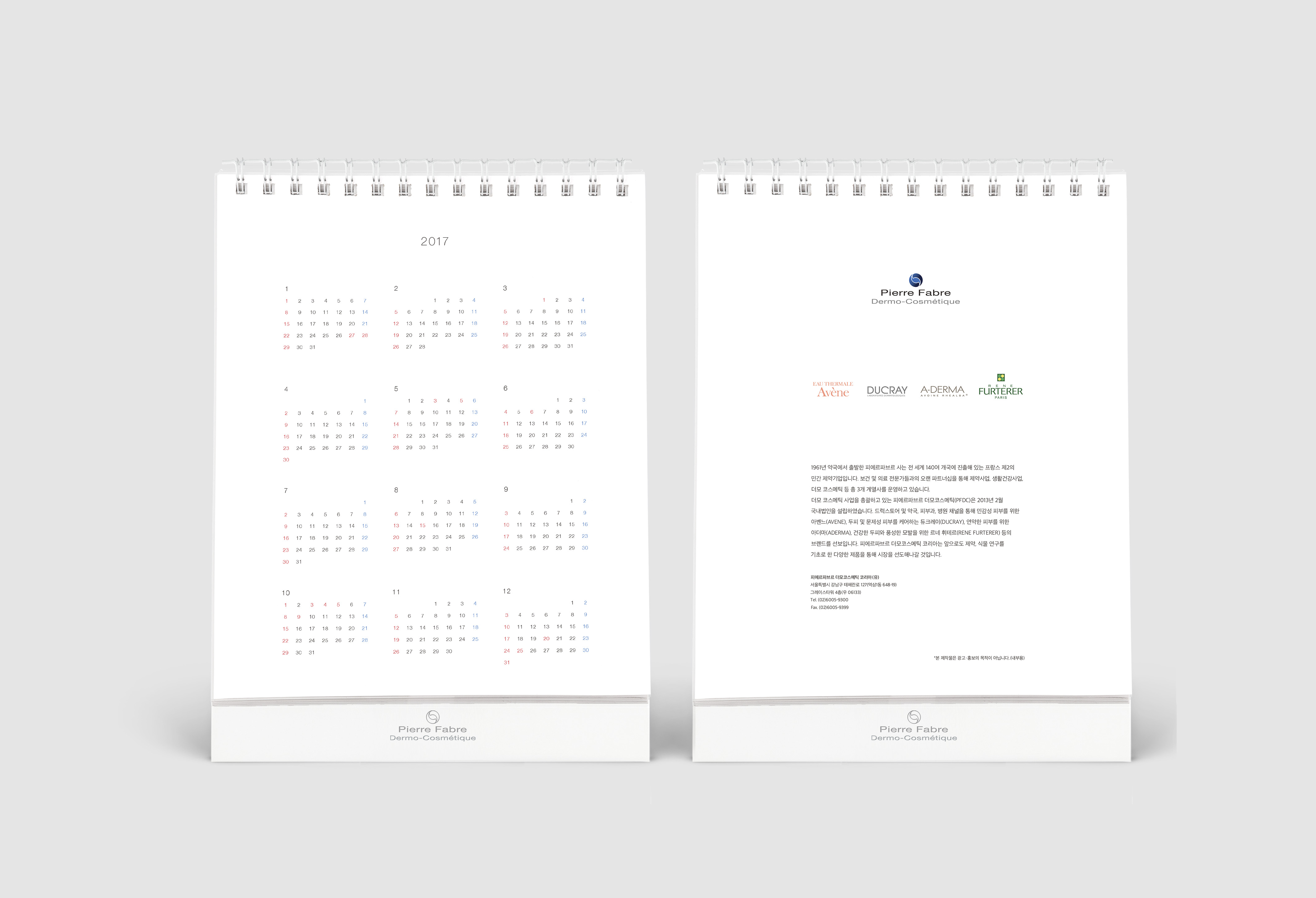
2016 Desk calendar for Pierre Fabre Dermo-Cosmétique Korea.
Design process
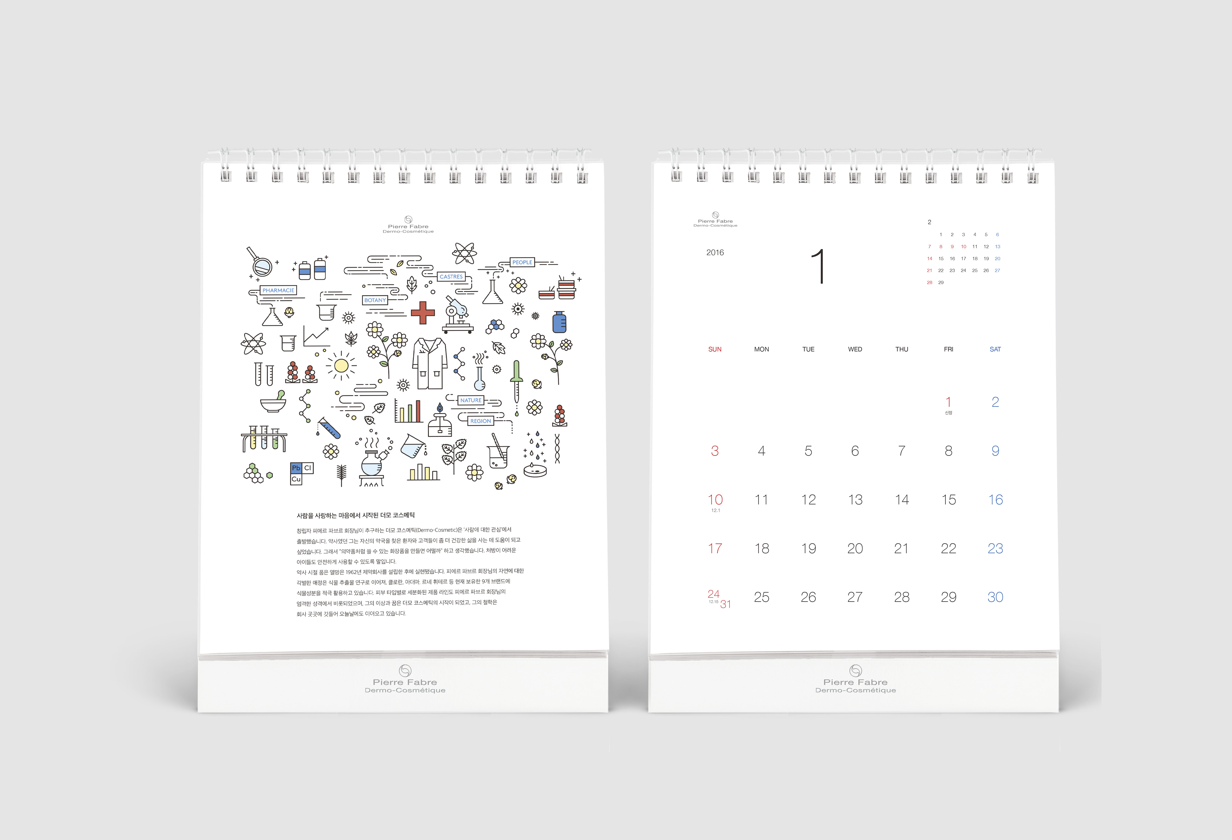
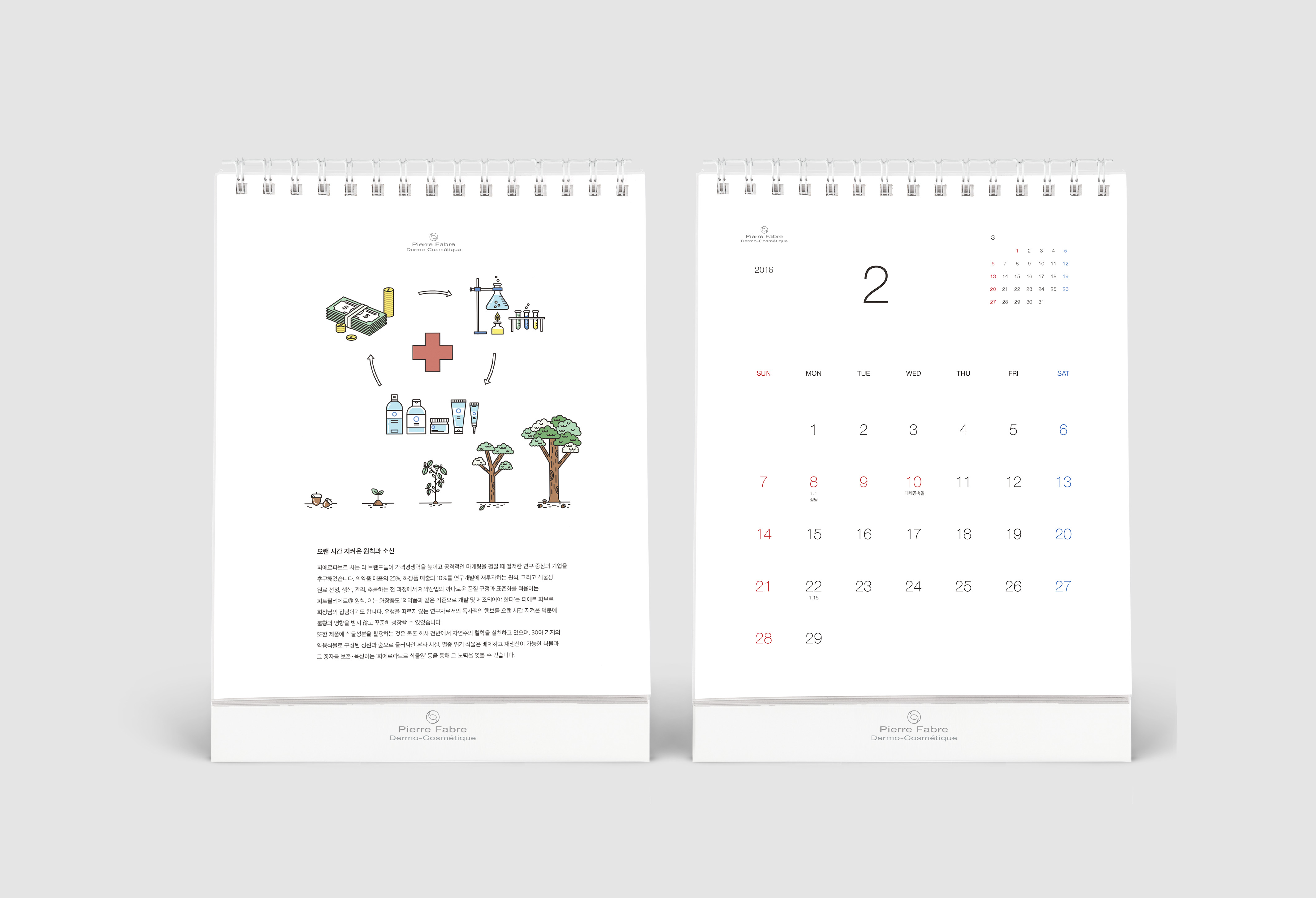
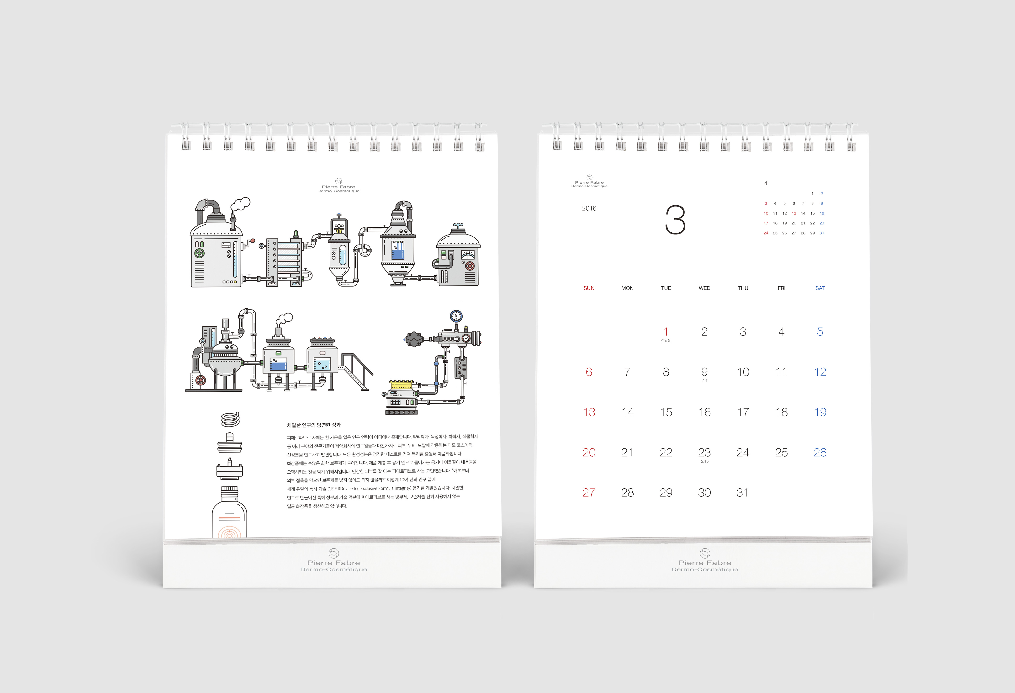
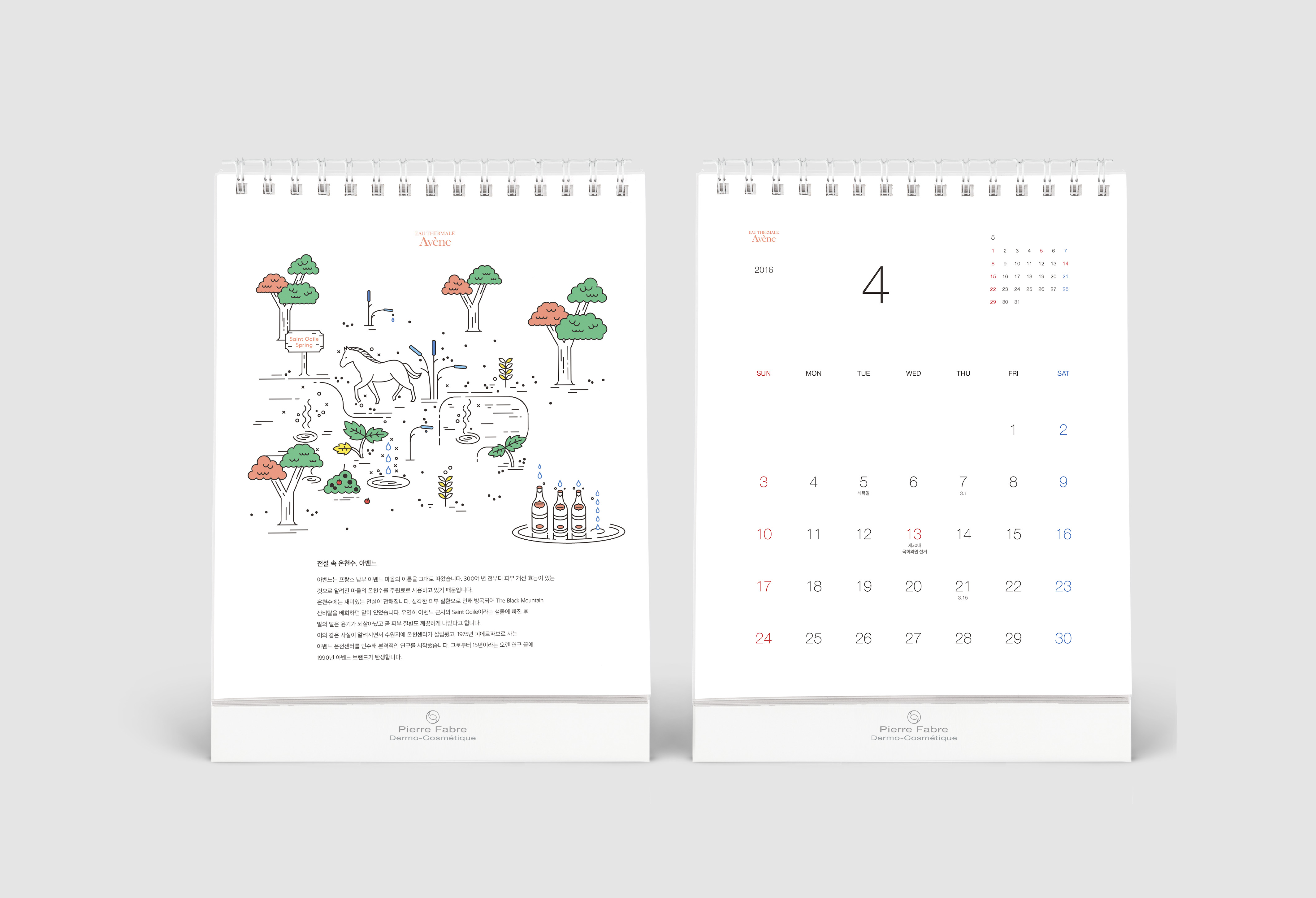
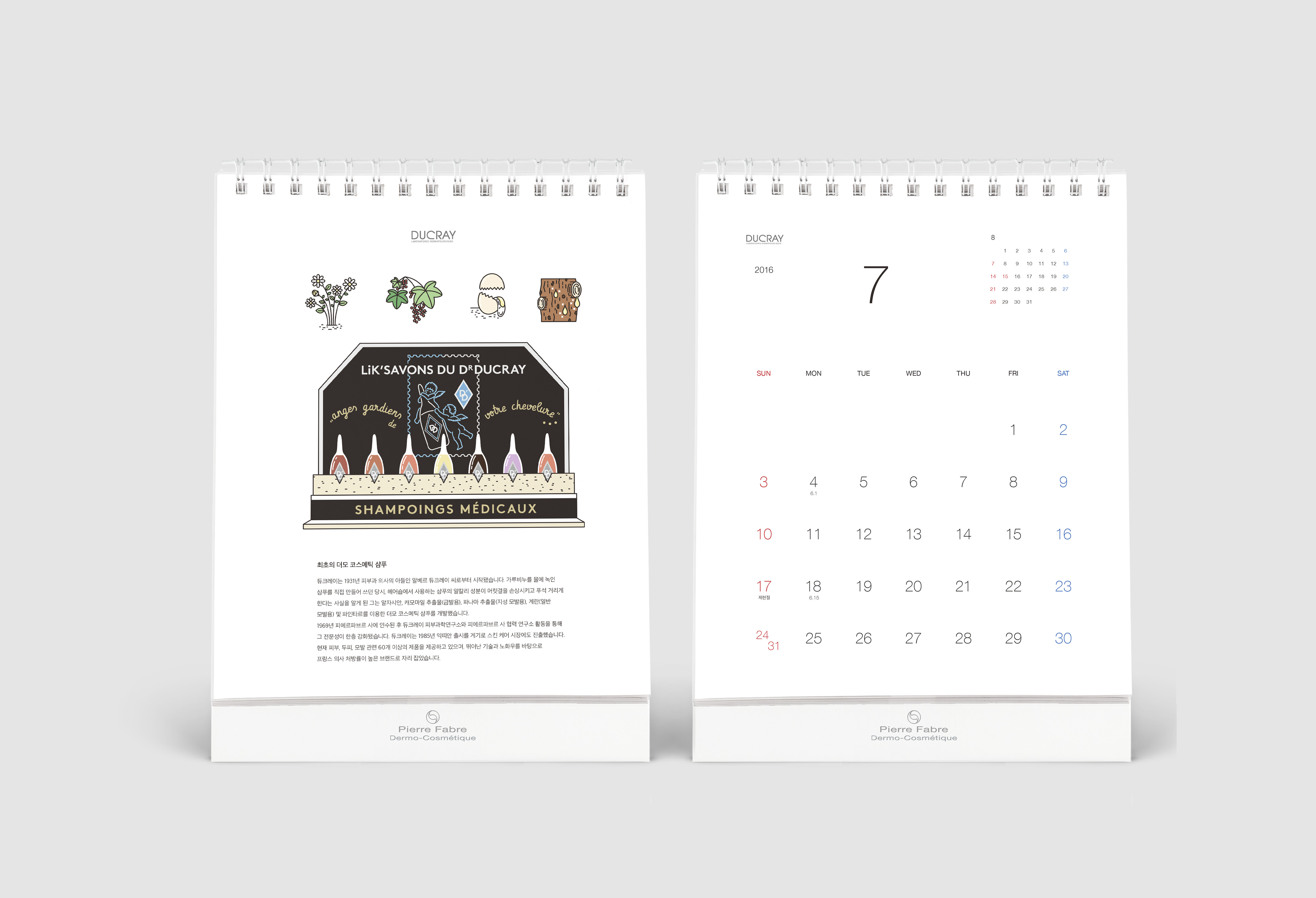
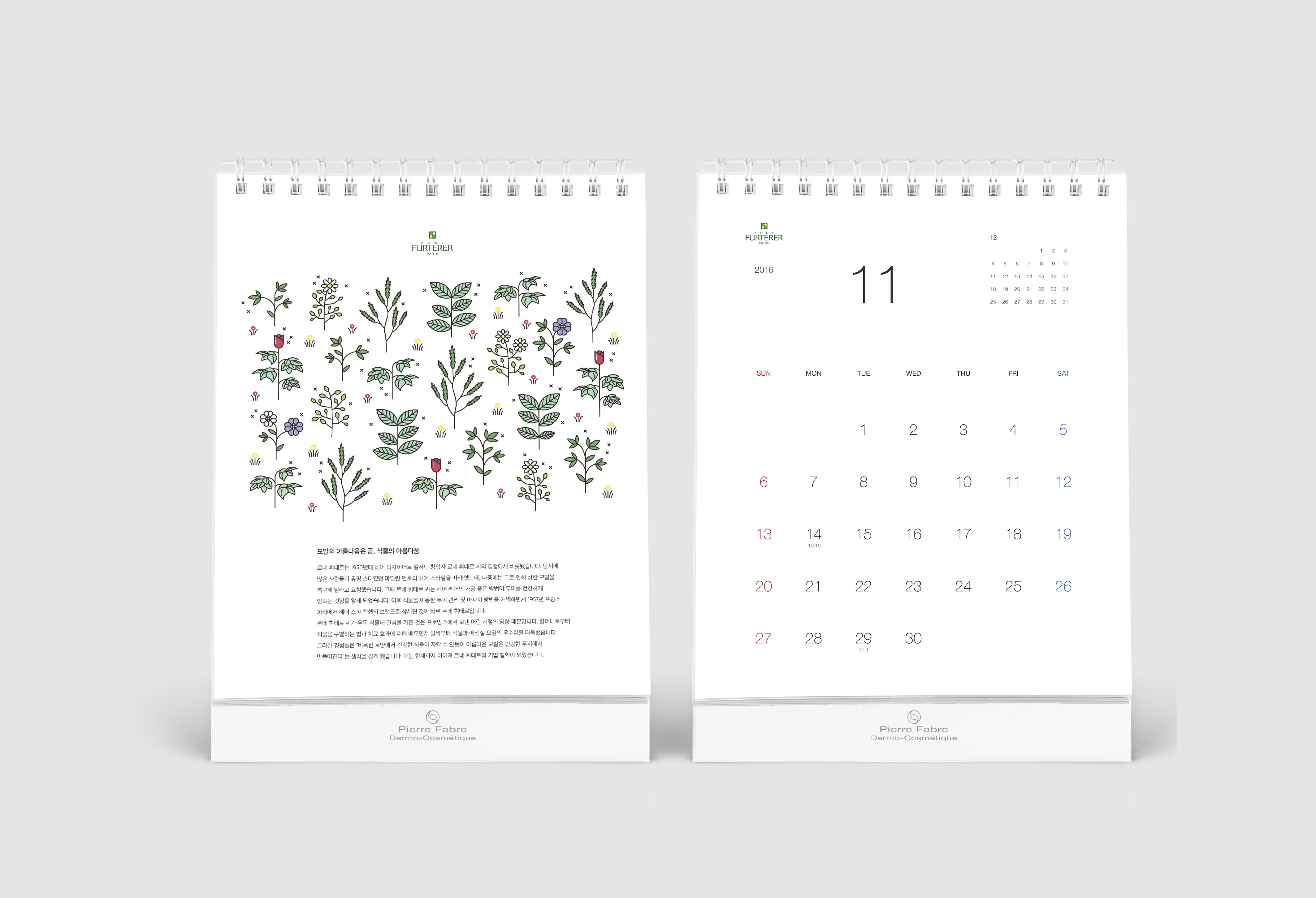
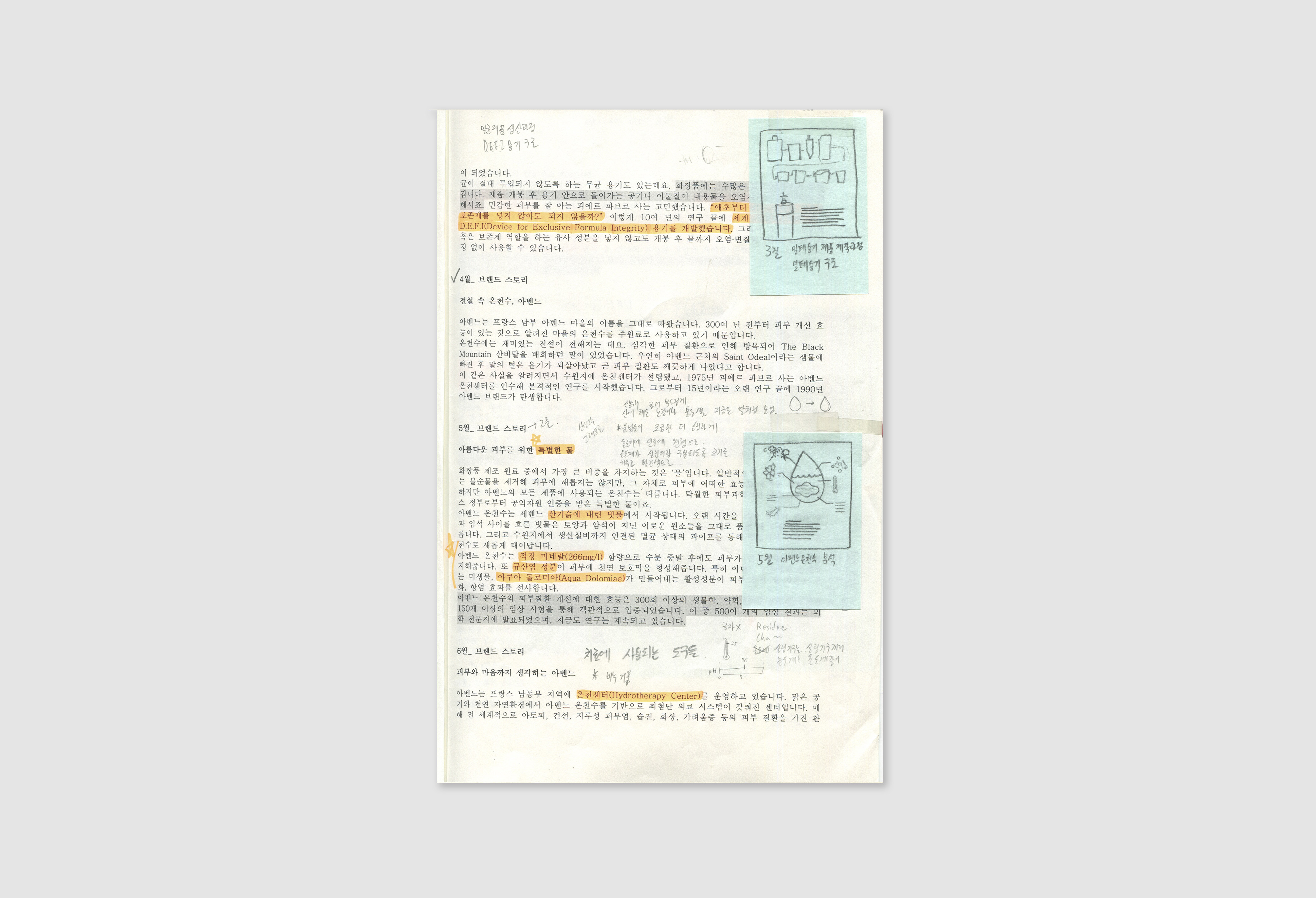
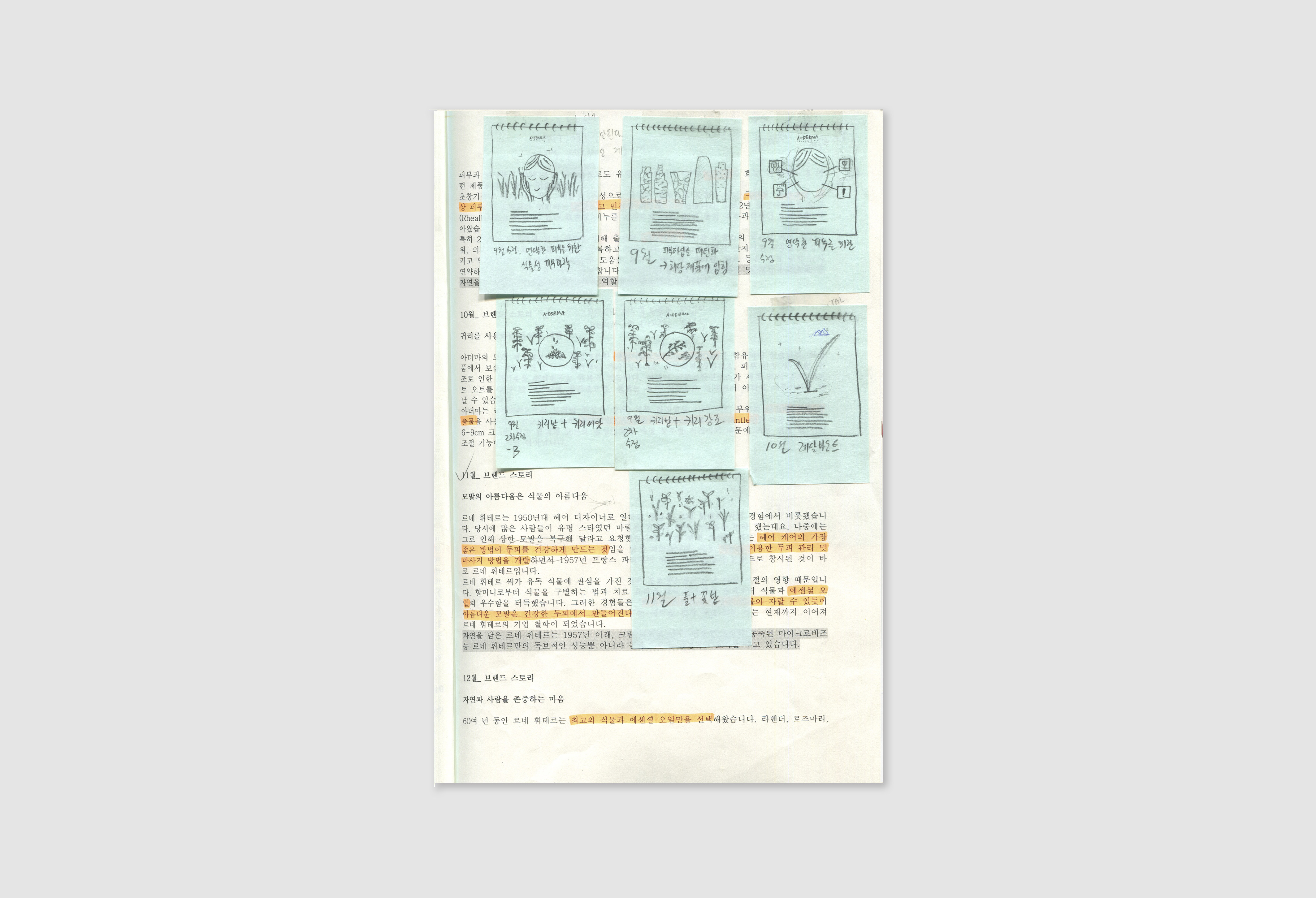
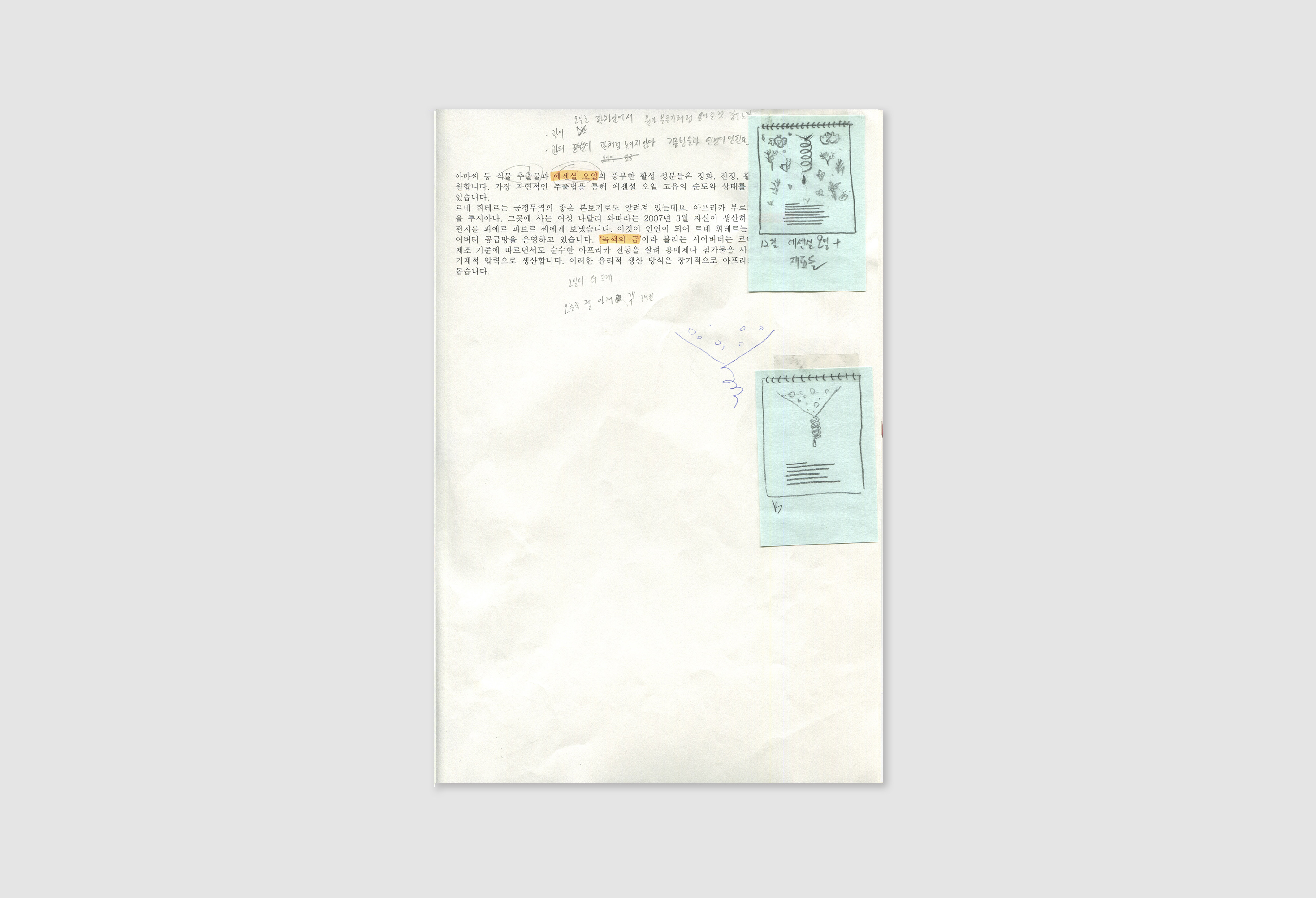
I focused on to unite one identity through the story that beginning of the company and brands rather than concentrated on introducing their products. My concept of design was “clean and warm.” It started from figures of the Pierre Fabre which is the first dermo-cosmetic company in the world. Their mission is “From Health to Beauty,” so they researched and used the natural ingredient to make medicines and cosmetics for dermatology. Their scientific specialty gives the image of “Clean” and uses of natural materials for people health gives the image of “warm."
I designed calendar with lightly weighted fonts for neat image and chose vector illustration to design their stories because it fits for symbolizing the essence of the story. The calendar composed of the front page of dates and back page of the story. Each month dates pages have symbols that connect to story on back pages. The story starts from the foundation of the company in January to behind story of significant brands, and its product in December.
![]()
![]()
![]()
![]()
![]()
The project term was too short to entrust illustrator with the whole process of illustration, so I sketched elements to laid them out on the page at first and gave them to illustrator.
Creative Director: Younghoon Park
Editor: Myunghee Guk
Designer: Jaekook Han
Illustrator: Sein Hong
I focused on to unite one identity through the story that beginning of the company and brands rather than concentrated on introducing their products. My concept of design was “clean and warm.” It started from figures of the Pierre Fabre which is the first dermo-cosmetic company in the world. Their mission is “From Health to Beauty,” so they researched and used the natural ingredient to make medicines and cosmetics for dermatology. Their scientific specialty gives the image of “Clean” and uses of natural materials for people health gives the image of “warm."
I designed calendar with lightly weighted fonts for neat image and chose vector illustration to design their stories because it fits for symbolizing the essence of the story. The calendar composed of the front page of dates and back page of the story. Each month dates pages have symbols that connect to story on back pages. The story starts from the foundation of the company in January to behind story of significant brands, and its product in December.

The project term was too short to entrust illustrator with the whole process of illustration, so I sketched elements to laid them out on the page at first and gave them to illustrator.
Creative Director: Younghoon Park
Editor: Myunghee Guk
Designer: Jaekook Han
Illustrator: Sein Hong
Copyright 2025, Jaekook Han