


Overview
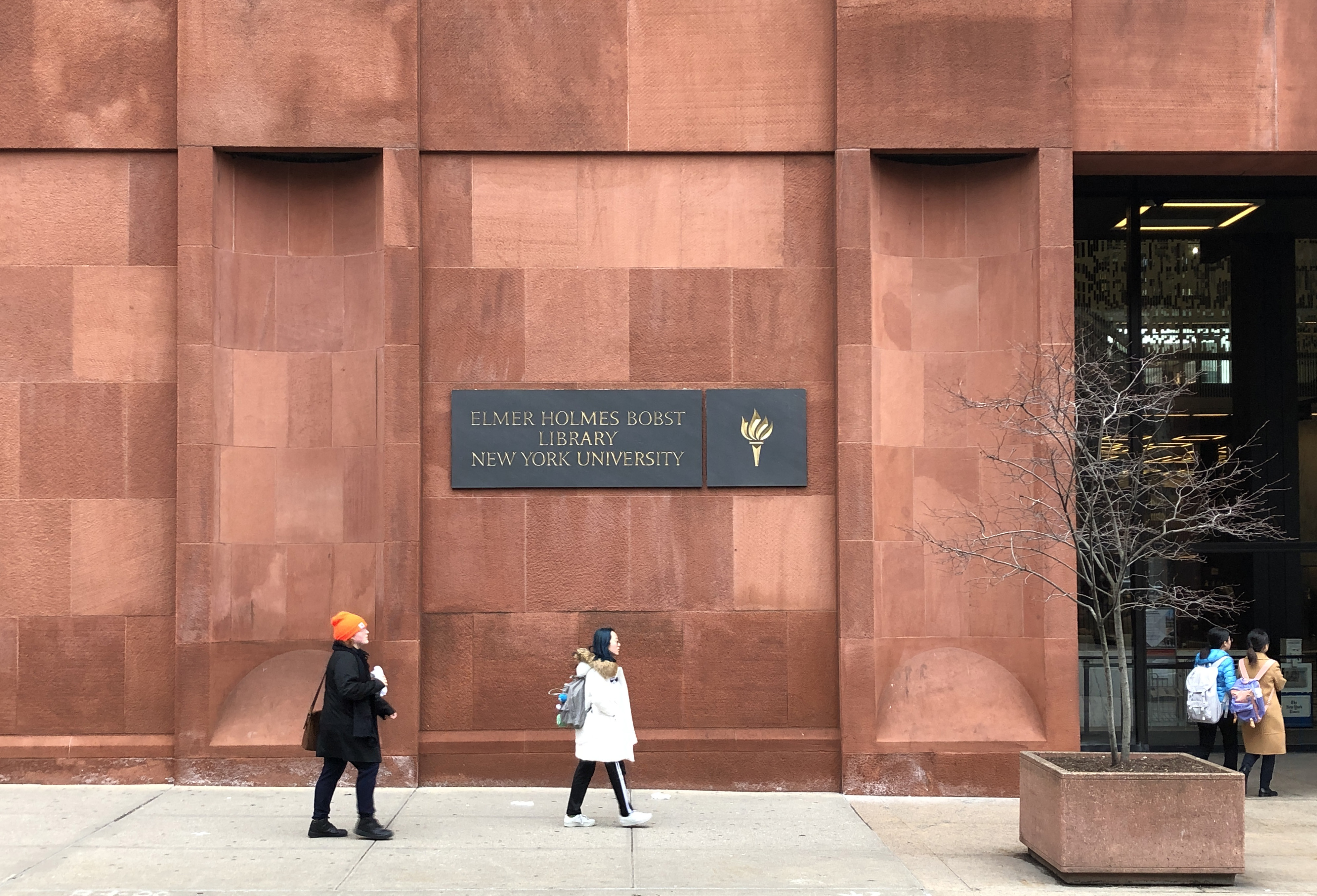
I try to answer the above question through the thesis project, especially for the Bobst Library. The Bobst Library is the main library at New York University, the core location where research takes place. Bobst is a mobile application for the Bobst Library at NYU, allowing students and faculty to navigate the library and find research information easily.
︎︎︎ Thesis presentation link
︎︎︎ Thesis presentation link
Team
Solo Project
(Thesis)
Solo Project
(Thesis)
Advisor
Sarah Rothberg
Margaret Smith
Sarah Rothberg
Margaret Smith
Tool
Sketch
Zoom
Illustrator
Protopie
After Effects
Sketch
Zoom
Illustrator
Protopie
After Effects

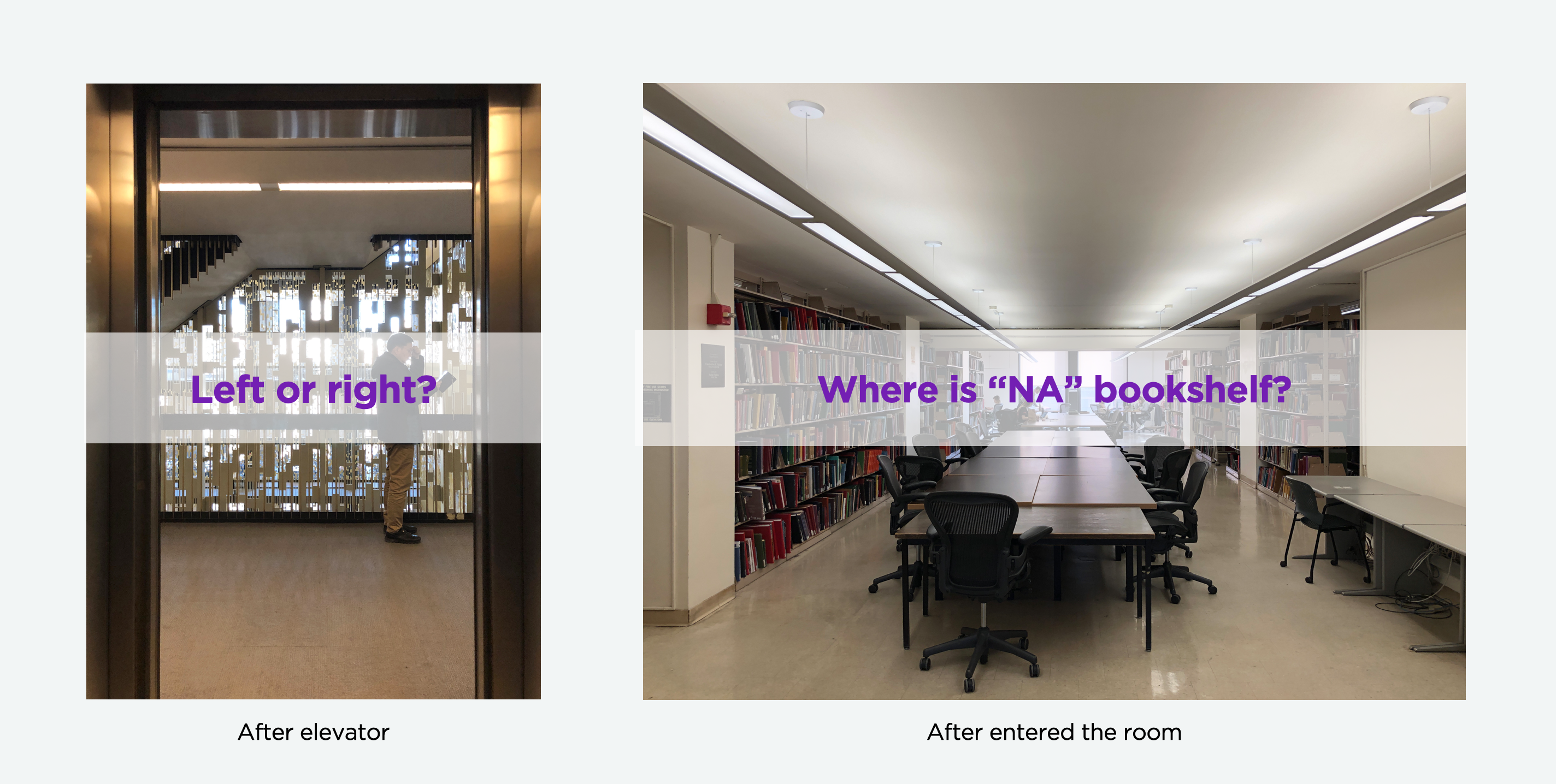
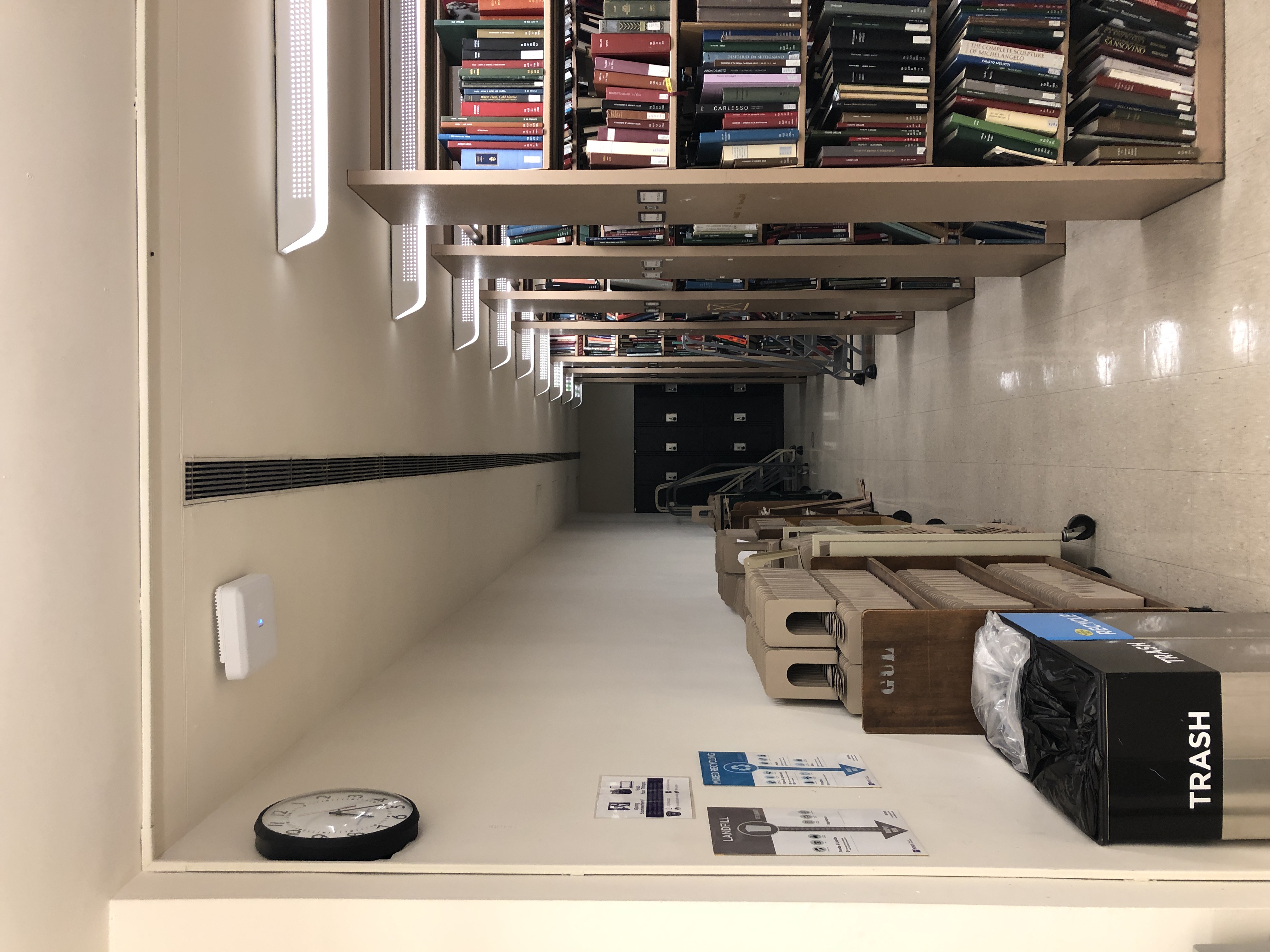
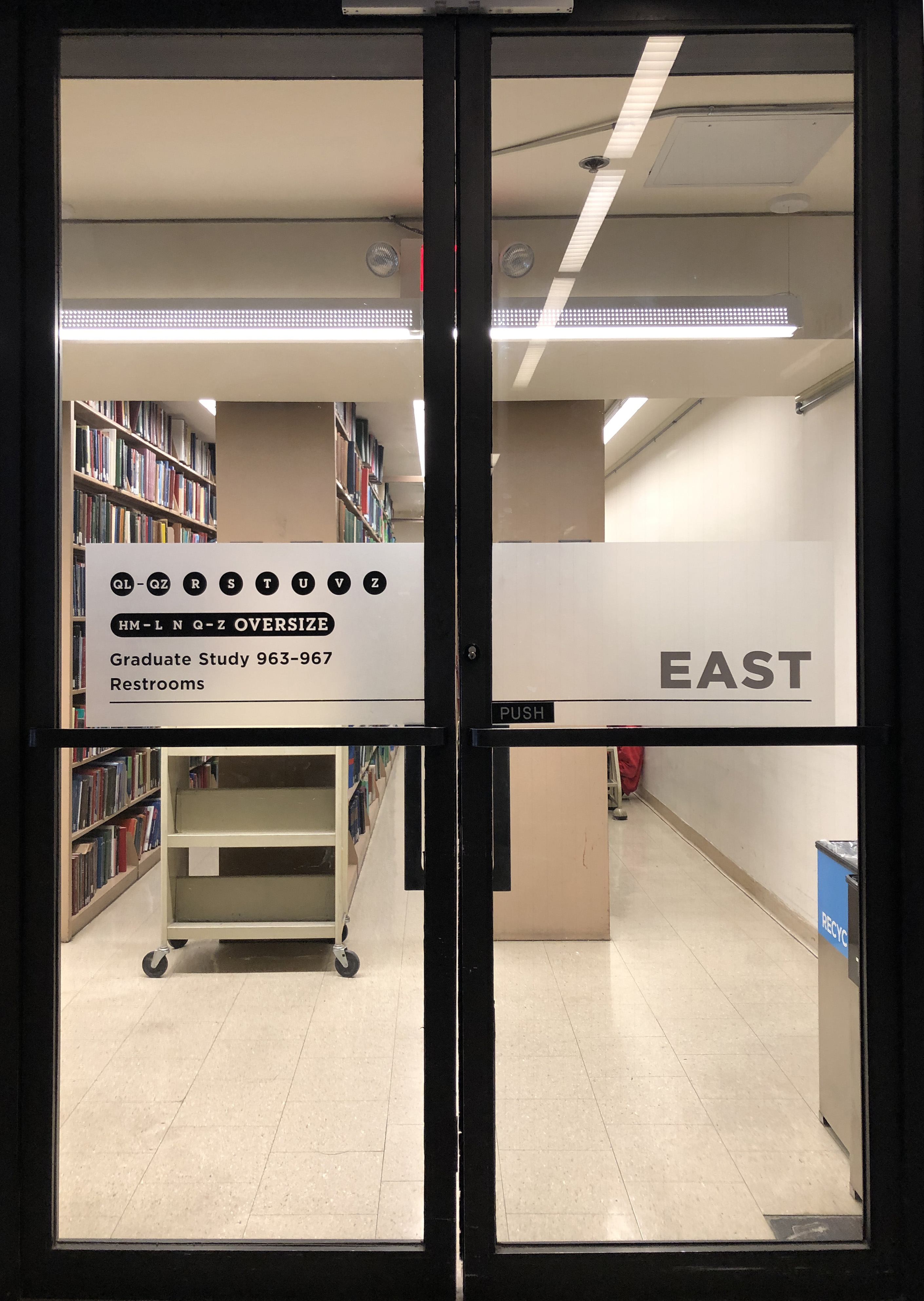
When I visit the Bobst Library
I had an unpleasant experience. I spent a long time wandering around the library trying to find the right room and the right bookshelf. There was no clear physical or digital way-finding indicator. This experience made me wonder if there are ways to help students and faculty efficiently navigate the library. This marks the beginning of the project.
Problem
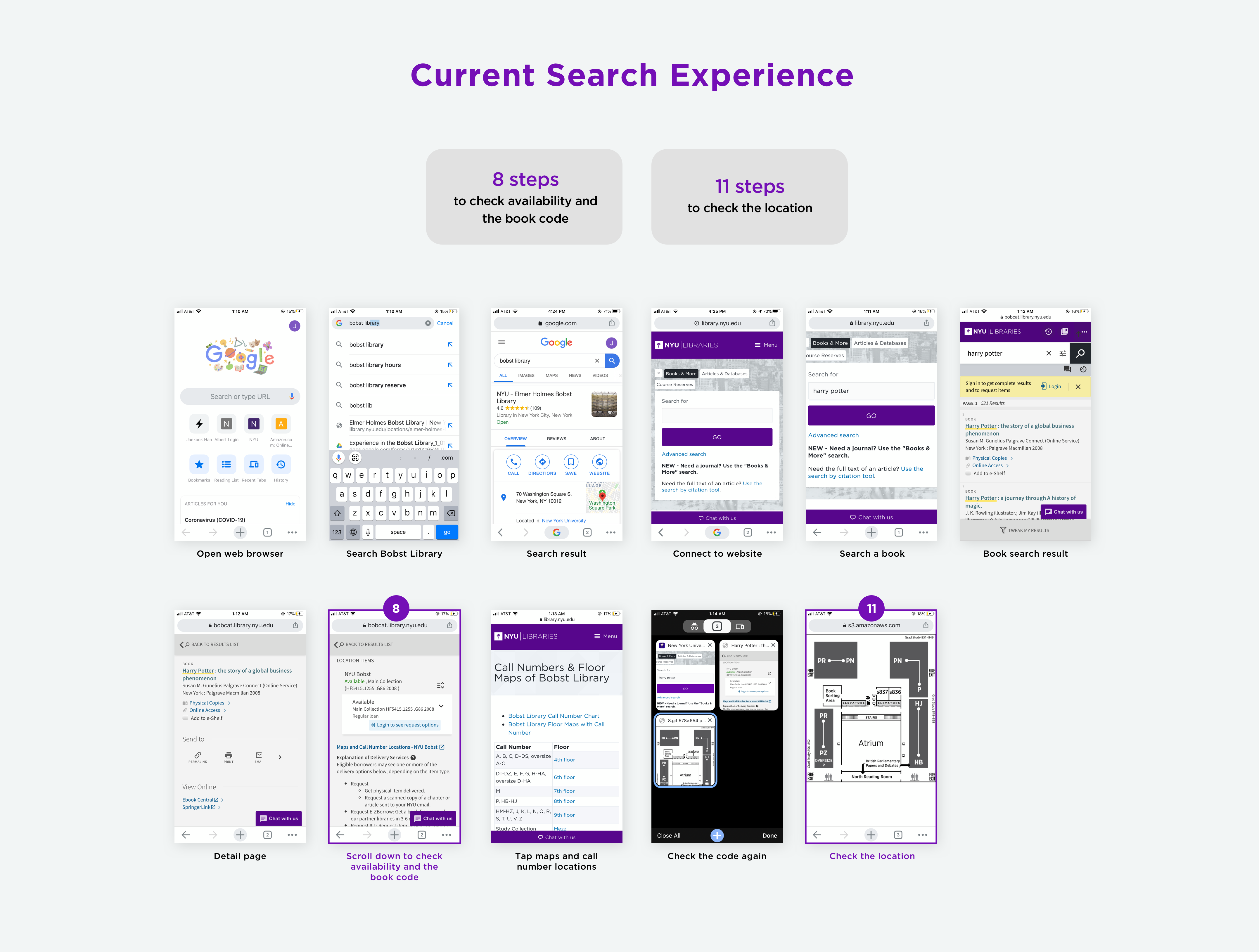
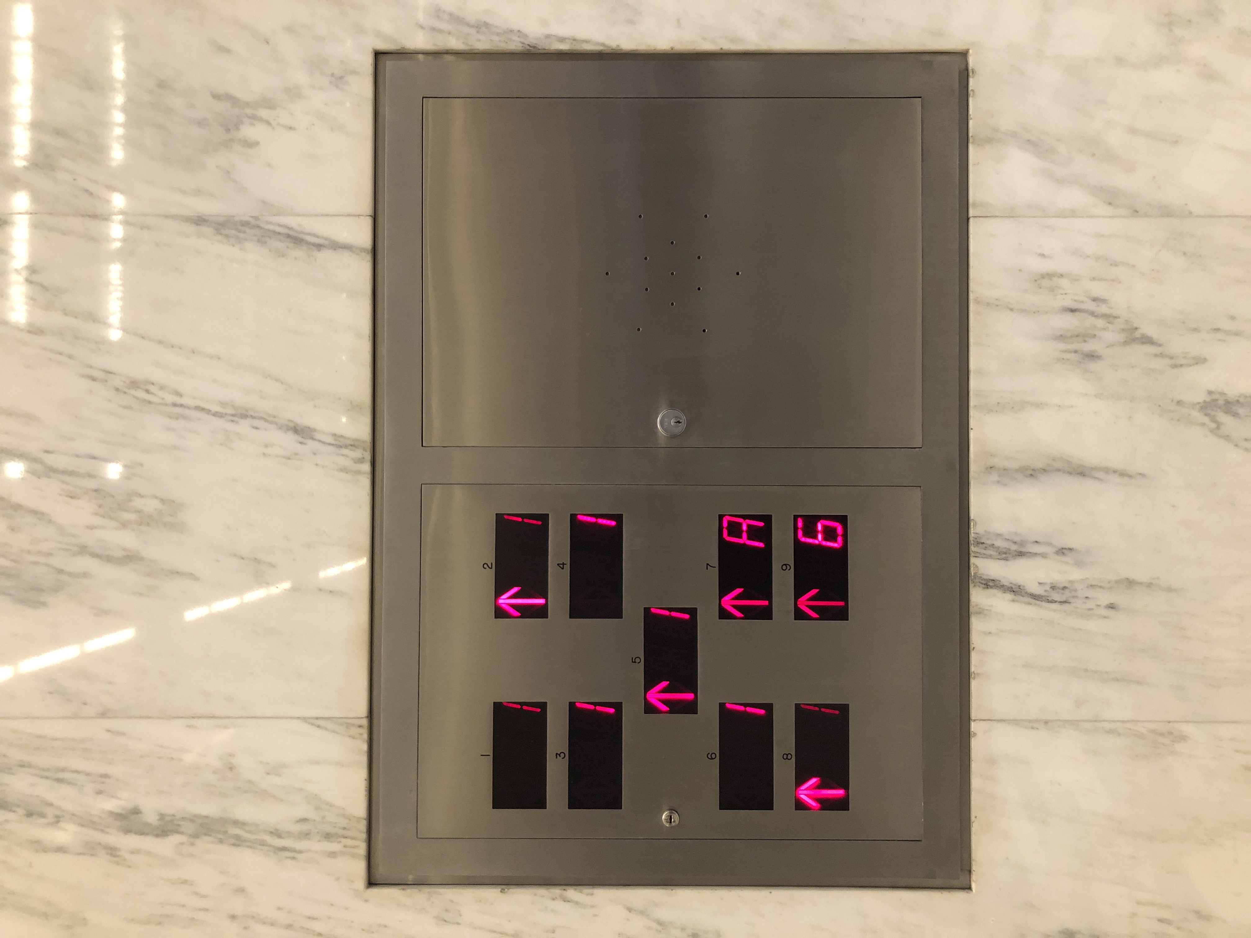
The book search process in the Bobst library starts from the digital space, where you search for a book and end in a physical space where you get a book. But there is a gap between them because of too many steps to information from the website and a lack of a way-finding system in the physical space.
Currently, on the website, it takes 8 steps to check for a book's availability and book code, and 11 steps to check its location. In the physical space, there are no signs inside the building. You have to check every room or every bookshelf if you are not familiar with the structure of the library.
Currently, on the website, it takes 8 steps to check for a book's availability and book code, and 11 steps to check its location. In the physical space, there are no signs inside the building. You have to check every room or every bookshelf if you are not familiar with the structure of the library.

Site-Visit
To understand the needs and frustrations of the users, the first thing I did was a site-visit. I went to the library and took a video and photos, documenting the book finding journey from searching to finding a book. This gave me a hypothesis of what the users’ pain points might be.

Survey
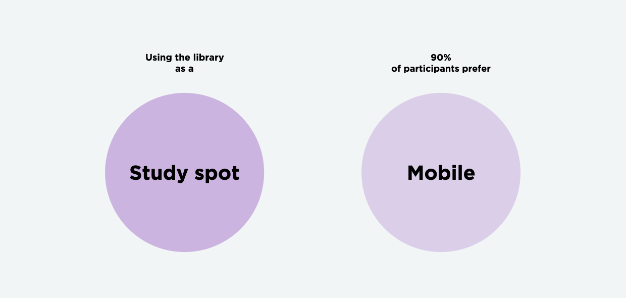
The second step was a survey about the library navigating experience. This survey helped to narrow down the problems and identified a user need that I didn’t know, which is using the library as a study spot. This was a very helpful insight. In terms of medium, more than 90% of participants prefer a mobile platform.
Interviews
The third step was interviews with potential users who either visit the Bobst Library for research or to study. These interviews were beneficial to know the specific pain point, define the problem, and gave me unexpected insights. The main pain point is the struggle with navigation: finding a room, a bookshelf, or the row the book lives on. In addition, many interviewees go to the library to study but find it difficult to find an available seat.
“It’s always hard to find and checkout multiple books at once.”
“I don’t like wandering around to find an available seat.”


<Iris Bierlein, Sr. UX Designer at Bobst Library NYU>
Interviews with a Professional
To get a different perspective on the project, I interviewed Iris, who is a senior user experience designer at the Bobst Library NYU. The interview helped me understand how the library system works, what’s possible and impossible to realize with this application. After the interview, my goal expanded to making a mobile application and a physical sign system. I believe a great library experience is dependent on the integration and interaction of the digital and physical space.
Even though the mobile application is useful, the journey of library experience takes place in the real world. Because of that, the app and the physical sign system should go together. Unfortunately, COVID-19 led to the shutdown of the library, so I focused my attention on the mobile application. This was a crucial point for my project. Because even though my main medium is a mobile, which is digital, the project is about how to virtualize the physical space and connect it to the real world.

What I have found
Based on the interview and survey results, I created a persona – a first-year graduate student at NYU with the following needs:
And find out the opportunity statement.
1 - Find a book and direction to the section easily
2 - Want to know the best physical route to optimize finding multiple books
3 - Check available seats for studying
And find out the opportunity statement.

Prototyping
& User Testing
The next step was to make a paper prototype based on the research and conduct user-testings. In the first prototype, I put every function on one page. Because the concept that drives me is “Intuitive understanding”, my primary goal is to reduce the steps to information. But it didn’t work. Instead, the interface confused the users. After gathering feedback from the user-test, I re-designed the user-interface focusing on simple and clear delivery of the essential information each page should have.

<First prototype>

<Second prototype & User testing>
Under COVID-19
Under COVID-19, I switched to using the Zoom screen share and Sketch preview to user-test for the digital prototype. I shared my prototype preview screen with testers and gave them a scenario: “You are trying to find a book for your research and you just opened the application. What is your next move?” The test worked better than I expected. I got feedback saying “The user experience and interface are pretty clear” from all testers, so I proceed to finalize the design.
Solution
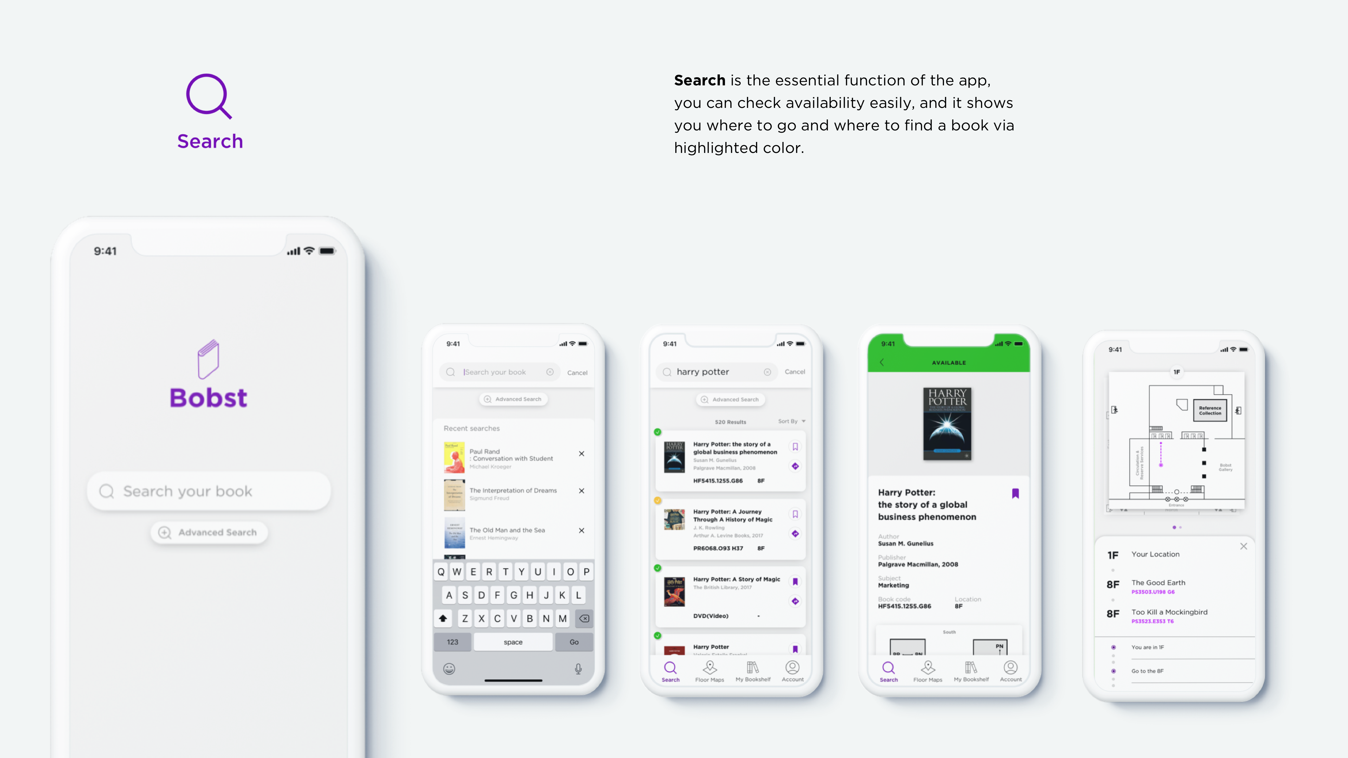
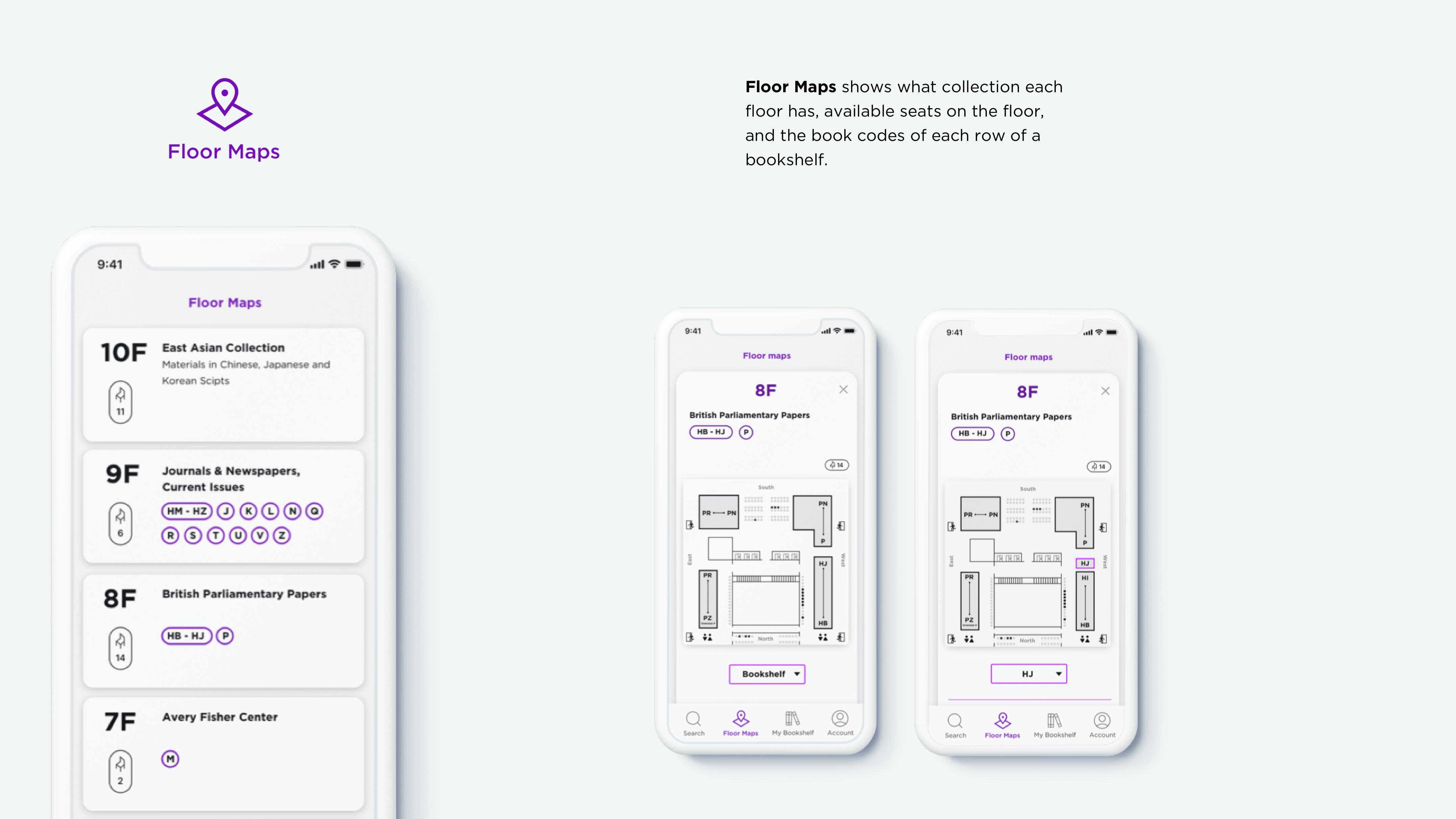
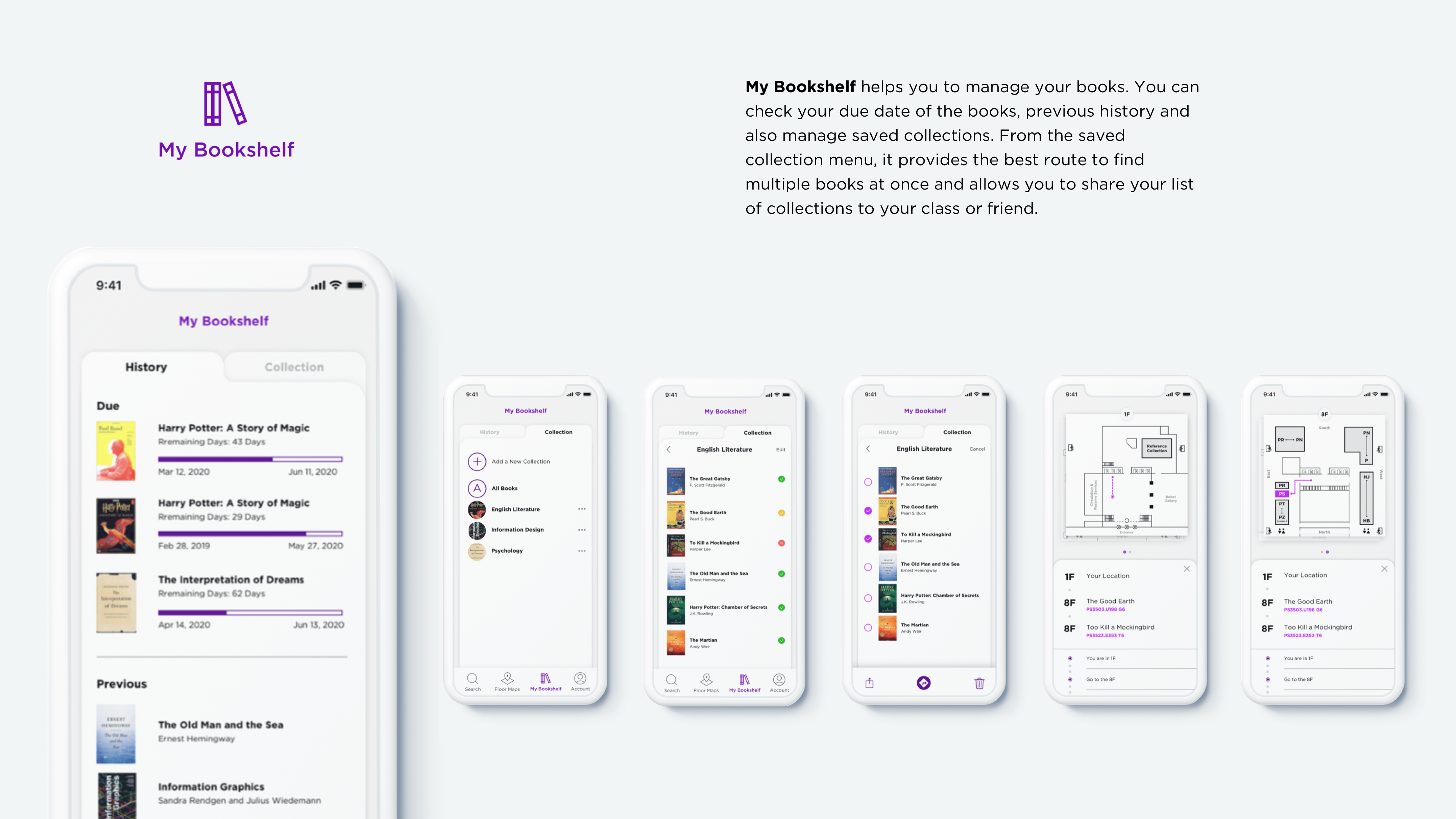
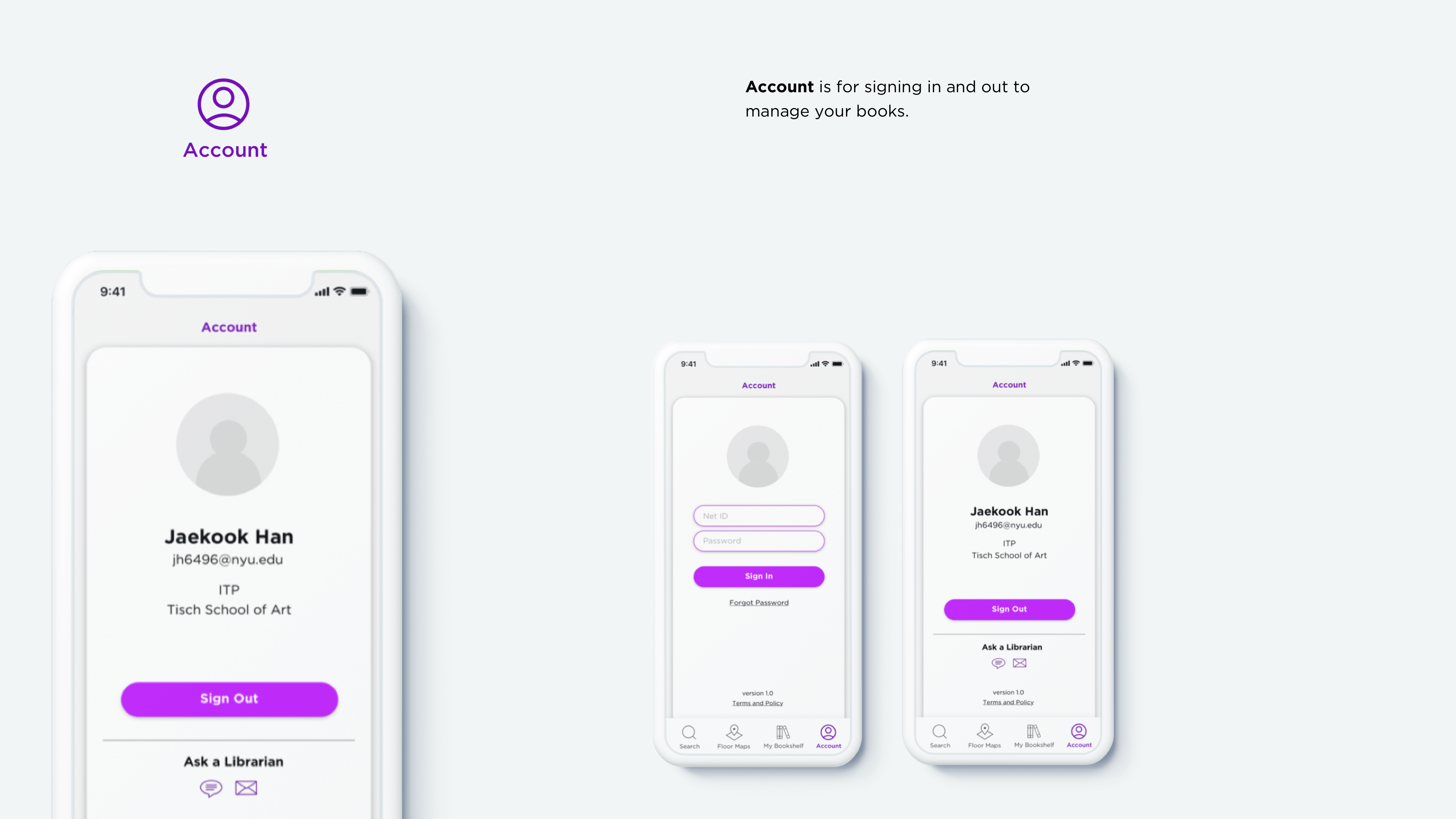
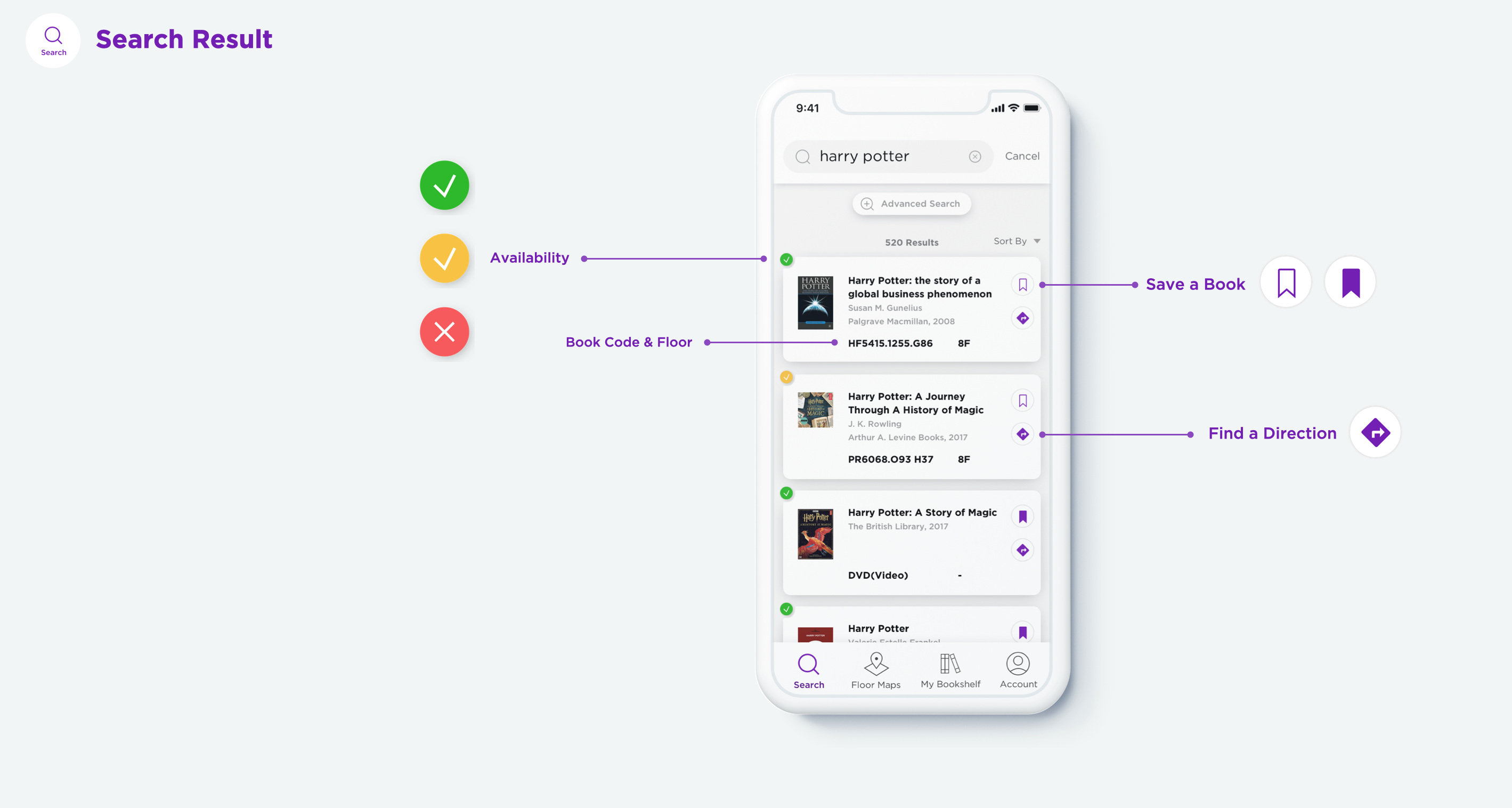
Bobst focuses on the core function of the library, which is searching for and finding a book. Based on that, the app has four menus: search, floor maps, my bookshelf, and account.
Detail
Details in the search menu show the essence of the Bobst application. Users can check all the information that is needed to search for and find a book. Especially, in the search result, users can check availability, book a code, and a location. Furthermore, they can go to the directions page directly from here.


What’s enhanced?
In the final design, you can see how the Bobst application enhanced the search experience compared to the existing website. For availability and a book code, you need three steps, and for location, you need four steps, while the existing website needs eleven steps.
Harmonize a transition from digital to the real world
Library experience starts from the digital space and ends up in the physical space. The project made me keep questioning how to harmonize a transition from digital to real experience with a simple and intuitive design. I've learned how a library search system works and why it couldn't have its own platform with a better user experience. They handle millions of data(books and media) with limited resources. But it also gave me a chance to find a problem and improve it.
Next step
This time, I could only focus on the digital experience because of COVID. I hope there is an opportunity to improve the physical experience, so I can balance both experiences. Furthermore, if there is a chance, I want to realize the design of the actual product as a platform so every library who have struggled with a complicated search system can improve their experience through the application.
Copyright 2025, Jaekook Han